Graphs and Data Visualization
1. Bar Graphs and Pictographs
Learning outcomes
- I can construct bar graphs and pictographs from data.
- I can interpret information presented in bar graphs and pictographs.
- I can compare categories using graphical displays.
- I can identify trends and differences shown in graphs.
- I can evaluate the effectiveness of a graphical representation.


Turning Data Into a Visual Story
Suppose a class surveys students about their favourite after-school activities.
| Activity | Number of Students |
|---|---|
| Sports | 18 |
| Gaming | 12 |
| Music | 9 |
| Reading | 6 |
The table gives us the exact values, but a graphical display can make the differences much easier to:
see immediately.
Two useful ways of displaying this type of data are:
bar graphs and pictographs.
Both are especially useful for comparing:
categories.
What Is a Bar Graph?
A bar graph uses rectangular bars to represent numerical values.
The height or length of each bar corresponds to the:
value or frequency of a category.
For example, the activity data above can be shown as a bar graph.
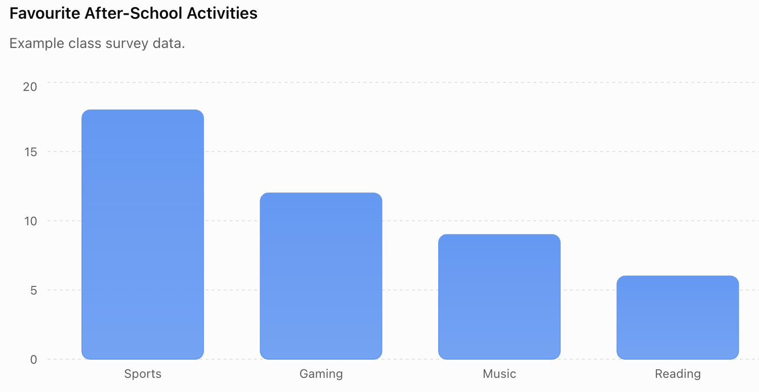
The graph makes it easy to see that:
Sports is the most popular category.
Reading is the:
least popular category.
Parts of a Bar Graph
A well-constructed bar graph usually contains several important features.
Title
The title explains:
what the graph shows.
Example:
Favourite After-School Activities
Categories
One axis identifies the:
categories being compared.
Numerical Axis
The other axis represents the:
frequency or measured value.
Scale
The scale shows how much each interval represents.
Labels and Units
These tell the reader exactly what is:
being measured.
Why Do Bar Graphs Have Gaps?
The bars in a standard bar graph usually have:
gaps between them.
This shows that the categories are:
separate.
For example:
Dogs | Cats | Fish | Birds
are separate categories.
The gaps visually reinforce this distinction.
Vertical and Horizontal Bar Graphs
Bar graphs can be:
vertical
or:
horizontal.
A vertical graph places categories along the horizontal axis.
A horizontal graph places categories along the vertical axis.
Both can display the same:
data.
Horizontal graphs are particularly useful when category names are:
long.
Constructing a Bar Graph
Suppose students record the number of trees in four areas of a park.
| Area | Number of Trees |
|---|---|
| North | 14 |
| South | 20 |
| East | 8 |
| West | 16 |
Step 1: Identify the categories
The categories are:
North, South, East, and West.
Step 2: Identify the largest value
The largest value is:
20.
Step 3: Choose a suitable scale
A useful scale might be:
0, 2, 4, 6, 8 ... 20
Step 4: Label the axes
For example:
Park Area
and:
Number of Trees
Step 5: Add a title
Number of Trees in Different Areas of the Park
Step 6: Draw the bars
Draw bars with heights:
14, 20, 8, and 16.
Choosing an Appropriate Scale
A scale should make the graph:
easy to read.
Suppose the data are:
20, 40, 60, 80
Using a scale that increases by:
1
would be unnecessarily difficult.
A better scale might increase by:
10 or 20.
The scale should be:
- consistent
- clearly labelled
- appropriate for the values
- easy to interpret
Equal Intervals
Graph scales should normally use:
equal numerical intervals.
Correct:
0, 5, 10, 15, 20, 25
Incorrect:
0, 5, 10, 20, 25, 50
If equal visual spaces represent unequal numerical changes, the graph can become:
misleading.
Worked Example 1: Reading a Bar Graph
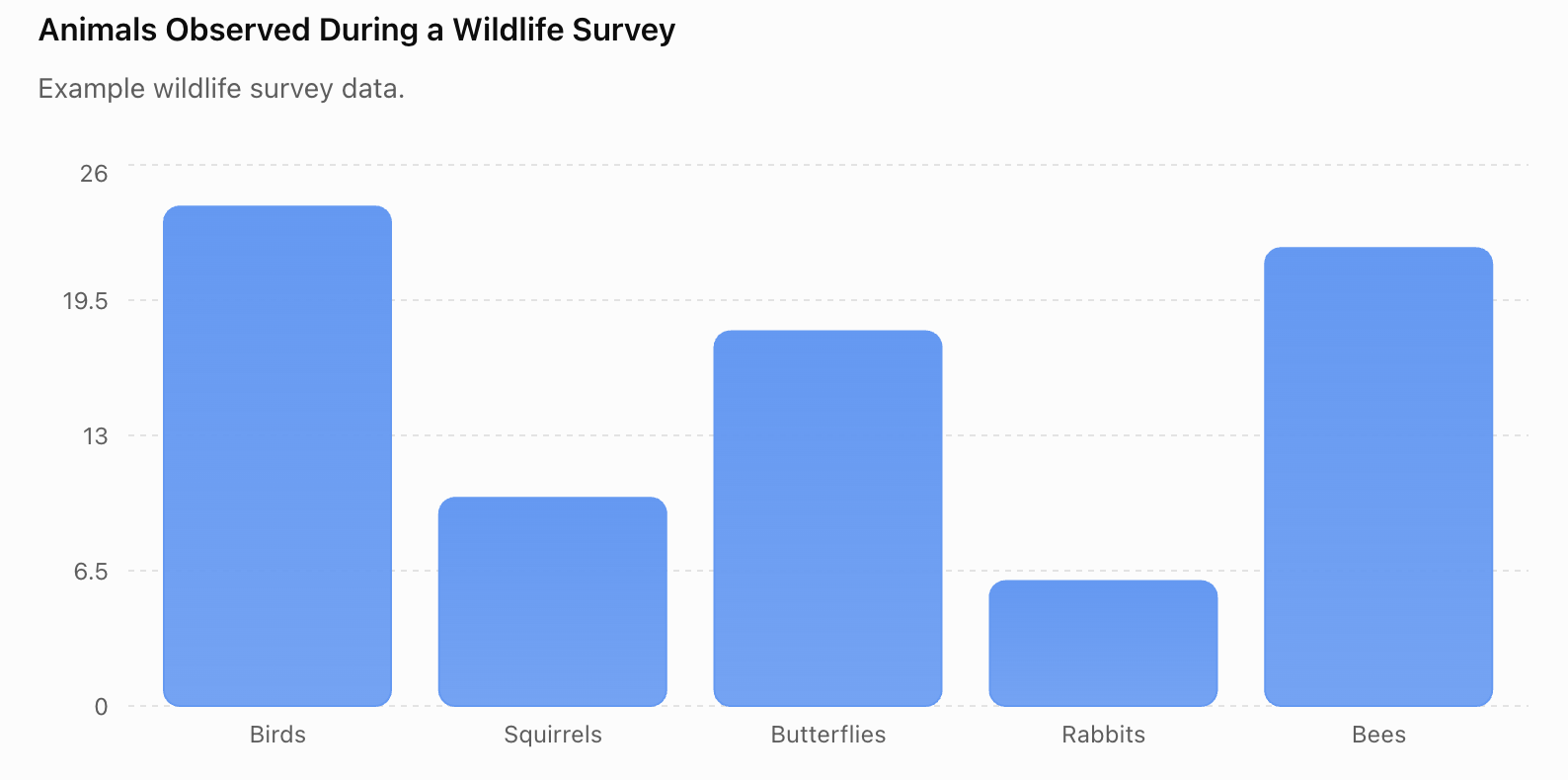
A wildlife survey records animals observed during one morning.
| Animal | Number Observed |
|---|---|
| Birds | 24 |
| Squirrels | 10 |
| Butterflies | 18 |
| Rabbits | 6 |
| Bees | 22 |