Graphs and Data Visualization

Сайт: Young Education
Курс: Data and Probability Foundations
Книга: Graphs and Data Visualization
Надруковано: ゲストユーザ
Дата: пʼятниця 25 вересня 2026 01:01 AM

1. Bar Graphs and Pictographs

Learning outcomes
  • I can construct bar graphs and pictographs from data.
  • I can interpret information presented in bar graphs and pictographs.
  • I can compare categories using graphical displays.
  • I can identify trends and differences shown in graphs.
  • I can evaluate the effectiveness of a graphical representation.

https://images.openai.com/static-rsc-4/uMqVUntD-UM1n43xGfse7ilgYCx_kiTtnsCKkizfkvh2i-6EIsfOEsVD4hFtFjuDzuyOVAwaeOcDWf_j-z5smNziTDbuvd1DZ7ugIhYDQDs2iHZl_P0GqFozhLib94TvR4GlKgiTlR8IB7NqP8-79r-eKLCsqorAP45y5vEQjRUnJXkX6D3yjvlit9xUgCiW?purpose=fullsize
 
https://images.openai.com/static-rsc-4/wLBkRz_dDVXE9rFCSKeIs7SgWTkR-R2LhY731NiN7RMBgVNHyjpFXMIByW6dYRoKZ-gyXamozsShQxLFdZoAowKKawCWhK6QEgsi2DLDNC1IfR94gVoPaQOHhtKlc_80u7APnQDWnqWGYr7NWAtIWwMOApM6KnqFRLKRjeUJCmUVlMeswp4Vf8KxGrcABoi0?purpose=fullsize
 
https://images.openai.com/static-rsc-4/be6wC5hzUTW8MXD5MVD_DtsFkHSSu3iPrW8rXSIJCtRhuLAYLe3YsP1QuieYpfMwRsIF3leKQUOLDHEgDDQqNFxG8AobWslDUC2si0-1c4jYtNfDVKxAdftmEjghKPK6Fz6W4TLb5xsphw9gt-zMJb-GckDDat_EuT-JekbEV3qtmN6_sKGfRalmlVd9mct5?purpose=fullsize
 
6

Turning Data Into a Visual Story

Suppose a class surveys students about their favourite after-school activities.

Activity Number of Students
Sports 18
Gaming 12
Music 9
Reading 6

The table gives us the exact values, but a graphical display can make the differences much easier to:

see immediately.

Two useful ways of displaying this type of data are:

bar graphs and pictographs.

Both are especially useful for comparing:

categories.


What Is a Bar Graph?

A bar graph uses rectangular bars to represent numerical values.

The height or length of each bar corresponds to the:

value or frequency of a category.

For example, the activity data above can be shown as a bar graph.
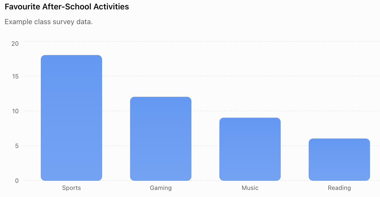
The graph makes it easy to see that:

Sports is the most popular category.

Reading is the:

least popular category.


Parts of a Bar Graph

A well-constructed bar graph usually contains several important features.

Title

The title explains:

what the graph shows.

Example:

Favourite After-School Activities

Categories

One axis identifies the:

categories being compared.

Numerical Axis

The other axis represents the:

frequency or measured value.

Scale

The scale shows how much each interval represents.

Labels and Units

These tell the reader exactly what is:

being measured.


Why Do Bar Graphs Have Gaps?

The bars in a standard bar graph usually have:

gaps between them.

This shows that the categories are:

separate.

For example:

Dogs | Cats | Fish | Birds

are separate categories.

The gaps visually reinforce this distinction.


Vertical and Horizontal Bar Graphs

Bar graphs can be:

vertical

or:

horizontal.

A vertical graph places categories along the horizontal axis.

A horizontal graph places categories along the vertical axis.

Both can display the same:

data.

Horizontal graphs are particularly useful when category names are:

long.


Constructing a Bar Graph

Suppose students record the number of trees in four areas of a park.

Area Number of Trees
North 14
South 20
East 8
West 16

Step 1: Identify the categories

The categories are:

North, South, East, and West.

Step 2: Identify the largest value

The largest value is:

20.

Step 3: Choose a suitable scale

A useful scale might be:

0, 2, 4, 6, 8 ... 20

Step 4: Label the axes

For example:

Park Area

and:

Number of Trees

Step 5: Add a title

Number of Trees in Different Areas of the Park

Step 6: Draw the bars

Draw bars with heights:

14, 20, 8, and 16.


Choosing an Appropriate Scale

A scale should make the graph:

easy to read.

Suppose the data are:

20, 40, 60, 80

Using a scale that increases by:

1

would be unnecessarily difficult.

A better scale might increase by:

10 or 20.

The scale should be:

  • consistent
  • clearly labelled
  • appropriate for the values
  • easy to interpret

Equal Intervals

Graph scales should normally use:

equal numerical intervals.

Correct:

0, 5, 10, 15, 20, 25

Incorrect:

0, 5, 10, 20, 25, 50

If equal visual spaces represent unequal numerical changes, the graph can become:

misleading.


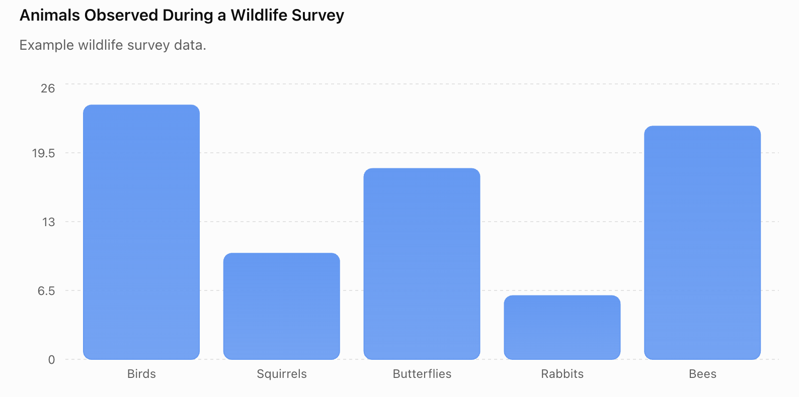
Worked Example 1: Reading a Bar Graph

A wildlife survey records animals observed during one morning.

Animal Number Observed
Birds 24
Squirrels 10
Butterflies 18
Rabbits 6
Bees 22
 

From the graph:

Most common: Birds

Least common: Rabbits

Difference between birds and rabbits:

24 − 6 = 18

Difference between birds and bees:

24 − 22 = 2

Total observations:

24 + 10 + 18 + 6 + 22 = 80

Graphs allow us to answer both:

visual and numerical questions.


Comparing Categories

Bar graphs are especially useful when we want to compare:

different groups or categories.

Suppose:

Transport Students
Bus 25
Car 18
Walk 12
Bicycle 5

We can immediately compare:

Bus vs Car

Walk vs Bicycle

or:

any other pair of categories.

For example:

25 − 5 = 20

So 20 more students travel by bus than by:

bicycle.


Difference and Total

When interpreting graphs, pay attention to what the question asks.

Suppose:

Apples = 15

Oranges = 9

The difference is:

15 − 9 = 6

The combined total is:

15 + 9 = 24

These answer completely different:

questions.


What Is a Pictograph?

A pictograph, sometimes called a pictogram, uses pictures or symbols to represent numerical data.

For example:

Books Read This Month

Key: 📘 = 2 books

Student Books
Alex 📘 📘 📘
Mia 📘 📘
Sam 📘 📘 📘 📘
Noor 📘

To interpret the pictograph, we must use the:

key.

https://images.openai.com/static-rsc-4/euyJGgQN3b2gnHa1wsSNe0d08r7Hq2PAYsTOnv71fMCZNdyu95s3tV_QSMchkjE_yDAscXXGsov5588m3crz5I-IroBzRwzFhUiNaKnD4dkwr6hg07CzrbYsi2rfXyuaxMwB9MnDaf9fVyzWL_h-1s3lmuxaxrNQEoY510OxL2IXNA7drqtcAhyeLqj-Wvi3?purpose=fullsize
 
https://images.openai.com/static-rsc-4/uQOs9F522kyxVm1YZ7sunrAwmInSGeHuEnigKZR7RDIxPfMORMQUxubK2enkFqsn101ZKGnFJSoztABliiNg9XcsYfTlzUNVANmfBzHtFpTec3ITlKN59aybR0VdNB0oU9ynTGp6QLaXlwBSSLC9Bpo_-dMQ7NMKQhRfQUI6KHrMRr3db7Jv_AElDinwyf_u?purpose=fullsize
 
https://images.openai.com/static-rsc-4/4Bi9I17hUO8Zzmdo2X994PCqhaekiDQ65al3f408XWbyqB24JkiZHbQFpFu6QgIJkIDhtbwRaRuvJ8jNukOvnrEcHYBfMi9oQAJuPt46oGPwzX8Z9N0ImGlOUClWWAZ3MCfW09gqcqlsfS4PQT0lO9dIdAinKbPnj3HRSyNujI4z-BX4SQ8mvW7go2ieCYex?purpose=fullsize
 
7

The Key Is Essential

In the previous example:

📘 = 2 books

Therefore:

Alex:

3 × 2 = 6 books

Mia:

2 × 2 = 4 books

Sam:

4 × 2 = 8 books

Noor:

1 × 2 = 2 books

Without the key, we would not know what each:

symbol represents.


One Symbol Can Represent Many Items

Suppose:

● = 5 people

Then:

● ● ●

represents:

15 people.

If:

🌳 = 10 trees

then:

🌳 🌳 🌳 🌳

represents:

40 trees.

Always check the:

key before interpreting a pictograph.


Partial Symbols

Sometimes a pictograph uses part of a symbol.

Suppose:

★ = 10 students

Then:

½★ = 5 students

Therefore:

★★½

represents:

10 + 10 + 5 = 25 students.

Partial symbols allow pictographs to represent values that are not exact multiples of the:

full symbol value.


Constructing a Pictograph

Suppose a fruit shop sells:

Fruit Number Sold
Apples 30
Bananas 20
Oranges 40
Pears 10

Choose:

🍎 = 10 pieces of fruit

The pictograph could be:

Apples: 🍎 🍎 🍎

Bananas: 🍎 🍎

Oranges: 🍎 🍎 🍎 🍎

Pears: 🍎

The key must clearly state:

🍎 = 10 pieces of fruit.


Choosing a Good Key

Suppose the values are:

100, 200, 300, 400.

Using:

● = 1

would require:

1,000 symbols altogether.

That would be impractical.

Instead, we might choose:

● = 100

A good key makes the pictograph:

simple, accurate, and readable.


Worked Example 2: Pictograph

A farmer records the number of baskets of vegetables harvested.

Key: 🧺 = 4 baskets

Tomatoes: 🧺 🧺 🧺 🧺

Carrots: 🧺 🧺 🧺

Peppers: 🧺 🧺

Beans: 🧺 🧺 🧺 🧺 🧺

Therefore:

Tomatoes = 16 baskets

Carrots = 12 baskets

Peppers = 8 baskets

Beans = 20 baskets

The largest harvest was:

beans.

The difference between beans and peppers was:

20 − 8 = 12 baskets.


Bar Graph or Pictograph?

Both displays can represent:

categorical data.

But they communicate information differently.

Bar Graph Pictograph
Uses rectangular bars Uses symbols or pictures
Good for precise comparisons Good for simple visual comparisons
Handles larger values easily Can become crowded with large values
Scale shown on an axis Scale shown using a key
Usually easier for detailed analysis Often more visually engaging

Neither is automatically:

better.

The best choice depends on the:

data, purpose, and audience.


Identifying Trends and Patterns

Graphs allow us to see more than individual values.

We can look for:

  • largest categories
  • smallest categories
  • similar categories
  • major differences
  • groups of similar values
  • overall patterns

Suppose:

Month Ice Creams Sold
January 120
February 140
March 180
April 230

The values show an:

increasing pattern across these months.

However, we should be careful with the word:

trend.

A bar graph shows differences between categories. If those categories have a meaningful order, such as months, we may also identify an overall:

pattern or trend.


Patterns Do Not Explain Causes

Suppose ice cream sales increase as the weather becomes warmer.

The graph shows:

an increase in sales.

It does not, by itself, prove:

why the increase occurred.

The graph presents evidence.

Explanations require:

additional reasoning and evidence.

This distinction is important in both mathematics and:

science.


Worked Example 3: Comparing Data

Suppose a school records participation in four clubs.

Club Students
Science 28
Art 20
Music 24
Drama 16

We can make several statements.

Science has:

the highest participation.

Drama has:

the lowest participation.

Science has:

28 − 16 = 12

more students than Drama.

Music has:

24 − 20 = 4

more students than Art.

Science and Music together contain:

28 + 24 = 52 students.


Evaluating a Graph

A graph can be mathematically correct but still be:

poorly designed.

When evaluating a graphical representation, ask:

Is it accurate?

Do the bars or symbols represent the correct values?

Is it clearly labelled?

Can the reader tell what the data represent?

Is the scale appropriate?

Are numerical intervals consistent?

Is the key clear?

For a pictograph, can the reader understand what each symbol represents?

Is it easy to read?

Can the main comparisons be identified quickly?

Is this the right type of display?

Does the graph suit the:

data and purpose?


Effective vs Ineffective Graphs

An effective graph communicates information:

quickly and accurately.

An ineffective graph may:

  • hide important differences
  • exaggerate differences
  • use confusing labels
  • omit units
  • use an inappropriate scale
  • contain unnecessary decoration
  • use an unclear pictograph key

The purpose of a graph is not simply to look:

attractive.

Its main purpose is to communicate:

data accurately.


Misleading Bar Graphs

Suppose two products receive satisfaction scores:

Product A = 96

Product B = 100

If the vertical axis begins at:

95

instead of zero, the difference between the bars can appear:

very large.

But the actual difference is only:

4 points.

https://images.openai.com/static-rsc-4/MOPAapGDsdMiEcsYPTEHN1rjj87Z3qDlbVO-7s_ZYS0BtO8rUSuXWs32_-W17POUjjufW0Pa5zaTbcMHuJvKQZyQLwXBGoYyjubQnsTaZAgNXvRf6Qq_ZT0spVvKZJ5ZWhQYjaePt1WTrhDMq5asDcmmRIJuzY3ypDVWCQIeuFkiIdv-sT1BEdiJS2a_ohwX?purpose=fullsize
 
https://images.openai.com/static-rsc-4/es2Mc-k6iHmWPCoABPqHF5lnXfT-dnGldCi8OOg_2eRfkc-MI1rOKxrx94ZKL2Hw_2-8wuEQPN0WsW1UuzUf_CKz7o-655gbZpJJ6SHM0pu9ESb2zjSX5G_bPaZEC7Uy07m7fWa6jzC0hh-b7ZLb1BX3YP4Jy7HTfbrRakgC5xA_7kLu2PuENwthcg4PyUw6?purpose=fullsize
 
https://images.openai.com/static-rsc-4/jx2CZogiPbF8IBrcJmdLP1PAPm8FkLbHWrd6-kxDZYTP5ju9z87S_Ebd0lEGx07_Er87ICBUVDQTiW-Q9IhTClDDIEDjnNySPS0usdntYsbzncGTp4wS88OlnsVALmObzWY0VX9jwNfViRr0_qCnaABV3wzrJ6AAABrBil0IXY_paAMYABW3IGxz6Yl9JNQB?purpose=fullsize
 
6

When reading a bar graph, always examine:

the numerical scale.


Why Starting at Zero Often Matters

Bar graphs communicate values partly through the:

length of each bar.

If the baseline is changed dramatically, the visual difference between bars may no longer reflect the actual:

relative difference.

For this reason, bar graphs generally work best with a baseline of:

zero.

If a different baseline is used for a justified reason, it should be:

clearly indicated.


Misleading Pictographs

Pictographs can also distort information.

Suppose:

🚗 = 100 cars

Town A has 200 cars.

Town B has 400 cars.

Town A should receive:

🚗 🚗

Town B should receive:

🚗 🚗 🚗 🚗

Instead, imagine the designer shows one car picture for each town but makes Town B's picture:

twice as tall and twice as wide.

The second image has approximately four times the:

area.

This exaggerates the visual difference.


Keep Symbols the Same Size

A good pictograph normally keeps symbols:

the same size.

Quantity should be represented by:

the number or fraction of symbols,

not by randomly changing the size of the pictures.

This makes comparisons:

fair and accurate.


Misleading Keys

Suppose a pictograph uses:

● = 10 people

for one category.

But elsewhere, without explanation:

● = 20 people.

The graph becomes:

inconsistent and misleading.

A pictograph should use the same key throughout unless a change is explicitly and clearly:

explained.


Unnecessary Decoration

Graphs sometimes include:

  • 3D bars
  • shadows
  • perspective effects
  • oversized pictures
  • decorative backgrounds

These features can make a graph look impressive while making the data:

harder to interpret.

Simple graphs are often more:

effective.

https://images.openai.com/static-rsc-4/7uPeAIZ86NogsO3lA351wVy9oJSRrEqoQfrx1HJZbU4k_r3cbi3Cv1hcq-_n2kK1hjf14rE4FPxMIx-TfB55d8_jIiNF-8kYVZFj82N4uK5nR1bXNmgBDghkTUxV11SZi30l-nAGM3Fm19kwGPKRttcsA4pBmtM6P6qfV15AvYD-KVLxKkk33sgkJDPHWXMv?purpose=fullsize
 
https://images.openai.com/static-rsc-4/Cu4XzXp6AYJGuRqUrqTdcbRvCXSHeUfZ1PaJwdOe1xAn-CnsELLJ-Xq2XNZMs4EqZLoq1V31UWoezKG_NJYuv7s-8SwkQtSGfgz4lX5dLVAhhvIY4g_iWDYQcLY-bcmbaKQnuhzJqEofKKBtMMzbYcsSiM_VfQG23lHIk9u24I0XP-jZ_-nj3wa1sgVxPabB?purpose=fullsize
 
https://images.openai.com/static-rsc-4/CTyI5wzLSw_joSbxVSCDFFc7-fB7MA1zR--fLcwBqaWiqmwAjfOi7gP8VNXa-nityarSLas35LEVM8ux0LToYKs-v02SNRDRQhpnfL9KVD21SIGLV9RVm-u74GOaRO2oxay4HpUjwEFMlC9Gfl7l30QfxGesOsqZQC8Xi2V6wIDvLIj30-imIdTe5W17OmSw?purpose=fullsize
 
6

Worked Example 4: Which Graph Is Better?

A teacher wants to display the number of students in five clubs:

12, 18, 27, 31, 24

Option A

A pictograph where:

★ = 1 student

This would require:

112 stars.

It would be crowded and difficult to count.

Option B

A bar graph with a scale from:

0 to 35

This would allow the categories to be compared:

quickly and precisely.

For this dataset, the bar graph is likely the more:

effective representation.


Worked Example 5: When a Pictograph Works Well

A children's reading program records books completed by four groups:

Group A = 10

Group B = 15

Group C = 20

Group D = 25

Using:

📚 = 5 books

requires only:

2, 3, 4, and 5 symbols.

This creates a display that is:

simple and easy to interpret.

Here, a pictograph could be very:

effective.


Evaluating Effectiveness

A useful question is:

"Can the reader understand the important information quickly and accurately?"

If yes, the graph is probably doing its:

job.

Effectiveness depends on:

  • accuracy
  • clarity
  • simplicity
  • appropriate scale
  • suitable graph type
  • correct labels
  • audience
  • purpose

Graphs in Science

Bar graphs are frequently used in science to compare:

different experimental groups or categories.

For example:

Fertilizer Average Plant Height (cm)
None 12
A 19
B 23
C 16

A bar graph makes it easy to compare the:

four treatments.

However, the graph alone does not tell us whether the differences were caused by the fertilizer.

That depends on the quality of the:

experimental design.


Graphs in Business

Businesses use bar graphs to compare:

  • sales
  • expenses
  • products
  • locations
  • customer groups
  • monthly performance

For example:

Store A = $45,000

Store B = $52,000

Store C = $38,000

A graph allows managers to compare the stores:

quickly.


Graphs in Media

News reports and social media frequently use graphical:

data displays.

https://images.openai.com/static-rsc-4/7Q8GP_oqZrnN8QIxDszFChAZLrx2s6zgRWHtqJexurLib7HO5Bq0MN8RiuujR1YV96FV1wU6cdns-ULHvGe3jXlM9fYbU4H4AJdwDxnn09UkImaURyQi3mQOP5J_td3Bb9OBUxKuGzPi1cFGO3LD3ao1AtBiP7GGMxZXg0OFcfBgF2SM6bhvRi8BHGcv-E9n?purpose=fullsize
 
https://images.openai.com/static-rsc-4/HFfivB0AUrR0GXR0zn67ZGACfv5wPxkcLrz90LRgJYeGHugDRbOf9DuLjeDG9cLHNS0IwLmmQhRd6Zx5FMGE_xwoaKurrNAGm7RO-aVtMU4MYWVu_cPPTtqd3-jsZAW0JiauslFOIbhALe9B-f1zWUp8hFojDPs5k6R_glpjq-5CtBD9pBANqRuQlpkmJjEq?purpose=fullsize
 
https://images.openai.com/static-rsc-4/Las6Kt669aGvWmOKbD5SS2UYRwgoHOXKjNRfy2FTa9BKLy95stRX9k9RI2tpyD0HXg-4b5fOGt1W0NUYYG_mEOgj4dqTn2VaeOGNiW-9iwiw6yKB8Xf813nTgK9Pi71zI3IUwrsUtdEwohpU0EusaKWoEwC2wqe9zZEkNg_kevLTuQWxiLfq5z1Uo_iVO6an?purpose=fullsize
 
4

When reading these graphs, ask:

  • Where did the data come from?
  • What does the scale show?
  • Is anything missing?
  • Does the visual appearance match the actual numbers?
  • Is the graph designed to inform or persuade?
  • Would another representation communicate the data more clearly?

Graph literacy involves both:

reading and questioning.


From Raw Data to Bar Graph

Suppose students choose their favourite season:

Summer, Winter, Summer, Spring, Summer, Autumn, Winter, Summer, Spring, Autumn, Summer, Winter, Spring, Summer, Autumn

Step 1: Count the frequencies

Season Frequency
Spring 3
Summer 6
Autumn 3
Winter 3

Step 2: Choose a scale

A scale from:

0 to 6

works well.

Step 3: Label the graph

Title:

Favourite Seasons

Axes:

Season

and:

Number of Students

Step 4: Draw the bars accurately

The graph now communicates the raw data much more:

efficiently.


From Raw Data to Pictograph

Using the same data:

Spring = 3
Summer = 6
Autumn = 3
Winter = 3

We could choose:

● = 1 student.

Then:

Spring: ● ● ●

Summer: ● ● ● ● ● ●

Autumn: ● ● ●

Winter: ● ● ●

Because the values are small, the pictograph remains:

simple and readable.


Comparing Two Representations

The bar graph and pictograph contain:

the same underlying data.

However, they emphasize different things.

The pictograph is:

visually engaging.

The bar graph allows more precise comparison using:

a numerical scale.

This demonstrates an important principle:

The same data can be represented in different ways.

The best representation depends on what you want to:

communicate.


The GRAPH Check

Before accepting or creating a graphical display, use:

G — Graph Type

Is this an appropriate type of graph?

R — Range and Scale

Does the scale represent the data fairly?

A — Accuracy

Are the values shown correctly?

P — Presentation

Are the title, labels, units, and key clear?

H — Honest

Does the visual display represent the numerical differences fairly?

This provides a useful checklist for:

evaluating graphs.


Worked Example 6: Evaluate This Graph

Suppose a bar graph compares test scores:

Class A = 81

Class B = 83

The graph's vertical axis runs from:

80 to 84.

Visually, Class B's bar appears several times taller than Class A's visible bar segment.

Evaluation

The numerical values may be correct.

However, the truncated axis exaggerates the apparent:

difference.

Actual difference:

83 − 81 = 2 points.

Improvement

For a conventional bar graph, use a zero baseline or make the axis break/truncation unmistakably clear and consider whether another display would better communicate the small difference.


Worked Example 7: Evaluate This Pictograph

A graph shows the number of trees planted by two groups.

Group A = 20

Group B = 40

Group A is represented by one tree image.

Group B is represented by one tree image that is twice as tall and twice as wide.

Problem

The second picture has about:

four times the area.

The data show only:

twice as many trees.

Improvement

Use equal-sized symbols and a clear key, such as:

🌳 = 10 trees.

Then:

Group A → 🌳 🌳

Group B → 🌳 🌳 🌳 🌳

The visual representation now matches the:

numerical relationship.


Communicating Information Effectively

A strong graph should allow the reader to answer:

What is being compared?

What are the values?

Which categories are largest and smallest?

How large are the differences?

What patterns are visible?

If the graph makes these questions difficult to answer, its design may need:

improvement.


A Good Graph Tells the Truth Clearly

The purpose of a graphical representation is not simply to make data look:

interesting.

Its purpose is to make the data:

understandable.

The most effective graph is often the one that communicates the important information with the least:

confusion or distortion.


Check Your Understanding

1. Define a bar graph.

2. Why do bar graphs normally have gaps between the bars?

3. List four features of a well-constructed bar graph.

4. Why are equal scale intervals important?

5. When might a horizontal bar graph be preferable to a vertical one?

6. Define a pictograph.

7. Why does a pictograph need a key?

8. If ★ = 4 students, what does ★★★ represent?

9. If ● = 10 people, what does ½● represent?

10. Explain how to choose an appropriate pictograph key.

11. A bar graph shows 28 students choosing basketball and 19 choosing football. How many more chose basketball?

12. If 🍎 = 5 apples, how many apples are represented by 🍎🍎🍎½🍎?

13. Give one advantage of a bar graph over a pictograph.

14. Give one advantage of a pictograph over a bar graph.

15. Explain why changing the sizes of pictograph symbols can be misleading.

16. Why can a truncated vertical axis make a bar graph misleading?

17. A graph shows values of 40, 60, 80, and 100. Suggest a reasonable scale.

18. What information should you examine before interpreting a graph?

19. Explain the difference between identifying a pattern and explaining its cause.

20. Describe three features you would examine when evaluating whether a graphical representation is effective.


Key Terms

  • Bar graph: Graph using separated rectangular bars to compare categories or discrete values.
  • Bar: Rectangle whose height or length represents a numerical value.
  • Category: Group or type used to classify data.
  • Axis: Reference line along which categories or numerical values are displayed.
  • Scale: Numerical system used to represent values on an axis.
  • Interval: Numerical difference between consecutive values on a scale.
  • Label: Text identifying an axis, category, or quantity.
  • Title: Short description explaining what a graph represents.
  • Pictograph: Graph using symbols or pictures to represent quantities.
  • Pictogram: Another term commonly used for a pictograph.
  • Key: Explanation showing the numerical value represented by each symbol.
  • Partial symbol: Fraction of a pictograph symbol representing part of its full value.
  • Frequency: Number of times a value or category occurs.
  • Comparison: Examination of similarities or differences between categories.
  • Difference: Amount by which one value is greater or smaller than another.
  • Pattern: Recognizable feature in a dataset.
  • Trend: General direction of change across meaningfully ordered data.
  • Truncated axis: Axis that omits part of the numerical range, often by starting above zero.
  • Graphical representation: Visual method of displaying data.
  • Misleading graph: Graph whose design can create an inaccurate impression of the underlying data.

Key Takeaways

  • Bar graphs and pictographs are useful for displaying and comparing categorical data.
  • Bar graphs represent values using the height or length of bars.
  • Separate categories are normally represented by bars with gaps between them.
  • Bar graphs can be vertical or horizontal.
  • A good bar graph includes a clear title, labels, an appropriate scale, and units where necessary.
  • Numerical scales should use consistent intervals.
  • Bar graphs are particularly useful when precise comparisons between categories are needed.
  • Pictographs represent quantities using pictures or symbols.
  • Every pictograph needs a clearly defined key.
  • One symbol can represent multiple observations or items.
  • Partial symbols can represent fractions of the key value.
  • A pictograph key should keep the display simple and readable.
  • Pictographs are often visually engaging and effective for relatively simple datasets.
  • Large or complicated datasets are usually easier to represent using a bar graph than a pictograph.
  • Graphs can be used to identify the largest and smallest categories and calculate differences and totals.
  • Patterns and trends can sometimes be identified from graphical displays.
  • A visible pattern does not automatically explain why the pattern occurred.
  • Bar graphs can become misleading when inappropriate or truncated scales exaggerate differences.
  • Pictographs can become misleading when symbols change size instead of quantity.
  • Decorative features should never make the underlying data harder to understand.
  • The same dataset can often be represented using several different graphical displays.
  • The best representation depends on the data, purpose, and audience.
  • An effective graph should be accurate, clear, appropriately scaled, and easy to interpret.
  • Evaluating a graph means examining both the numbers and the way those numbers are visually represented.
  • Good data visualization should communicate information clearly, accurately, and without unnecessary distortion.


2. Line Graphs

Learning outcomes
  • I can construct line graphs from datasets.
  • I can identify trends and patterns shown in line graphs.
  • I can distinguish between independent and dependent variables.
  • I can interpret changes over time using line graphs.
  • I can use line graphs to make predictions.

https://images.openai.com/static-rsc-4/8m0bKIRbz7We3cHzHgqdcOItQiVEf9waeIp5qQfollNekvZ1zFSz0JPxi35YRFRqfD1RAjts0cKpxVlLMj5HW9MfLiutV3Z7XNMYm4omLCuKP7OczHbJwYsWXedIHh4c6mElQVzqzGKCB6ZSFLS4s6X_FkJxk2PImzD-vwbRQrGD-Efb1Y634EnzvRC0vrRJ?purpose=fullsize
 
https://images.openai.com/static-rsc-4/8FeYemIhbOG0ytWs5ENkHLN2JngHu9GMxs6NIkGfiLh1TQIvA43LgKOwFPinqG8P2ieiVHNw-NgpdAWnbdKCetFvEeVpxD7eQftArB8dU--CdxMirSMRpDwGYMOHmyPhCdu7qybeVMeer52N62jX0WGSmockVIBIdFJyYHlH26qDlNukYBZVwOyWjYsnLRpB?purpose=fullsize
 
https://images.openai.com/static-rsc-4/CFWr1Evo1dDhjaVRemEuj151sayX7mTKJGsx7jdT3iGt0JVOxaGnO3xcQKAd_qqzZi-rpXEE1JcHjcGyjHtcNzuVbWeUFyeF5pcalp29xV61fCOAJlwkdFcX-YvVNJ1BXlYQQvHMLa2qUKl2wvBlHrV7Ht4Oa3ZCKdvD8P-U_gBJzwEz4P4LyuTgM8c5fo_K?purpose=fullsize
 
6

What Is a Line Graph?

A line graph displays numerical data by plotting points on coordinate axes and connecting those points with:

lines.

Line graphs are particularly useful when we want to show how one variable changes as another variable changes.

They are commonly used to show changes over:

time.

Examples include:

  • temperature during a day
  • plant height over several weeks
  • population over many years
  • distance travelled over time
  • electricity use throughout a day
  • reaction progress during an experiment

A line graph helps transform a table of numbers into a visible:

pattern or trend.


Why Use a Line Graph?

Consider the following temperature data.

Time Temperature (°C)
8:00 18
10:00 21
12:00 25
14:00 28
16:00 26
18:00 22

A table provides the exact measurements.

A line graph makes it much easier to see that the temperature:

increased during the morning, reached a maximum, and then decreased.

This is the major advantage of line graphs:

patterns of change become visible.


Parts of a Line Graph

A good line graph normally contains:

  • a descriptive title
  • horizontal axis
  • vertical axis
  • axis labels
  • measurement units
  • appropriate numerical scales
  • accurately plotted points
  • lines connecting appropriate points

Each part helps the reader understand:

what the graph represents.


The Horizontal Axis

The horizontal axis is called the:

x-axis.

It usually represents the:

independent variable.

In a graph showing plant height over several weeks:

Time → x-axis

This is because time is the variable against which the changes in plant height are being examined.


The Vertical Axis

The vertical axis is called the:

y-axis.

It usually represents the:

dependent variable.

For the plant experiment:

Plant height → y-axis

Plant height changes as time passes.

A useful general rule is:

Independent variable → x-axis

Dependent variable → y-axis


Independent Variables

The independent variable is the variable that is changed, selected, or used as the explanatory/input variable.

For example:

Independent Variable Possible Dependent Variable
Time Plant height
Temperature Reaction rate
Light intensity Photosynthesis rate
Distance Travel time
Applied force Spring extension

In controlled experiments, the independent variable is often deliberately:

changed by the investigator.


Dependent Variables

The dependent variable is the quantity that is:

measured or observed in response.

Suppose a student investigates how temperature affects the time required for sugar to dissolve.

Independent variable: Temperature

Dependent variable: Dissolving time

The student changes:

temperature

and measures:

time.


DRY MIX

A useful memory aid is:

DRY

D — Dependent

R — Responding

Y — Y-axis

MIX

M — Manipulated

I — Independent

X — X-axis

So:

Dependent / Responding → Y

Manipulated / Independent → X

This can help when deciding where variables belong on a graph.


Constructing a Line Graph

Suppose a plant is measured every week.

Week Plant Height (cm)
0 3
1 6
2 10
3 15
4 19
5 22

How should we construct the graph?


Step 1: Identify the Variables

The independent variable is:

time in weeks.

Therefore:

Week → x-axis

The dependent variable is:

plant height.

Therefore:

Plant Height (cm) → y-axis.


Step 2: Choose a Title

A useful title should describe the relationship being displayed.

For example:

Plant Height Over Time

or:

Change in Plant Height Over Five Weeks

A title such as:

Graph

does not provide enough information.


Step 3: Choose the Scale

The maximum height is:

22 cm.

A sensible vertical scale might run from:

0 to 25 cm

in intervals of:

5 cm.

The horizontal axis could run from:

0 to 5 weeks

in intervals of:

1 week.

The scale should use:

equal intervals.


Step 4: Plot the Points

Plot:

(0, 3)

(1, 6)

(2, 10)

(3, 15)

(4, 19)

(5, 22)

Each point represents:

one pair of corresponding measurements.


Step 5: Connect the Points

If the data represent a quantity changing continuously between measurements, the points may be connected using:

line segments

or, in some scientific situations, represented with an appropriate:

best-fit line or curve.

The resulting graph reveals the pattern of:

plant growth over time.

https://images.openai.com/static-rsc-4/uRCcVU9zKRCOemhaIWw4M3y3zEXcBHPITut7gu9hIOGv4434Bxc2_9oTNojEjyHRdy810L9waBxNKzmOvRzy0Vjn0Pr8Q65Vfb9lfilH6V4-Wp9QEZtZ_URLBGN2oAwqwTE-dRvrFSPcMfOahGR5Nt3UYJXnYYeHyU9Svfh_O8oGp8HvUoLGhIViwTEqJCcQ?purpose=fullsize
 
https://images.openai.com/static-rsc-4/GvxnqNqW6RRF2-62B6xqlOgK5NhuF9yD8TIh3hGer6aY29k6PHmzzxI-JGzkJjs3Fe88uJfO36LIV4qaZPgAqb6UgwQ_i7NkUY0pzH2J3kSE4GXsy4b-UqtsClbedFK0kaLVETgcUwOReQHvgavL9O030xM82yhF_CxsvZnwon04pzhTb018xSs67xc-pnVO?purpose=fullsize
 
https://images.openai.com/static-rsc-4/hBIg7elAvvxAiRyhZbIt1G-iq-v-E8EOTPaE_H1kV_RXhOh7myZVKk1_EAEFb0Q846Db_CGRawRZiOcF3xwK1WBhdb45PenMlpZeUm9UW5vo0A8Orh1y4PK8fwZmPrS7a-USx74siElQpjbkkI7RZQxrWz3eJrHe8NvMNWHzEcpzYsho1Em1ECsrG7jMoczw?purpose=fullsize
 
6

Reading a Line Graph

A line graph can answer questions such as:

What was the value at a particular time?

When was the value greatest?

When did the fastest change occur?

Did the quantity increase or decrease?

Was there a period with little change?

What overall trend is visible?

Line graphs therefore allow us to study both:

individual values and overall patterns.


Increasing Trends

A line that generally rises from left to right indicates an:

increasing trend.

For example:

Day Plant Height (cm)
1 4
2 6
3 9
4 12
5 15

As time increases, plant height:

increases.

We describe this as a:

positive or increasing trend.


Decreasing Trends

A line that generally falls from left to right indicates a:

decreasing trend.

For example:

Time (min) Water Remaining (mL)
0 100
5 82
10 65
15 49
20 34

As time increases, the amount of water remaining:

decreases.


Constant Sections

Sometimes a graph becomes approximately:

horizontal.

This means the dependent variable is not changing significantly while the independent variable changes.

For example:

Time (min) Temperature (°C)
0 20
5 30
10 40
15 40
20 40

Between 10 and 20 minutes, the temperature remains:

40°C.

The graph would show a:

horizontal section.


Steepness and Rate of Change

The steepness of a line tells us how rapidly the dependent variable is:

changing.

A steeper upward line indicates a:

faster increase.

A shallow upward line indicates a:

slower increase.

A steep downward line indicates a:

rapid decrease.

A horizontal line indicates:

no change.

This idea becomes extremely important when studying:

gradient and rate of change.


Worked Example 1: Water Temperature

A cup of hot water cools over time.

Time (min) Temperature (°C)
0 90
5 75
10 64
15 56
20 50
25 46

The independent variable is:

time.

The dependent variable is:

temperature.

The overall trend is:

decreasing.

Notice also that the temperature decreases rapidly at first and more slowly later.

This means the graph would become:

less steep over time.

https://images.openai.com/static-rsc-4/s1qtmT4Y1fjtO0lbIJfwXChUuJxdBQQsr4KSvm1jSls_2BLcIfYIZsplnJ7TAheJ7r6bApBfs4Lv7Xi_GIYm34B4-3hU7PR5w4P-24mFxhXYcJ8dtFUsSo7NghV1sql7je1hR8Km8b1pzF-8PIDHUAcqM5ZRCSgOcHpVPJG5Wfmnx5TFmHhRMkk7jT6LaWfv?purpose=fullsize
 
https://images.openai.com/static-rsc-4/7RdRVVFJSl0x-uHVngMGQ_yOKyptXv6PWJ4kL9bWf7eNKHKD-sOruhLEJPPAtw4o8S1HBHUGTKGVKlGQTLEDZKy8SWKxP35LoH3Inr6b99gRZKvHC0QnU90yS3KKG8yDxgiokGx4hTT-he3T9NsYwOlXGCJbzugJlp1szldmdzT1rAtxmtxGuRfrdrCpTs1e?purpose=fullsize
 
https://images.openai.com/static-rsc-4/3I0uQPjH9odyMbnjmRg9ncz2DH7EbNmh7VXDY999-SYoGsxu2_csmxuqP-MfO1FfDjyY1S0xwRDJgDPPmthmsahiuSy1CgqK2TOxp3bbHdSuRjQtF98Het0f5mSR1G3ZM-b1XRvEre17Il2eJ-66tq8fy_UiOC1soj4NWrWdgDTaZ3IZm4ATxA6LunxFQfwC?purpose=fullsize
 
5

Changes Over Time

Time-series graphs are among the most common types of:

line graphs.

They can show:

short-term changes

such as temperature during one day,

or:

long-term changes

such as population over several decades.

When reading a time graph, move from:

left to right

to follow the sequence of events.


Finding the Amount of Change

Suppose a city's temperature changes from:

12°C at 6:00

to:

21°C at 12:00.

The change is:

21 − 12 = 9°C.

If the temperature later falls from:

21°C to 16°C,

the change is:

16 − 21 = −5°C.

The negative value indicates a:

decrease.


Comparing Changes

Suppose:

From 8:00 to 10:00:

18°C → 20°C

Change:

+2°C

From 10:00 to 12:00:

20°C → 26°C

Change:

+6°C

The temperature increased more rapidly during:

10:00–12:00.

On a graph, this section would appear:

steeper.


Peaks

A peak is a high point on a graph.

Suppose daily electricity demand reaches its maximum at:

7:00 PM.

The graph may rise during the afternoon, reach a peak in the evening, and then:

fall overnight.

Identifying peaks can help us determine when the dependent variable is:

greatest.


Troughs

A trough is a low point on a graph.

If electricity demand reaches its minimum at:

4:00 AM,

the graph may show a trough at that time.

Peaks and troughs are useful when identifying:

patterns in changing data.


Fluctuations

Not all line graphs increase or decrease smoothly.

Consider:

Month Rainfall (mm)
Jan 80
Feb 55
Mar 92
Apr 70
May 105
Jun 88

The graph would move:

up and down.

We describe these changes as:

fluctuations.


Overall Trend vs Individual Changes

A graph can fluctuate while still having an overall:

trend.

Suppose a company's yearly sales are:

100, 115, 108, 125, 121, 140

There are some decreases.

But the overall pattern is:

increasing.

When interpreting graphs, distinguish between:

short-term fluctuations

and:

longer-term trends.


Line Graphs and Predictions

One useful feature of a line graph is that patterns can sometimes be used to make:

predictions.

Suppose a plant grows approximately:

2 cm each week.

After:

Week 1 → 6 cm

Week 2 → 8 cm

Week 3 → 10 cm

Week 4 → 12 cm

We might predict:

Week 5 → approximately 14 cm.

This prediction extends the observed:

pattern.


Interpolation

Suppose measurements were collected at:

10°C

and:

20°C.

You use the graph to estimate a value at:

15°C.

This is called:

interpolation.

Interpolation means estimating a value:

between known data points.

Because the estimate lies within the measured range, interpolation is often more reliable than predicting beyond it, provided the relationship between the points is reasonably modeled.


Extrapolation

Suppose the measurements only extend to:

20°C,

but you use the graph to predict what might happen at:

30°C.

This is:

extrapolation.

Extrapolation means predicting:

beyond the range of collected data.

https://images.openai.com/static-rsc-4/CIjYwXSAPtGqsRezxhbjKRD7UdL7HPHH4Jvxm_71M0xKaRb1YIuHBmkKN_CEfd0EeaH5QWqFHV51Dn3V4_6vZDIZuZdw7rtt-mtOFKYMJ0Q7hnMIb_OOJQ8OGjQJTvDX6Ro84Rd0AdNvl9bqWvlZACIw1BPreIgywa6Ows595ap-F3N1Q6MP3dg3fftCdKOE?purpose=fullsize
 
https://images.openai.com/static-rsc-4/eyTCbj8J0lUYPyn-WuUCsEIKZwSJLZnO6eQBKts6yHNRjJ8Q6sWGFI8x9WdzE9TZTJG9eeKhVYPpR7dhkyv7x1OUZF3U1EauZzBeeRaQv6Qvqv5go85DB2x95dupttMwZxOHEyMo-BnOTNBseyPox2Jpqx3l9xaAo6DAUAfg9ZvgQ36Hne1iQqPzwd85g99q?purpose=fullsize
 
https://images.openai.com/static-rsc-4/5HsSL6AUQYht2J_anPtjfnOMU9YG5-ty06F-gxEokcT-VR_5Bhs0ZhSEzCdXi_NwN_KbD0kyN5nEdrdqmOt7VyKpR4WEOXWh0ZSC52GGZDN7yd-NhwYay1DcBSNGsmXeXDjJll1h5X9n1xED5rfNsKd2ZhbpOKTJzVLG1t73no9LiEB5_E13z-ONzFgVHkSy?purpose=fullsize
 
4

Why Extrapolation Is Riskier

Imagine plant growth increases steadily between:

10°C and 30°C.

Would it continue increasing at the same rate at:

80°C?

Almost certainly not.

The biological relationship may change completely.

This illustrates why extrapolation becomes less reliable the farther we move from:

observed data.


Predictions Are Estimates

A prediction from a graph should usually be described as:

an estimate.

Instead of saying:

"The plant will be exactly 28.4 cm tall."

it may be more appropriate to say:

"Based on the observed trend, the plant is predicted to be approximately 28 cm tall."

Predictions contain:

uncertainty.


Worked Example 2: Making a Prediction

A bacterial population is measured every hour.

Time серце Population
0 100
1 150
2 200
3 250
4 300

The population increases by:

50 each hour.

If the pattern continues, we might predict:

5 hours → approximately 350

However, this assumes the same pattern continues.

In real biological systems, unlimited growth is usually:

not sustainable.

A mathematically reasonable extrapolation may therefore still require:

scientific judgment.


Line Graphs in Science

Line graphs are extremely important in science because many scientific investigations involve:

continuous numerical variables.

Examples include:

Biology

Plant height vs time

Heart rate vs exercise duration

Population vs time

Chemistry

Reaction rate vs temperature

Concentration vs time

Solubility vs temperature

Physics

Distance vs time

Velocity vs time

Force vs extension

Environmental Science

Temperature vs year

Rainfall vs month

Pollutant concentration vs time

https://images.openai.com/static-rsc-4/duFW-aADxPuvhNgKmfpp9j0pb93sphJpbl8nev46occizk9g9of4YI7A0IQt4b-TrU16zhr1b1dpYlehGnALS9A6exn8PLNk-7rbfBsw2pS21YH6Yciy456-ZUiu3r_ebP27QU8FV7og7JozNzSEIEE4oLC9xpBv1vOe9mGgUQHJFP067Fdj2uxEiUBNnmXA?purpose=fullsize
 
https://images.openai.com/static-rsc-4/xsjji_SKhgDDjSzMovUVIamMwlC3SW31w5h_BV9XQIoRUB5KIPapktob-L_HD4CF9HipmVAV22M0P9CVfTseiWw7FQZCHsz7-N2Vln_BxKUjWFPWr7WAmVtVYILUOQK2VsXlD5Y8M4y5gd7LQa83DaSklO03lDfVw2lz2znfDj25vS1y5uT4I8-OoCm_QGhB?purpose=fullsize
 
https://images.openai.com/static-rsc-4/dt21kYwi8BN6fhsiXXjFHSAm7cZ2nt7KlgKDFCWIvch-mxwSdHJu8iEi-uEoYjKKIWZt2_lhIxd98Zfq8291i366j6mCFyifC41wDLbGiroxO4gD-WqdNCVsWa-e1tpmdwpYfHqZp5CxF8_vpvlaHDZ9Bkg2FH_DDMLLndZsnJID9uSSbLhmwhBy7yzS5ZOZ?purpose=fullsize
 
7

Line Graphs vs Bar Graphs

These graph types serve different purposes.

Line Graph Bar Graph
Shows relationships between numerical variables Often compares categories
Often shows change over time Often compares separate groups
Points may be connected Bars remain separate
Useful for trends and rates Useful for category comparisons
Often used with continuous data Often used with categorical or discrete data

Choosing the correct graph helps prevent:

misinterpretation.


When Should Points Be Connected?

Points should not automatically be connected simply because they have been:

plotted.

Connecting points suggests that intermediate values have:

meaning.

For example, temperature measured at different times can reasonably be connected because temperature exists:

between the measurements.

But suppose the x-axis contains:

Dog, Cat, Fish, Bird.

There is no meaningful value halfway between:

Dog and Cat.

A bar graph would be more appropriate.


Scatter Data and Best-Fit Lines

Sometimes scientific measurements do not fall perfectly on:

one line.

For example:

Temperature (°C) Reaction Rate
10 2.1
20 4.3
30 5.9
40 8.2
50 9.7

The points show a general:

increasing relationship.

Instead of connecting every point in a zigzag pattern, scientists may use a:

line or curve of best fit.

This represents the overall:

relationship or trend.


Line of Best Fit

A line of best fit is a line drawn to represent the general pattern in a set of data.

It does not usually pass through:

every point.

Instead, it attempts to represent the:

overall relationship.

Best-fit lines can help with:

  • identifying trends
  • estimating values
  • comparing datasets
  • making predictions

Curve of Best Fit

Not all relationships are:

linear.

For example, enzyme activity may increase with temperature until an optimum is reached and then decrease rapidly because enzymes:

denature.

Such data may require a:

curve of best fit.

https://images.openai.com/static-rsc-4/M8AG0gInO8k113jIDUDjcYgoVa8PQqvsxK13ta9-ZtXuhB7_pEs47g_b-70IoYdqsLxsIqiRkW09oB38o7fU1wkIVPsJ50tHlUL6O-u-5gqJuN300waTcp67YczDaNsijZgi-jJOJX2u06NzEgESchX2-GtPqMNLoVh0-9t3baaNLSujrh3FiL98vV02iIbD?purpose=fullsize
 
https://images.openai.com/static-rsc-4/kXiNUCWBuG7PQ7tmN-6TtNk6cyK7hCZ53OqB5FHajPUlAYB0kZkmQYhYMy-cpQW4UlcgSt4cDgtBmW3c8oP_es9Sp3xsbXk7LT2KFymH_QSWcFqfjYhx2Iazh3mmZcrg8HT-NfQnDjVU0EJRrDf-N_hF_ss5e8dp3JcbZqzcdhPipr94XDY2odBEpFdDmmGU?purpose=fullsize
 
https://images.openai.com/static-rsc-4/u8LC6xzb3K_d5MQPNEeGIID_7oAQwtPNpZAvwxwA07w1PSn4I8qexMLBSlrIn3tg1hD4ZcPHMqo6lE1P2nb_UREYJidUIG28R9w1ytzBd35_v0yqTm-Wi3O2t05wKaLNNDACeklFgCi9FGXG70PFRPyxxJ3D6hH8MB7EnlbAcqWxSgqMEBp-reAVqRUFsVdO?purpose=fullsize
 

The graph type should represent the actual pattern rather than forcing the data into:

a straight line.


Multiple Lines on One Graph

Sometimes we want to compare two or more datasets.

Suppose we measure two plants:

Plant A

and:

Plant B.

Both can be plotted on the same graph using different line styles or markers.

A:

legend

or:

key

identifies which line represents each dataset.

This allows direct comparison of:

growth patterns.


Example: Comparing Two Plants

Week Plant A (cm) Plant B (cm)
0 4 4
1 7 6
2 11 8
3 16 11
4 22 14

Both plants grow.

However:

Plant A grows more rapidly.

The gap between the two plants also:

increases over time.

A multiple-line graph makes this pattern much easier to:

see.


Reading Between Data Points

Suppose a graph shows:

At 2 minutes:

10 m

At 4 minutes:

20 m

If the line between the points is straight, we might estimate that at 3 minutes the value is approximately:

15 m.

This is:

interpolation.

But remember that the estimate assumes the graph between the measured points provides a reasonable representation of:

the underlying change.


Evaluating a Line Graph

A line graph should be checked for:

Appropriate Variables

Are the variables on the correct axes?

Clear Labels

Are both axes identified?

Units

Are units included?

Scale

Are intervals equal and appropriate?

Accurate Plotting

Are the points placed correctly?

Appropriate Connections

Should the points actually be connected?

Clear Title

Does the title explain the relationship being shown?


Misleading Line Graphs

Line graphs can be misleading if their scales are poorly:

chosen.

Suppose a value changes from:

100 to 102.

If the y-axis runs from:

99.5 to 102.5,

the change may appear enormous.

The numerical change is actually only:

2 units.

Unlike bar graphs, line graphs do not always need a zero baseline, because their main purpose is often to show change rather than bar length. However, the scale should always be clearly labelled and interpreted in context.


Unequal Time Intervals

Consider measurements collected at:

0, 1, 2, 5, and 10 hours.

The points should not be equally spaced on the x-axis.

The spacing should represent the actual:

time intervals.

The distance from 5 to 10 hours should be five times the distance from 0 to 1 hour if the axis uses a linear scale.

Otherwise, the graph can distort the:

rate of change.


Worked Example 3: Distance Over Time

A cyclist's distance from the starting point is recorded.

Time (min) Distance (km)
0 0
10 3
20 6
30 6
40 10
50 14

From 0–20 minutes:

distance increases steadily.

From 20–30 minutes:

distance remains constant.

This suggests the cyclist was:

stationary relative to the starting point.

From 30–50 minutes:

distance increases again.

A line graph allows the journey to be interpreted:

visually.


Worked Example 4: Temperature During a Day

Time Temperature (°C)
6:00 16
9:00 20
12:00 26
15:00 29
18:00 25
21:00 20

The temperature:

increases from morning to afternoon.

It reaches its maximum at:

15:00.

It then:

decreases during the evening.

This is an example of a graph containing both an:

increasing and decreasing trend.


Worked Example 5: Predicting From a Graph

Suppose water evaporates from a container.

Day Water Volume (mL)
0 500
1 470
2 440
3 410
4 380

The volume decreases by approximately:

30 mL per day.

If this pattern continues:

Day 5 ≈ 350 mL

This is a reasonable short-range:

extrapolation.

Predicting the volume after:

100 days

would not be reasonable using the same linear pattern because the container would eventually:

run out of water.


Graphs Tell Us What Happened — Not Necessarily Why

Suppose a graph shows that ice cream sales increased as temperature increased.

We can say:

Higher temperatures were associated with higher ice cream sales in the dataset.

We should not automatically conclude:

Temperature was the only cause of the increased sales.

Other variables may also be involved.

Graphs reveal:

patterns and relationships.

Explaining causes requires:

additional evidence.


Correlation and Causation

When two variables change together, they may be:

correlated.

But:

correlation does not automatically prove causation.

For example, during summer:

ice cream sales increase

and:

sunburn cases increase.

Ice cream does not cause:

sunburn.

Both may be related to a third variable:

hot, sunny weather.

This is an important principle when interpreting graphical data.


A Line Graph Construction Checklist

Before finishing your graph, check:

1. Have I identified the independent variable?

2. Is it on the x-axis?

3. Have I identified the dependent variable?

4. Is it on the y-axis?

5. Are both axes labelled?

6. Have I included units?

7. Are the scales appropriate?

8. Are the intervals equal?

9. Are all points plotted accurately?

10. Should the points be connected?

11. Does the graph have a descriptive title?

12. Can another person interpret it without additional explanation?


The TAILS Graph Check

A useful graphing reminder is:

T — Title

Give the graph a descriptive title.

A — Axes

Draw and identify both axes.

I — Intervals

Choose equal, sensible intervals.

L — Labels

Label variables and units.

S — Scale

Choose a scale that uses the graph space effectively and represents the data clearly.

This helps produce graphs that are:

clear, accurate, and useful.


Real-World Applications of Line Graphs

Line graphs appear throughout everyday life.

https://images.openai.com/static-rsc-4/iPKXnGP6GylF832iJAdzT3GAR885TJtfkIen9sJx3uCpCyLMm9m2ejpyqs9pEsYoFy-tw6QsvbLudPP5MPOsdsCYX8klDEmA5yGt3fOB02t0WaY7LGexXtyPGZZ-D1-A-vXlawsWjwX7jYBXOQWPRFRlAvcMLQqzs6JxdnbXxR0-GwNBZdLyPrt-MjQvHb6D?purpose=fullsize
 
https://images.openai.com/static-rsc-4/PCpMCxaHcnY1EnR0FPJdfXh-oG8amthJrfYB9UjqNShDodpM37EVJqXXpaKYoX_hRdM86hQqs-tZ5VkgK5MzX2HR7U-vUmbgqfVCK76TyQbiu0Wvorl6equyzr0Bu0dDKV5Mi9CbZ_yYvO6PXKKCP_-o396WwMjpX1vwnsHraahiwbwWah2jgdQEfZbpbB3p?purpose=fullsize
 
https://images.openai.com/static-rsc-4/peiRus0mn0GJqgkU_z5FQnGMBJjiNyuhgzxK3vFlumtgXSHnWr1f_aYZoQCsbfAoJrhBLRrb1VPCwicDAjaACqzEh33ANrQ6VdcrrSb2HosPLxuapDhMZ65Q46K6G563wC9cQIoR3sYdUP8ijYHoG6C6ZCKS9iA6toRBn91ytNn_z1pP_L6jAUmktA1yeTzp?purpose=fullsize
 
6

Weather

Temperature changes throughout the day.

Medicine

Heart rate or blood glucose may be tracked over time.

Sports

Performance may be monitored across a season.

Business

Sales or expenses may be compared over months.

Science

Measurements may be tracked during experiments.

Environmental Studies

Temperature, rainfall, pollution, or populations may be studied over years.

Line graphs are especially valuable whenever we need to understand:

how something changes.


Check Your Understanding

1. What is a line graph?

2. When is a line graph particularly useful?

3. Which axis normally contains the independent variable?

4. Which axis normally contains the dependent variable?

5. Explain the difference between an independent and dependent variable.

6. What does an upward-sloping line generally indicate?

7. What does a downward-sloping line generally indicate?

8. What does a horizontal section indicate?

9. What can the steepness of a line tell us?

10. Explain the difference between a peak and a trough.

11. What is interpolation?

12. What is extrapolation?

13. Why is extrapolation generally riskier than interpolation?

14. Why should predictions from graphs usually be treated as estimates?

15. Explain the difference between a line graph and a bar graph.

16. Why should categorical values such as dog, cat, and fish normally not be connected with a line?

17. What is a line of best fit?

18. Why might a curve of best fit be more appropriate than a straight line?

19. A temperature rises from 18°C to 27°C. Calculate the change.

20. Explain why identifying a trend does not necessarily explain what caused that trend.


Key Terms

  • Line graph: Graph displaying numerical data using plotted points and connecting lines or curves where appropriate.
  • x-axis: Horizontal axis.
  • y-axis: Vertical axis.
  • Independent variable: Variable changed, selected, or used as the explanatory variable.
  • Dependent variable: Variable measured or observed in response.
  • Dataset: Collection of related observations or measurements.
  • Data point: Position representing a pair of corresponding values.
  • Scale: Numerical system used along an axis.
  • Interval: Difference between consecutive scale values.
  • Trend: General direction or pattern in data.
  • Increasing trend: General pattern in which values rise.
  • Decreasing trend: General pattern in which values fall.
  • Constant: Remaining unchanged.
  • Fluctuation: Repeated increase and decrease.
  • Peak: High point in a dataset or graph.
  • Trough: Low point in a dataset or graph.
  • Rate of change: Amount by which one variable changes relative to another.
  • Interpolation: Estimation within the range of measured data.
  • Extrapolation: Prediction beyond the range of measured data.
  • Prediction: Estimate of an unknown or future value based on available evidence.
  • Line of best fit: Line representing the overall pattern in data.
  • Curve of best fit: Curve representing a nonlinear relationship in data.
  • Correlation: Relationship in which variables show an associated pattern of change.
  • Causation: Relationship in which a change in one factor produces a change in another.

Key Takeaways

  • Line graphs show how one numerical variable changes in relation to another.
  • They are especially useful for showing changes over time.
  • The independent variable is normally plotted on the x-axis.
  • The dependent variable is normally plotted on the y-axis.
  • DRY MIX can help remember which variables belong on which axes.
  • Graphs should have clear titles, axis labels, units, and appropriate scales.
  • Scale intervals should be consistent.
  • Data points represent pairs of corresponding values.
  • Connecting points implies meaningful values exist between the measurements.
  • Upward patterns indicate increases.
  • Downward patterns indicate decreases.
  • Horizontal sections indicate little or no change in the dependent variable.
  • Steeper sections generally represent faster rates of change.
  • Peaks represent high points and troughs represent low points.
  • Graphs can contain short-term fluctuations while still showing an overall trend.
  • Interpolation estimates values within the measured range.
  • Extrapolation predicts values outside the measured range.
  • Extrapolation generally becomes less reliable as predictions move farther beyond the available data.
  • Predictions should usually be treated as estimates rather than exact values.
  • Scientific data may require a line or curve of best fit rather than simply connecting every point.
  • Multiple datasets can be displayed on one graph when a clear legend or key is provided.
  • Unequal numerical or time intervals must be represented by appropriately unequal spacing on a linear axis.
  • Line graphs do not always need to begin at zero, but their scales must be clearly communicated and interpreted carefully.
  • Line graphs are widely used in science, medicine, weather, business, sports, and environmental studies.
  • A graph can reveal an association between variables without proving that one variable caused the other.
  • Constructing a good line graph requires both mathematical accuracy and thoughtful communication.


3. Circle Graphs and Percentages

Learning outcomes
  • I can construct circle graphs from data.
  • I can calculate percentages represented in circle graphs.
  • I can interpret parts of a whole using pie charts.
  • I can compare categories using percentage data.
  • I can evaluate the suitability of circle graphs for different datasets.

https://images.openai.com/static-rsc-4/0z47jTC5SopM5qrP-7-7OpilIBDZ2X-Wlj-hnRgWEqdnVFJEvqzthsha2UDgVdGGbRg5jaxuIqiveLCnrI-TTIlnqUOn_k4joXx8GjgX76V4cufFdIqznXc6nwWkfYturqNW091PycOCeGIE7XspKVoADTRc0EJDA7z6lpr4W_ghZwdPJuDwABsmS323a7e4?purpose=fullsize
 
https://images.openai.com/static-rsc-4/Ldg3lsa5TYPLqT7GWNVr9mnsJbRWWK9Pk2dtEyzJ43vhwlogJHgRYV8-6_JoKLqJHc_oYjYl9yjmSzdYLCeZ8iCaK9kfIV8os6PKEjnvjdlt5ZSJmE2LtI61SdvuuCmpVD3-yvjrxYJTqCKvviYICMJ0EzhEESpbNFRPxdyfm84hj6xN3bcr3kkJIy929Rtp?purpose=fullsize
 
https://images.openai.com/static-rsc-4/GoorvC2Xs8kd20apthnuCD3ezqwFIDWBaXnVigS9xvyh2aeaj_FqMl9xbmXVzABpM2YFB2S2lja4bnmL2qyc3WKsBYgLbSx2sQejhQWBIyrka8UC0ivk3s8FsZOtPAbE5-0jSbfOnTZ60mRb0166hByV2ycPlSPszrg49ZWDRSZu5PCkakJRXm9J-PfKoWYs?purpose=fullsize
 
6

What Is a Circle Graph?

A circle graph, also called a pie chart, represents how a whole is divided into:

parts or categories.

The entire circle represents:

100% of the data.

It also represents:

360°.

Each sector, or slice, represents one category's share of the total.

This makes circle graphs especially useful when we want to answer:

How much of the whole belongs to each category?


Parts of a Whole

Suppose 40 students are asked about their favourite school subject.

Subject Students
Science 12
Mathematics 10
English 8
Art 6
Music 4
Total 40

Each category represents part of the:

40 students.

For example:

Science = 12 out of 40 students

Mathematics = 10 out of 40 students

English = 8 out of 40 students

A circle graph converts these parts into:

sections of a circle.


From Frequency to Percentage

To calculate the percentage represented by a category, use:

Percentage = (Category Frequency ÷ Total Frequency) × 100

For Science:

Percentage = (12 ÷ 40) × 100 = 30%

For Mathematics:

Percentage = (10 ÷ 40) × 100 = 25%

For English:

Percentage = (8 ÷ 40) × 100 = 20%

For Art:

Percentage = (6 ÷ 40) × 100 = 15%

For Music:

Percentage = (4 ÷ 40) × 100 = 10%

Check:

30% + 25% + 20% + 15% + 10% = 100%

Now the data can be represented as a circle graph.


The Whole Is Always 100%

The most important idea in a circle graph is:

Whole = 100%

All sectors combined must represent:

100%.

For example:

25% + 35% + 20% + 20% = 100%

This means every observation has been accounted for.

If your percentages total:

137%

something is wrong.

If they total:

74%

some data may be missing, unless the chart deliberately represents only part of a larger total.


A Circle Is 360°

A complete circle contains:

360°

Therefore:

100% = 360°

This relationship allows us to convert percentages into:

sector angles.


Percentage and Angle

Some common percentages are useful to recognize.

Percentage Fraction Angle
100% 1 360°
75% 3/4 270°
50% 1/2 180°
25% 1/4 90°
20% 1/5 72°
10% 1/10 36°
5% 1/20 18°

These relationships make circle graphs easier to:

construct and interpret.


Calculating Sector Angles

To convert a percentage into an angle:

Sector Angle = (Percentage ÷ 100) × 360°

For example, if a category represents 25%:

Sector Angle = (25 ÷ 100) × 360°

Sector Angle = 90°

So 25% of a circle is:

90°.


From Frequency Directly to Angle

You do not have to calculate the percentage first.

You can use:

Sector Angle = (Category Frequency ÷ Total Frequency) × 360°

For example:

12 out of 40 students chose Science.

Sector Angle = (12 ÷ 40) × 360°

Sector Angle = 108°

Therefore, the Science sector should measure:

108°.


Worked Example 1: Complete Circle Graph Calculations

Return to our favourite-subject data.

Subject Students Percentage Angle
Science 12 30% 108°
Mathematics 10 25% 90°
English 8 20% 72°
Art 6 15% 54°
Music 4 10% 36°
Total 40 100% 360°

Check:

108° + 90° + 72° + 54° + 36° = 360°

The calculations are:

consistent.


Three Equivalent Ways to Describe a Sector

A sector can be described using a:

fraction

percentage

or:

angle.

For Science:

Fraction = 12/40 = 3/10

Percentage = 30%

Angle = 108°

These all represent:

the same proportion of the whole.


Constructing a Circle Graph

Suppose a survey produces:

Transport Students
Bus 15
Car 10
Walk 8
Bicycle 7
Total 40

Let's construct a circle graph from the data.


Step 1: Find the Total

Add the frequencies:

15 + 10 + 8 + 7 = 40

Therefore:

Total = 40 students


Step 2: Calculate Percentages

Bus

Percentage = (15 ÷ 40) × 100 = 37.5%

Car

Percentage = (10 ÷ 40) × 100 = 25%

Walk

Percentage = (8 ÷ 40) × 100 = 20%

Bicycle

Percentage = (7 ÷ 40) × 100 = 17.5%

Check:

37.5% + 25% + 20% + 17.5% = 100%


Step 3: Calculate Angles

Bus

Angle = (37.5 ÷ 100) × 360° = 135°

Car

Angle = (25 ÷ 100) × 360° = 90°

Walk

Angle = (20 ÷ 100) × 360° = 72°

Bicycle

Angle = (17.5 ÷ 100) × 360° = 63°

Check:

135° + 90° + 72° + 63° = 360°


Step 4: Draw the Circle

Use a compass or suitable digital tool to create a:

circle.

Mark its:

centre.

Draw one radius from the centre to the edge.

This provides your:

starting line.

https://images.openai.com/static-rsc-4/m1gGDHlAWzovDgLDpSLb5ahaSfvfqvL2v6Xq3-k6DfV3XWfZ3J5XUB_3-hiL7bwtDtmBWx_WEz4ed19f4bTyFIue_znZSwe-1lNokoe7LIGC4fplSlAmxBu7NtHjlaN_6ztfMFWhUSkPjCD-Ll6cD4aZ5hyWsJvf2LXWtPUlzAefVTEVoLo7z0jqcRysPtv_?purpose=fullsize
 
https://images.openai.com/static-rsc-4/qBe2YhLnIQSbygfpA9Z-tqULdSCEzIHDALqOr0NnmBXg5xvI7C1DDukIZl2A8ncWEk73xWCXeH5D6M7LIKeoZI-mTq23lCt3gVAPv5awQdzWSBgNx_0sG62WjwNNJnv90xe-Cmc9bmrQGRL5M8MUWxCxkRFxbuYQol-1SoR7ZtEbhKva79T2DbrVoIG_hhiH?purpose=fullsize
 
https://images.openai.com/static-rsc-4/g6lMXOgsUI7tVxyGOb7CD4IHseZ31eIbz4i7ZQJrM4OG4zjuvHjgbPf4-xwvqL2-0nreRY-iEWUQmCBGa5xGgY7oEH0g5jRqG-p-1L16SogT_cDBkw7l6hnkISzAMRexD_W1XgOrJn6x-CeGtbtf6d3xEZEER5b7U0xAw0XvFNUr2c9HBeOmTMLlc2HhPnog?purpose=fullsize
 
5

Step 5: Measure Each Sector

Use a protractor to measure:

135°

then:

90°

then:

72°

then:

63°.

The final sector should complete the:

360° circle.


Step 6: Label the Graph

Each sector should be clearly identified.

You can:

  • write the category inside the sector
  • include the percentage
  • use a legend or key
  • use labels beside the graph

For example:

Bus — 37.5%

A clear graph should not require the reader to:

guess what the sectors mean.


Step 7: Add a Title

Use a descriptive title such as:

How Students Travel to School

rather than simply:

Pie Chart.

The title should explain:

what the data represent.


Interpreting Circle Graphs

Circle graphs allow us to compare categories using:

proportions.

A larger sector represents:

a larger share of the total.

A smaller sector represents:

a smaller share of the total.

For example:

Half of the circle = 50%

One quarter of the circle = 25%

Three quarters of the circle = 75%


Worked Example 2: Reading a Circle Graph

Suppose a family budget is represented as:

Category Percentage
Housing 40%
Food 20%
Transport 15%
Savings 15%
Entertainment 10%

Housing is the:

largest category.

Entertainment is the:

smallest category.

Housing represents four times the share of Entertainment because:

40% ÷ 10% = 4

Food represents twice the share of Entertainment because:

20% ÷ 10% = 2


Finding an Actual Amount From a Percentage

Suppose the family's monthly budget is:

$4,000

Housing represents:

40%.

Calculate:

Housing = 40% of $4,000

Housing = 0.40 × $4,000

Housing = $1,600

Therefore:

$1,600 is allocated to housing.


Finding Frequency From a Circle Graph

Suppose a circle graph shows that:

30%

of 200 students prefer basketball.

Calculate:

Number of Students = 0.30 × 200

Number of Students = 60

Therefore:

60 students prefer basketball.


Finding a Percentage From an Angle

Suppose a sector measures:

72°.

Use:

Percentage = (Sector Angle ÷ 360°) × 100

Therefore:

Percentage = (72 ÷ 360) × 100

Percentage = 20%

The sector represents:

20% of the whole.


Finding Frequency From an Angle

Suppose 120 students participated in a survey.

A sector representing football measures:

90°.

First calculate the fraction of the circle:

90 ÷ 360 = 1/4

Then calculate:

Number of Students = 1/4 × 120

Number of Students = 30

Therefore:

30 students chose football.


Comparing Categories

Suppose a circle graph shows:

Science = 35%

Mathematics = 25%

English = 20%

Art = 15%

Music = 5%

How much greater is Science than Mathematics?

35% − 25% = 10 percentage points

The difference is:

10 percentage points.


Percentage Points vs Percent Increase

Suppose Category A represents:

20%

and Category B represents:

30%.

The difference is:

30% − 20% = 10 percentage points

But the percentage increase from 20% to 30% is:

Percentage Increase = ((30 − 20) ÷ 20) × 100

Percentage Increase = 50%

Therefore:

10 percentage points

and:

50% increase

do not mean the same thing.


Combining Categories

Suppose:

Food = 25%

Housing = 35%

Together:

25% + 35% = 60%

Therefore, Food and Housing represent:

60% of the total.


Fractions and Circle Graphs

Circle graphs connect naturally to:

fractions.

Half of a circle:

1/2 = 50% = 180°

One quarter:

1/4 = 25% = 90°

Three quarters:

3/4 = 75% = 270°

One fifth:

1/5 = 20% = 72°

https://images.openai.com/static-rsc-4/t_eyscOFIZ1-gGEhjW6TeZAP_prjxzd7tz14EmlrtdFeTgppKuHCuMqpd-GeQfEyWsUSpp7-bYQDLQXI-Dz00aNzDyrzwLJTiCSe8sweiygUiZ68j_eQtWy6txBz_Mc7Vsi0hiLhuVz6Fl-g_eMPkYEwO5Xh3qBhck74ElRmUtXW2waPmKTTT0_ChrtoA8hY?purpose=fullsize
 
https://images.openai.com/static-rsc-4/tg-_OzU8u4IzTk1n0-SSKOlcdfgQ3tIHxRHnFXBqLX5WtphJ9cpRXgzsw3HRFHUCVR3VDn2ZQKXSep-4uX_hC5wK0G3pktOsJ6DsYl5-yduDFHaXYtxDsALQeqh53MlJqUqJ6dXi3rSknR-rXj5qOJJSiiNh0cudbOeKEcvTwnrUOTb3J5kuNmPRbdF1b3TD?purpose=fullsize
 
https://images.openai.com/static-rsc-4/hGLwhQXnIfNLSPhKNXlSqvC8o8KK3lEerxnTyq6uJoMZtsz-l4wGCdQMNd_N-j2v4uQe99uFG1iqq1E6B--8zp2OEyU-F7vvL8H2G-1KeRsOUk5BWDEzP1qhwkXAGeJs-nqA1RvjBE5MtiABM9W7ZZYyWRuJZFHtOuWQzJJxf9Uh37KDRpoW1K-3FkmuTW_M?purpose=fullsize
 
5

Decimals, Fractions, and Percentages

These forms can all describe the same:

proportion.

For example:

1/4 = 0.25 = 25%

and:

3/5 = 0.60 = 60%

Circle graphs provide a visual way to connect:

fractions, decimals, percentages, and angles.


When Are Circle Graphs Useful?

Circle graphs are especially useful when:

  • categories form one meaningful whole
  • the total can be treated as 100%
  • there are relatively few categories
  • the goal is to compare proportions
  • differences between categories are reasonably visible

Examples include:

  • household budgets
  • survey responses
  • market shares
  • land use
  • school enrolment by category
  • spending categories
  • energy sources

When Are Circle Graphs Not Suitable?

Circle graphs are not appropriate for every:

dataset.

Suppose we record temperature:

Time Temperature
8:00 18°C
10:00 22°C
12:00 27°C
14:00 30°C

These values do not represent parts of one:

whole.

A:

line graph

would be more appropriate.


Circle Graphs Should Represent a Meaningful Whole

Consider the heights of four students:

150 cm

160 cm

170 cm

180 cm

Technically, we could add these values together and calculate percentages.

But what would the whole represent?

660 cm of student height?

That is not a meaningful part-to-whole quantity.

Therefore, a circle graph would be:

inappropriate.


Too Many Categories

Suppose a dataset contains:

25 categories.

A circle graph would contain:

25 slices.

Many would be extremely small and difficult to:

distinguish.

In this situation, a:

bar graph

would usually communicate the information more clearly.


Similar-Sized Categories

Suppose a circle graph contains:

21%, 20%, 20%, 19%, 20%

The sectors would look very:

similar.

Determining which category is slightly larger may be difficult.

A bar graph often makes small differences:

easier to compare.


Circle Graph vs Bar Graph

Circle Graph Bar Graph
Shows parts of a whole Compares category values
Whole represents 100% Categories do not need to form a whole
Best with relatively few categories Handles many categories better
Emphasizes proportions Supports precise comparison
Uses sectors Uses bars
Useful for percentage shares Useful for frequencies and amounts

The choice depends on:

what you want the reader to notice.


Circle Graph vs Line Graph

Circle Graph Line Graph
Shows composition Shows change or relationships
Represents one whole Often shows values over time
Uses percentages or proportions Uses plotted numerical values
Best for part-to-whole questions Best for trends and changes

A circle graph should not normally be used to show:

change over time.


Worked Example 3: Choosing the Correct Graph

Situation A

A company wants to show how its annual spending is divided among salaries, rent, equipment, advertising, and utilities.

A:

circle graph

could be appropriate because the categories form:

one total budget.

Situation B

The company wants to show its revenue from January through December.

A:

line graph

would usually be more appropriate because the goal is to show:

change over time.

Situation C

The company wants to compare sales for 15 different products.

A:

bar graph

would probably be easier to read because there are:

many categories.


Evaluating a Circle Graph

When evaluating a circle graph, ask:

Does the data form a whole?

If not, a circle graph may be inappropriate.

Do the percentages total approximately 100%?

Small rounding differences may occur, but large discrepancies indicate a:

problem.

Are the categories clearly labelled?

Every sector should be identifiable.

Are there too many sectors?

Too many slices reduce:

readability.

Are the sector sizes accurate?

The visual size should match the numerical:

proportion.

Is another graph type clearer?

A graph should be selected for communication, not simply because it can be:

constructed.


Misleading Circle Graphs

Like other graphs, circle graphs can be designed in ways that distort:

visual comparisons.

Common problems include:

  • incorrect sector sizes
  • missing categories
  • percentages that do not total 100%
  • unclear labels
  • unnecessary 3D effects
  • too many slices
  • visually emphasizing one category
  • using a circle graph when the data do not form a whole

The Problem With 3D Pie Charts

Three-dimensional effects can make sectors near the front appear:

larger.

Sectors near the back may appear:

smaller.

The numerical data have not changed, but perspective changes the:

visual impression.

For accurate comparisons, a simple two-dimensional circle graph is usually:

clearer.


Worked Example 4: Spot the Problem

A pie chart shows:

Food = 35%

Housing = 40%

Transport = 20%

Entertainment = 15%

Calculate the total:

35% + 40% + 20% + 15% = 110%

This cannot represent one complete whole.

The chart contains:

an error.

The data or calculations should be checked.


Worked Example 5: Rounding

Suppose three categories produce:

33.3%

33.3%

33.3%

Their total is:

99.9%.

This does not necessarily mean the graph is wrong.

The missing:

0.1%

may result from:

rounding.

Small rounding differences are normal.


Worked Example 6: Favourite Sports

A survey of 80 students gives:

Sport Students
Football 28
Basketball 20
Swimming 16
Tennis 12
Other 4

Football

Percentage = (28 ÷ 80) × 100 = 35%

Basketball

Percentage = (20 ÷ 80) × 100 = 25%

Swimming

Percentage = (16 ÷ 80) × 100 = 20%

Tennis

Percentage = (12 ÷ 80) × 100 = 15%

Other

Percentage = (4 ÷ 80) × 100 = 5%

Check:

35% + 25% + 20% + 15% + 5% = 100%

Now calculate the angles:

Sport Percentage Angle
Football 35% 126°
Basketball 25% 90°
Swimming 20% 72°
Tennis 15% 54°
Other 5% 18°
Total 100% 360°

Reverse Problems

Sometimes you know the sector but need to determine the:

original data.

Suppose a survey contains:

240 people.

A sector measures:

60°.

First:

Fraction of Circle = 60 ÷ 360 = 1/6

Then:

Number of People = 1/6 × 240 = 40

Therefore:

40 people are represented.


Another Reverse Problem

A circle graph represents:

500 households.

A category represents:

18%.

Calculate:

Number of Households = 0.18 × 500

Number of Households = 90

Therefore:

90 households belong to that category.


Comparing Two Circle Graphs

Be careful when comparing two different:

circle graphs.

Suppose School A has:

100 students

and 40% participate in sports.

40% of 100 = 40 students

School B has:

500 students

and 30% participate in sports.

30% of 500 = 150 students

Although School A has the larger:

percentage,

School B has the larger:

number of students.


Percentages and Frequencies Are Different

A larger percentage does not always mean a larger:

frequency.

You must also know the:

total size of the group.

For example:

50% of 20 = 10

while:

25% of 200 = 50

The smaller percentage represents the:

larger number.


Real-World Uses of Circle Graphs

Circle graphs appear in:

  • business reports
  • household budgets
  • market research
  • demographic summaries
  • surveys
  • environmental reports
  • school statistics
  • spending reports
  • resource allocation
https://images.openai.com/static-rsc-4/QYgoKJxdsHvR54uLwer_djordDdmxKvOuEWEFoMo9Ga7omy1qw4xezKm3HbFPvGBqnvbI3SlxC-ZfyV5CZ-IW4E0110h2nXuaS8Fy5vBPe7ZnAA_znoU97Qoy3f8pcK7msGJ4CFHQT2fhma6r4vIhgMaOXQDW5zpVB_qVBIrQMFJuxUF8ZZeOg5PwtNDId46?purpose=fullsize
 
https://images.openai.com/static-rsc-4/7a9EbErSCnFm_Xy5BHEt12P0sTgNQmuYVZip-CElbzoBJtdA3Y2-MC9hFPXyKMJoZCHydbKeXyXuQKl23Zeu8zDwAMTqp1Hko7DkIHaEWsXMP1nWqzcH6pCx9Dv_YxAL7L9sLnNYKuHVIWmjYEoG_TXizearbdDFAhKETmPD_v_ouTViBpwjhLwmFDB37viL?purpose=fullsize
 
https://images.openai.com/static-rsc-4/XqgEYnSJwDQz4DzFslHroOaiJI9ULiPDIfa2_mYOnvqomNg8jvsX382mcwS9zfRO1cED9MIqdq_ifDXS28R5zl6iVKI5fJWjOBKj2MWS4OD48NN3K_3EWU4Ou9m9Ismtou5lBSuNQKjmw8HGpkT39HbIHvwSKd78iL6X1hDfqYE4PcL7KKlt6KK5PUzcRcEl?purpose=fullsize
 
6

They are useful because people can quickly see:

how a total is divided.


Circle Graphs in Science

Circle graphs can sometimes be useful in science.

For example, a scientist might display the proportion of organisms in a habitat:

Plants = 45%

Insects = 30%

Birds = 15%

Other organisms = 10%

But circle graphs are less useful for showing:

continuous experimental relationships.

For relationships such as:

temperature vs reaction rate

a line or scatter graph would normally be more appropriate.


Constructing Circle Graphs Digitally

Spreadsheet software can automatically create:

pie charts.

Usually, you:

  1. enter the categories
  2. enter the values
  3. select the data
  4. choose a pie or circle graph
  5. add labels
  6. display percentages if useful
  7. add a descriptive title

Digital tools make construction easier.

But the computer cannot decide whether a circle graph is:

the best representation.

That requires:

mathematical judgment.


The PIE Check

Before creating or accepting a circle graph, use:

P — Parts

Do the categories represent parts of one meaningful whole?

I — Information

Are the labels, percentages, and categories clear?

E — Entire Whole

Do all categories together represent approximately 100%?

If the answer to one of these is no, reconsider whether the graph is:

appropriate.


Check Your Understanding

1. What is another name for a circle graph?

2. What percentage does the entire circle represent?

3. How many degrees are in a complete circle?

4. Write the formula for calculating a category's percentage.

5. Write the formula for calculating a sector angle from frequency.

6. What angle represents 50%?

7. What angle represents 25%?

8. What percentage is represented by 72°?

9. A survey contains 60 students. If 15 choose basketball, what percentage chose basketball?

10. Calculate the sector angle for the basketball group in Question 9.

11. A category represents 35% of 200 people. How many people does it represent?

12. A sector measures 90°. What fraction and percentage of the circle does it represent?

13. Why should the percentages in a circle graph total approximately 100%?

14. Explain why a small rounding difference may be acceptable.

15. Why is a circle graph unsuitable for displaying temperature changes throughout a day?

16. Why might a bar graph be preferable when a dataset contains 20 categories?

17. Explain why 3D effects can make a circle graph misleading.

18. School A has 200 students and 40% play football. School B has 500 students and 25% play football. Which school has more football players? Show your calculations.

19. Explain the difference between a percentage and a percentage-point difference.

20. Give three questions you should ask when evaluating whether a circle graph is suitable for a dataset.


Key Terms

  • Circle graph: Circular graphical display showing how a whole is divided among categories.
  • Pie chart: Another name for a circle graph.
  • Whole: Complete quantity represented by the entire circle.
  • Sector: Region or slice of a circle representing a category.
  • Frequency: Number of observations belonging to a category.
  • Fraction: Number representing part of a whole.
  • Decimal: Base-ten representation of a numerical value.
  • Percentage: Proportion expressed out of 100.
  • Proportion: Comparative relationship between a part and a whole.
  • Sector angle: Angle at the centre of a circle representing a category.
  • Degree: Unit used to measure angles.
  • Percentage point: Unit describing the arithmetic difference between two percentages.
  • Part-to-whole relationship: Comparison of an individual category with the complete total.
  • Rounding: Replacing a value with a nearby value containing fewer digits.
  • Graphical representation: Visual method of communicating data.

Key Takeaways

  • A circle graph is also called a pie chart.
  • Circle graphs show how a meaningful whole is divided into parts.
  • The complete circle represents 100%.
  • A complete circle contains 360°.
  • Each sector represents one category's proportion of the total.
  • Calculate percentage using: Percentage = (Category Frequency ÷ Total Frequency) × 100.
  • Calculate sector angle using: Sector Angle = (Category Frequency ÷ Total Frequency) × 360°.
  • A sector's fraction, decimal, percentage, and angle all describe the same proportion.
  • 50% = 180°.
  • 25% = 90°.
  • 20% = 72°.
  • 10% = 36°.
  • Percentages should total approximately 100%.
  • Sector angles should total 360°.
  • Small differences from 100% may result from rounding.
  • Circle graphs are most effective when the categories form one meaningful whole.
  • Circle graphs work best with a relatively small number of categories.
  • Too many sectors make a circle graph difficult to read.
  • Bar graphs are usually better when precise comparisons between many categories are required.
  • Line graphs are usually better for showing change over time.
  • Percentage data can be converted back into frequencies when the total is known.
  • A larger percentage does not necessarily represent a larger number when two datasets have different totals.
  • 3D effects and distorted sectors can make circle graphs misleading.
  • An effective circle graph should be accurate, clearly labelled, easy to interpret, and appropriate for the dataset.

4. Histograms and Frequency Distributions

Learning outcomes
  • I can organize grouped data into frequency distributions.
  • I can construct histograms from grouped data.
  • I can interpret information displayed in histograms.
  • I can identify common distribution patterns.
  • I can compare datasets using frequency distributions.

https://images.openai.com/static-rsc-4/5N963Vbm9BDDSKs9G6wjTHXXaK4LG116bZz8urXawCsPsMX_nkrDRuRaVxL7hDErY3jlc5m3KZlBWlTBn5YU0Rfm70zxY9HmlBBnRvuC2yeYFUMdx3TQHX4NvCa8CJ7NWVlSMTvFPYvBhPJEHTV-WEwDiAdTWpwRL6mL8jU-RxC_2G1qUxJH34beBei3yRQc?purpose=fullsize
 
https://images.openai.com/static-rsc-4/y2P-yyzjs9azS3Kzq5Oi07HQGsWQvYh4TTI-MXQwkUGi_HQaiaxGfFSNEB6za5pDaMYOJup74YjQ2DjWlx-uptTGP7lZGDrjCP93aCXLPlwVIHt1vUj6g1aW58NLyV0zMsiMfE5_wIw9V7JrcNIaLlQ6DEOhHnMUR53sozvY4czzDRqFgIoXQzMmJOMAQaRO?purpose=fullsize
 
https://images.openai.com/static-rsc-4/5i_VxmmWU6xrFOOO5gfc1b4tYru-O4L_v1qg9hinlHK7xKuJ9pxFkcbZCZo61GZy8t73rtVbXTC-Lnq5eSCtttglSCHdmzf7Fa5jI_UG2YTM4YWdjlyG30tst4lpHTsgTFkpA7XWyeqPlxdxyC7-kNuPeV82ypUYnxy_F7HBL9ol_BHu6YqvK9PDkSecHXRX?purpose=fullsize
 
6

What Is a Frequency Distribution?

Imagine recording the heights of 100 students.

A list containing 100 individual measurements would be difficult to:

read and interpret.

Instead, we can organize the measurements into groups such as:

150–159 cm
160–169 cm
170–179 cm
180–189 cm

Then we count how many observations fall into each group.

This creates a:

frequency distribution.

A frequency distribution organizes data so that we can more easily identify:

patterns, concentrations, and differences.


What Is Frequency?

Frequency means:

how often something occurs.

Suppose these are the numbers of books read by 10 students:

2, 3, 2, 5, 4, 3, 2, 4, 3, 2

The value 2 occurs:

4 times.

Therefore:

Frequency of 2 = 4

The value 3 occurs:

3 times.

Therefore:

Frequency of 3 = 3


Frequency Tables

A frequency table organizes values and shows how often each occurs.

For our book data:

Books Read Frequency
2 4
3 3
4 2
5 1
Total 10

This is useful when the number of possible values is:

small.

For larger datasets, we often organize values into:

groups or intervals.


Grouped Data

Grouped data places numerical observations into ranges called:

class intervals.

Suppose the test scores of 30 students range from:

41 to 98.

Instead of listing every individual score, we could use intervals:

40–49
50–59
60–69
70–79
80–89
90–99

We then count how many scores occur within each:

interval.


Class Intervals

A class interval is a range used to group numerical data.

For example:

20–29

is one class interval.

Values such as:

20, 21, 22, ... 29

belong to this group when the data are whole-number measurements and the classes are defined this way.

The next interval might be:

30–39.

Intervals should be designed so observations do not:

overlap ambiguously.


Why Group Data?

Grouping data makes large datasets easier to:

  • organize
  • summarize
  • visualize
  • compare
  • interpret

However, grouping also removes some:

detail.

If we know that five students scored between 70 and 79, we do not know their exact scores from the grouped table alone.

This is an important trade-off:

Grouping simplifies data but sacrifices some precision.


Creating a Grouped Frequency Distribution

Suppose 20 students receive the following scores:

42, 47, 51, 53, 55, 58, 62, 64, 66, 67, 69, 72, 74, 75, 78, 81, 84, 86, 91, 95

We could organize them into intervals.

Score Frequency
40–49 2
50–59 4
60–69 5
70–79 4
80–89 3
90–99 2
Total 20

This table is a:

grouped frequency distribution.


Checking the Total Frequency

Always check that the frequencies add to the number of observations.

For our example:

2 + 4 + 5 + 4 + 3 + 2 = 20

There were:

20 students.

Therefore, all observations have been:

accounted for.


Using Tally Marks

When organizing raw data, tally marks can make counting easier.

Score Tally Frequency
40–49    
50–59    
60–69    
70–79    
80–89    
90–99    

As each observation is read, add a tally to the appropriate:

class interval.

Then count the tallies to determine the:

frequency.


Choosing Class Intervals

Good class intervals should be:

  • clear
  • consistent
  • non-overlapping
  • wide enough to summarize the data
  • narrow enough to preserve useful information

Suppose ages range from:

10 to 79 years.

Using intervals of one year might produce too many:

groups.

Using only:

0–100

would produce too little information.

A reasonable choice might be:

10–19, 20–29, 30–39, and so on.


Class Width

The class width describes the size of an interval.

For continuous class boundaries such as:

0 to less than 10

10 to less than 20

20 to less than 30

the class width is:

10.

A consistent class width makes a frequency distribution easier to:

interpret and compare.


Class Boundaries

For continuous data, class boundaries help show exactly where one interval ends and another begins.

For example:

0 ≤ x < 10

means:

0 is included, but 10 is not.

The next interval could be:

10 ≤ x < 20

Now every possible value belongs to:

exactly one class.

This prevents ambiguity.


What Is a Histogram?

A histogram is a graph used to display the frequency distribution of:

numerical data.

It uses bars to represent how many observations fall within each:

class interval.

Histograms are especially useful for examining the:

shape of a distribution.

https://images.openai.com/static-rsc-4/CZTnpkcLOCwboIkzt_7st_i9ksOkot4K3uuMGNJiFGvEWJGzuWRzFc1uxDcAcn7dAEQHpxMKJ5A9-pWnWKP_w26XItMQ2bdZcGsEaVWgryUDqe6whEf7uG96FjAzF2nGz7wzRFid1mfaf7dCc-JODhYlJStbBBA7R5GR19ZrwWpoOpRCEMS7-iB0Yfezq54j?purpose=fullsize
 
https://images.openai.com/static-rsc-4/WowVP9ljVTtdZB7S80CZw4jgHxhb7zsxD8wXNYWYIH6-DB-OKhqUgRCKj8-Mv7ox0yxjy-G6ajJ9Gy1R8UqM3ItdvzTsNTtW0uEgKC7M-LnX01T4-RvFyoHfYCKLdoUGd7siogSLN0N8JiLNRFrCJUi_bwhVib7VW5E2--ozXzuYfQH8IMpyn2N9ZyXa9qfv?purpose=fullsize
 
https://images.openai.com/static-rsc-4/4Y2_uv7EJbbNR2-QShGtPb1dSJzKwjqCY5L5jRDGEzkpnZJZ_7_o9Rzd4VpdAIb7SVc7LVhfnj2lnYCdWdNtWOenEXp-3SKTNCxM4CskUCaxmWaa2W2bf72lalaEsWBUw5ewLTbuDxNBixnwfVrzdwhIxjJ-Aln2sLHdFnNP74Db7DXNZLbveoZstsNXnHpM?purpose=fullsize
 
6

Parts of a Histogram

A histogram normally includes:

Horizontal Axis

Shows the:

numerical intervals or bins.

Vertical Axis

Usually shows:

frequency

when the class widths are equal.

Bars

Represent the frequency within each:

interval.

Title

Explains what the histogram:

represents.

Scale

Allows frequencies and intervals to be:

read accurately.


Histograms Have Touching Bars

One important feature of a histogram is that the bars normally:

touch.

Why?

Because the horizontal axis represents a continuous numerical scale divided into adjacent:

intervals.

For example:

0–10

followed by:

10–20

followed by:

20–30

The intervals connect continuously.

Therefore, the bars also:

touch.


Histogram vs Bar Graph

Histograms and bar graphs may look similar, but they represent different types of:

data.

Histogram Bar Graph
Displays numerical data grouped into intervals Usually compares categories
Bars normally touch Bars normally have gaps
Horizontal axis has numerical order Categories may have any order
Used to examine distributions Used to compare categories
Bar position cannot usually be rearranged Category order can often be changed

For example:

Height intervals → Histogram

Favourite sports → Bar graph

This distinction is important.


Constructing a Histogram

Suppose we have the following distribution:

Time (min) Frequency
0–9 3
10–19 7
20–29 11
30–39 8
40–49 5
50–59 2

To construct the histogram:

Step 1: Place the time intervals on the horizontal axis.

Step 2: Place frequency on the vertical axis.

Step 3: Choose an appropriate frequency scale.

Step 4: Draw one bar for each interval.

Step 5: Make the bars touch.

Step 6: Make each bar's height equal to its frequency.

Step 7: Add axis labels and units.

Step 8: Add a descriptive title.


Reading a Histogram

A histogram allows us to answer questions such as:

  • Which interval contains the most observations?
  • Which interval contains the fewest?
  • Where are most values concentrated?
  • Is the distribution approximately symmetrical?
  • Is the distribution skewed?
  • Are there possible gaps or unusual values?
  • How do two distributions differ?

A histogram therefore shows more than individual frequencies.

It reveals the:

overall shape of the data.


Worked Example 1: Test Scores

Suppose a class produces:

Score Frequency
40–49 2
50–59 5
60–69 8
70–79 10
80–89 4
90–99 1

The most common interval is:

70–79.

This interval has a frequency of:

10.

The least common interval is:

90–99.

Its frequency is:

1.

The total number of students is:

2 + 5 + 8 + 10 + 4 + 1 = 30


The Modal Class

For grouped data, the interval with the greatest frequency is called the:

modal class.

In the previous example:

70–79

is the modal class because it has the highest frequency.

Notice that we cannot determine the exact mode from the grouped table.

We only know the interval containing the greatest number of:

observations.


Distribution Shape

One major reason for constructing a histogram is to examine the:

shape of a distribution.

Different datasets can produce very different shapes.

Common patterns include:

  • approximately symmetrical distributions
  • bell-shaped distributions
  • right-skewed distributions
  • left-skewed distributions
  • uniform distributions
  • bimodal distributions
https://images.openai.com/static-rsc-4/fzWbmSZYWwjAHDczZ8BstuQB8O1VpSI6RGIKkrIFpwpRCZH7hZINfpm-Vxe5yABVFH7OrTXqiGdFio0NMIauCPntumfu0lWrgD3LJLyv0ttaSlan0LTszXFQG8nA1wgPaPU0DQ_Qfqo0CUyTG2VbVR0XPxiu3Z3rE6B2rG4dVQjXSkc0EU-qJXo7R2-R_44w?purpose=fullsize
 
https://images.openai.com/static-rsc-4/77PKMlXs6lSNfQD8kT2BbSqs4xZ9PrVoKXBaQ1EVtBk2nQEJKVidI3oALj_Lw6IYIHC-sPtea6ugaCEbKaHMT_-j4ONpP_xH--eN7kpR59UoXIsLu1BfF9nXVZe2QpkCjFzTtn2Dmj2nDE1vIlRj_bxeU_r6fxAfmN8kVRcTiTqihuAg7aSZfR8vJbXN4iZi?purpose=fullsize
 
https://images.openai.com/static-rsc-4/Aeurx-WyQ4IGsxiP_o9Gm1x8-xxTrsnpf-EJw7mToc7G797HxBmhqE0NCdnBqDnW3p3UpoW9zSYeKKFqM-55X5F0S5qxBAVVvVyiMHCUrpVObRZeRQ_qhpZvts9ji55IVhNPieNjhRNj-CXXXPmD6WK48d5qLlfRgXnZm7whCZKhx15YKh2BhqjQAD1sW1SJ?purpose=fullsize
 
5

Symmetrical Distributions

A distribution is symmetrical when its two sides have approximately the same:

shape.

Imagine frequencies such as:

2, 5, 9, 12, 9, 5, 2

The distribution rises toward the centre and then falls in a similar:

pattern.

The left and right sides are approximately:

mirror images.


Bell-Shaped Distributions

A bell-shaped distribution has:

  • relatively few observations at the extremes
  • many observations near the centre
  • approximately symmetrical sides

Many naturally occurring measurements can sometimes show an approximately bell-shaped pattern.

However, we should not assume that every dataset is:

bell-shaped.

The shape must be determined from the:

actual data.


Right-Skewed Distributions

A right-skewed or positively skewed distribution has a longer tail toward the:

higher values.

Most observations occur toward the:

lower end.

A small number of unusually high values stretch the distribution to the:

right.

https://images.openai.com/static-rsc-4/Eh-4mucKgyPhzfnfGxDC6kT_iPCj18sivg31R7IQMkw1U8gjD1WMIVDua0MsZtpUmz9v1M_D9erPyrBnInp9qB5_JKlmuTY2BVEQblxZM6JYEab-Cw9QY-9s-P9FrjKyJuAC9KBrXUDplAXBiExPkGtYg6Pvuj2J8bdJRkX-fPIT7niWafC_BxVe55PFH13v?purpose=fullsize
 
https://images.openai.com/static-rsc-4/2L7ockCKOceoRQHvhk6RP6GiPICAKcK0icuTRUrKgeE4Ygho-EeEI_UGadh9mK5x0fs9APR9YPh-_rUL0S8sP-hPv_uH5IAJjGCg8RQjZp2ZraYznpqpG4VHZ6aGzqX9bvdJo-0elr5DFcESDiFgWXt6c9CIGkUNtzls4HHfXfa0yu2zzaoHNKiQBEyk28NN?purpose=fullsize
 
https://images.openai.com/static-rsc-4/Nj9yY8YcKL2-1u5OorWu2-ffJc3Kwib7utaPNPEr1GzQjAQoo5UD_GD670oFloN5FYYPNhFCydc0ifUmOIxI2uR7sklPx3o28BIZAFbQwstlc90njHLxdBb-dbSqMQXWTRL-tPuq6wyLIJS8h0aEmEjPNYaqpUUwCB3Ee6reE4YK6aGJ7B5Vr1bcaxC1FCvw?purpose=fullsize
 
6

A common real-world example can be:

income data,

where many people may have moderate incomes while a smaller number have extremely high incomes.


Left-Skewed Distributions

A left-skewed or negatively skewed distribution has a longer tail toward the:

lower values.

Most observations occur toward the:

higher end.

A small number of low values stretch the distribution to the:

left.

Remember:

The direction of skew is named after the direction of the long tail.


Uniform Distributions

A uniform distribution occurs when frequencies are approximately similar across the:

intervals.

For example:

5, 6, 5, 5, 6, 5

would produce bars with approximately equal:

heights.

There is no strong concentration around one particular:

interval.


Bimodal Distributions

A bimodal distribution contains two noticeable:

peaks.

This may suggest that the data contain two different:

groups or processes.

For example, imagine measuring the heights of a mixed group containing younger children and adults.

The histogram might contain:

two clusters.

One peak could represent the children.

Another could represent the adults.

The two peaks may indicate important information about the:

population.


Gaps in a Distribution

A histogram may contain an interval with:

zero frequency.

This creates a gap.

For example:

Value Frequency
0–9 4
10–19 8
20–29 7
30–39 0
40–49 5

The gap at:

30–39

may be meaningful.

It could indicate:

  • natural separation between groups
  • missing observations
  • unusual sampling
  • characteristics of the phenomenon being studied

A gap should therefore be:

noticed and investigated.


Outliers and Unusual Values

An outlier is a value that is unusually far from most of the:

other observations.

Suppose most test scores are between:

60 and 90,

but one student scores:

12.

That value may be an:

outlier.

In grouped data, histograms can sometimes suggest possible outliers, but the grouping may make it impossible to identify individual outliers precisely.


Worked Example 2: Reaction Times

Suppose reaction times are grouped as follows:

Reaction Time (ms) Frequency
150–199 2
200–249 6
250–299 13
300–349 11
350–399 5
400–449 2

Most reaction times fall between:

250 ms and 349 ms.

The modal class is:

250–299 ms.

Very few observations occur at the:

extremes.

The distribution appears concentrated around the:

middle intervals.


Relative Frequency

Sometimes raw frequencies are difficult to compare because datasets contain different numbers of:

observations.

Suppose:

Class A has 20 students

and:

Class B has 100 students.

A frequency of 10 means very different things in each class.

For Class A:

10 out of 20 = 50%

For Class B:

10 out of 100 = 10%

To make fair comparisons, we can use:

relative frequency.


Calculating Relative Frequency

Use:

Relative Frequency = Frequency ÷ Total Frequency

For example:

Frequency = 8

Total = 40

Relative Frequency = 8 ÷ 40 = 0.20

This can also be expressed as:

20%

Relative frequency tells us the:

proportion of the dataset in a category or interval.


Relative Frequency Table

Suppose:

Score Frequency Relative Frequency
40–49 2 10%
50–59 4 20%
60–69 6 30%
70–79 5 25%
80–89 3 15%
Total 20 100%

Relative frequencies make it easier to compare this distribution with another class containing a different number of:

students.


Comparing Two Frequency Distributions

Suppose two classes complete the same assessment.

Class A

Score Frequency
40–49 2
50–59 4
60–69 8
70–79 5
80–89 1

Class B

Score Frequency
40–49 1
50–59 2
60–69 5
70–79 8
80–89 4

Both classes contain:

20 students.

Class A is more concentrated around:

60–69.

Class B is more concentrated around:

70–89.

Therefore, the distributions differ in their:

location and shape.


What Should We Compare?

When comparing distributions, consider:

Centre

Where are most values concentrated?

Spread

How widely are the observations distributed?

Shape

Is the distribution symmetrical, skewed, uniform, or bimodal?

Peaks

Where are the highest frequencies?

Gaps

Are any intervals empty?

Unusual Values

Are there possible outliers?

A strong comparison describes several characteristics rather than simply saying:

"Graph A is higher."


Worked Example 3: Comparing Two Groups

Suppose two groups record running times.

Group A

Frequency pattern: 1, 4, 10, 4, 1

Group B

Frequency pattern: 4, 5, 3, 5, 3

Group A is strongly concentrated near the:

middle.

Group B is more:

spread out.

Even if both groups have similar central values, their distributions can still be very:

different.

This is why examining the whole distribution matters.


Histograms and Sample Size

A histogram containing 500 observations may look much smoother than one containing:

10 observations.

Small samples can produce irregular patterns simply because there are:

few data points.

Therefore, when comparing histograms, consider:

sample size.

A pattern based on a very small dataset may be less stable than one based on a:

large dataset.


Changing the Class Width

The appearance of a histogram depends partly on the:

class intervals chosen.

Suppose data range from 0 to 100.

We could group them using widths of:

5

10

or:

20.

Each choice produces a different level of:

detail.

https://images.openai.com/static-rsc-4/z1CVE5WqGnksLVTVMMS8CKji6jL0WirLXlTuv7JOHRQvxYITMQ0Nd8fHL9bWJ3Z1afZKTzQbI0v46AjjA1wfPQRDYZ91NSK6VlyD6X4gfoSAjCE18DAh8O1_1b19SnB9sWROfd3sLtgBQDfTowjy8B2N77vPoab6B8tuJYs5C1rdqMiMK86kydVTWsxgSq8C?purpose=fullsize
 
https://images.openai.com/static-rsc-4/YPxz04BxT6OhQ-zq98K5HPjXYKNJh3aOpsByk8cY48KvELpJGET8ggCGpJL9LxrSX0JQelyp15mUQvhNAqeo_zKcFYLb_PJiLdRxn6SMvSopu09mwL80z4VLrePQbcDPL5ObHQL6b7rQaaAe7bgj5WTNXlXWY7k-LwjopqaK7TcH2eaHIFdpOF6hZqkBfVY1?purpose=fullsize
 
https://images.openai.com/static-rsc-4/QOgOxd9E6si8I490q_5kQkoXvaGFDa7cw_yoc4U4lnLyWIAC8jag4mC4inoEl_qy7FlBxcyQj7PXlhrZARZdRI8Z12sZB2VodyjpXmXTcuY480EB7Hb321OpMcfwn83dxmwQsuewL56fVAwCmZIcSWLNVYfip-ZG4eCtpOm7_fMCFky-ipH1N0D7oce5MFYh?purpose=fullsize
 
5

Narrow Intervals

Narrow intervals provide:

more detail.

However, they can also make the histogram appear:

irregular or noisy.

Too many intervals may make the overall pattern difficult to:

see.


Wide Intervals

Wide intervals produce a:

simpler histogram.

However, important patterns may become:

hidden.

For example, two separate peaks might be combined into one broad:

bar.

Choosing intervals therefore requires:

judgment.


Same Data, Different Appearance

This is an important statistical idea.

Two histograms created from exactly the same raw data can look different if they use different:

class widths.

Therefore, when interpreting a histogram, consider not only the bars but also:

how the data were grouped.


Unequal Class Widths

So far, our examples have used intervals of equal width.

But consider:

0–10

10–20

20–40

40–80

These intervals have different:

widths.

If we simply use frequency as bar height, the wider intervals may appear misleadingly important because they cover a larger range.

For histograms with unequal class widths, we use:

frequency density.


Frequency Density

Use:

Frequency Density = Frequency ÷ Class Width

For example:

Class interval:

20–40

Frequency:

12

Class width:

20

Therefore:

Frequency Density = 12 ÷ 20 = 0.6

The height of the histogram bar should represent:

frequency density.

This ensures that the:

area of the bar

represents the frequency.


Why Area Matters in a Histogram

In a histogram:

Bar Area represents Frequency

When all class widths are equal, using frequency as the bar height works because every bar has the same:

width.

When class widths differ, the bar heights must be adjusted using:

frequency density.

This is a more advanced but important feature of:

histograms.


Worked Example 4: Unequal Intervals

Suppose:

Interval Frequency Width Frequency Density
0–10 5 10 0.5
10–20 8 10 0.8
20–40 12 20 0.6
40–80 16 40 0.4

For 20–40:

Frequency Density = 12 ÷ 20 = 0.6

For 40–80:

Frequency Density = 16 ÷ 40 = 0.4

Although the 40–80 interval has the largest frequency, its bar should not necessarily be the:

tallest.

Its interval is also much:

wider.


Histograms in Science

Histograms are extremely useful in scientific research.

They can show distributions of:

  • plant heights
  • body masses
  • reaction times
  • measurement errors
  • particle sizes
  • temperatures
  • rainfall
  • test results
  • population characteristics
https://images.openai.com/static-rsc-4/KxdZZJdn72Z7LATy2fki9s-GUpVhYlYmcK-tyIoO9A0wj4ZvCtZI3h-_hguWRW6kroTjpNXWcLgc_8o3At7_FrHLCnc_fnaewizqh6uhHHgy4wH0bVVSurRdyMZp7H7hyzvAH-v3OgzKT2LUVz0phrqQSjxzIlMAaLqtjDZnmCXtiGu5ptREBt14xopu0yWb?purpose=fullsize
 
https://images.openai.com/static-rsc-4/Uf_3RddKICPzro2yRIPrKC6W4RjOuDMcLIz-NN-Ur7q6hX6ScVymGco-N6lZIrw4djzUsRGtHpyXHcx6jOU27CPLSJ-UfPGJsnoSiBuksIWFaQlBjqYvDW9fzxSSh62IDEVvwwwEDgqoRsjU_tPmL6TI7sp8ZKONAcrQNFsUlwzJwYBl4ACUc6dmOsWzIPBI?purpose=fullsize
 
https://images.openai.com/static-rsc-4/wEXZECgG2B3l1-zL8Z5J9a5IQqdOd_4qENM3rYPL7J-EWjH1-wcG7xElgQFTkAB11QCVSBowZmje0N2kFu__wFhjVMwoRPIxfUBFWTAy9P1SAoLv6Vw8fSUo2aDSOs-n2jFakKd_b9fpeaHRbCVmSONPfP6MogjxOd8iJgXLAcGXST4RpE_EhpAKDVhMr7z-?purpose=fullsize
 
6

Scientists use histograms to understand:

variation within data.


Histograms in Quality Control

Suppose a factory produces bolts that should be:

50 mm long.

Measurements from hundreds of bolts can be displayed in a histogram.

If most bolts cluster close to:

50 mm,

the manufacturing process may be operating consistently.

If the distribution becomes wider or shifts away from 50 mm, this could indicate:

a change in the production process.

Histograms can therefore help identify:

patterns and potential problems.


Histograms in Education

A teacher could use a histogram to examine:

test scores.

The distribution might reveal:

  • most students performed similarly
  • scores were widely spread
  • two different performance groups appeared
  • many scores were concentrated at one end
  • unusual results occurred

This provides more information than simply knowing:

the class average.


Histograms in Biology

Suppose a biologist measures the lengths of:

200 leaves.

A histogram could show whether most leaves are:

similar in size

or whether there is:

large variation.

If two peaks appear, the biologist might investigate whether the sample contains:

two different populations or conditions.


Histograms and Normal Distributions

Some datasets produce an approximately:

bell-shaped, symmetrical distribution.

This type of pattern is related to the:

normal distribution.

https://images.openai.com/static-rsc-4/0JAbckGVuJNpGo-QT25NzxUI1ifesWhLRZjJPb3Cx2V0-VkaqCPbPaQp4XqwAbx8xBGNlhk4pGnFmvtVngThK0TuydLGKzJRfLXd7UQXra-T7X62JefRtpa9nAeAgoRHVT_us3IG_nMUiUHQU1LkMHAEgz2i4kYw2g35E8wwICHpV2DFJ2ljgwOVqAYZb5f-?purpose=fullsize
 
https://images.openai.com/static-rsc-4/CQQxkKuU-Po1tgV18oeKhBrCA9-KZi0o79ar2O54nJN360RMUELHVTZ7HlxHyJDMcnV0f5hT8MOpg_44AwgXTK6an896H2KFdLu_0KuSeR028w0oywrGh14nsncbQTiw0X5EL8oUpVLPRj2epJGEFLQASLvu_01EZWkKMLuHKYUfZJD1DgMTkVJgQ7ombx-i?purpose=fullsize
 
https://images.openai.com/static-rsc-4/j9b0JRh0iQtyNsEa-KERxJeo7vsBpLsW-Yip6joFdkOtXVHquGNOoMU5KEbpXkdg104K8G-DmjmiJSZOD5_t7iCg5lJ-_d4tQdWBfBfjP3XsL3iclk85BFk69wBt2KFwic5154FcTcXeZvzoXyxNN5hFg_F8wr8ON54kIUmkelkHcZOUkQ3N_WYnwUWlUHhR?purpose=fullsize
 
5

Many statistical methods make use of the normal distribution.

However:

Not every bell-shaped histogram is perfectly normal, and not every dataset should be expected to follow a normal distribution.

At this stage, the important skill is recognizing an approximately:

symmetrical bell-shaped pattern.


Interpreting Before Explaining

A histogram may show that:

Group A has a wider spread than Group B.

That is an interpretation of the:

data.

It does not automatically tell us:

why.

Perhaps the groups differ in age.

Perhaps the measurements were taken differently.

Perhaps the samples came from different populations.

Graphs reveal patterns.

Explanations require:

additional evidence.


Common Mistakes When Constructing Histograms

Watch for these common errors:

  • leaving gaps between bars
  • treating categories as numerical intervals
  • overlapping class intervals
  • forgetting axis labels
  • forgetting measurement units
  • using inconsistent scales
  • plotting frequencies incorrectly
  • changing class widths without accounting for frequency density
  • choosing intervals that hide important patterns
  • calling every bar graph a histogram

Evaluating a Histogram

Before accepting a histogram, ask:

Are the data numerical?

Histograms are designed for:

numerical distributions.

Are the intervals clear?

Each observation should belong to:

one interval.

Are the bars adjacent?

For continuous grouped data, the bars should:

touch.

Is the scale accurate?

The axes should represent the values:

consistently.

Are the class widths appropriate?

The intervals should reveal useful patterns without creating unnecessary:

noise.

Are unequal class widths handled correctly?

If widths differ, the graph may require:

frequency density.


The SHAPE Method

A useful way to interpret a histogram is to examine its:

SHAPE.

S — Symmetry or Skew

Is the distribution symmetrical or skewed?

H — High Points

Where are the peaks or modal intervals?

A — Areas of Concentration

Where are most observations located?

P — Possible Gaps or Unusual Values

Are there gaps, clusters, or possible outliers?

E — Extent

How widely are the observations spread?

This provides a systematic way to describe a:

distribution.


Worked Example 5: Describe the Distribution

Suppose a histogram has frequencies:

1, 3, 7, 12, 8, 4, 2

The frequencies rise toward a central peak and then:

decrease.

The distribution has one clear:

peak.

Most observations are concentrated near the:

middle.

There are relatively few observations at either:

extreme.

We could describe the distribution as:

approximately unimodal and fairly symmetrical.


Worked Example 6: Identify the Skew

Suppose the frequencies from low to high intervals are:

15, 11, 8, 5, 3, 1

Most observations occur among the:

lower values.

The frequencies gradually extend toward the:

higher values.

The long tail points to the:

right.

Therefore, the distribution is:

right-skewed.


Comparing Histograms Fairly

Suppose Histogram A contains:

50 observations

while Histogram B contains:

500 observations.

Raw frequency heights may not provide a fair comparison.

Instead, compare:

relative frequencies or percentages.

For example:

Dataset A:

20 out of 50 = 40%

Dataset B:

120 out of 500 = 24%

Although Dataset B has a larger raw frequency, Dataset A has the larger:

proportion.


Frequency Distributions and Data Reduction

Grouping data is a form of:

data reduction.

A large dataset is compressed into a smaller number of intervals.

This makes patterns easier to see.

However, once data have been grouped, some exact information is:

lost.

For example, if:

12 students scored between 70 and 79

we cannot determine from the grouped table whether the scores were:

70, 71, 72

or:

77, 78, 79.

This limitation should be remembered when interpreting grouped data.


A Complete Histogram Workflow

When creating a histogram:

Collect the numerical data

↓

Determine the data range

↓

Choose suitable class intervals

↓

Count the observations in each interval

↓

Create a frequency distribution

↓

Check the total frequency

↓

Label the horizontal axis

↓

Label the frequency axis

↓

Choose an appropriate scale

↓

Draw adjacent bars

↓

Add a descriptive title

↓

Examine the shape of the distribution

↓

Interpret the pattern


Check Your Understanding

1. Define frequency.

2. What is a frequency distribution?

3. What is grouped data?

4. What is a class interval?

5. Why might we group a large dataset?

6. What information is lost when data are grouped?

7. Define a histogram.

8. Why do the bars in a histogram normally touch?

9. Give two differences between a histogram and a bar graph.

10. What is the modal class?

11. Describe a symmetrical distribution.

12. What does right-skewed mean?

13. In which direction does the long tail point in a left-skewed distribution?

14. What is a bimodal distribution?

15. What might a gap in a histogram indicate?

16. Calculate the total frequency for: 3, 7, 9, 12, 6, 3.

17. An interval contains 8 of 40 observations. Calculate its relative frequency as a percentage.

18. Why are relative frequencies useful when comparing datasets of different sizes?

19. Explain how changing the class width can change the appearance of a histogram.

20. Why can very wide class intervals hide important patterns?

21. What is frequency density?

22. Calculate the frequency density if frequency = 18 and class width = 30.

23. Why is frequency density needed when class widths are unequal?

24. A histogram has two clear peaks. What term describes this distribution?

25. Describe three characteristics you should examine when comparing two frequency distributions.


Key Terms

  • Frequency: Number of times a value or observation occurs.
  • Frequency distribution: Organization of data showing how observations are distributed among values or intervals.
  • Frequency table: Table showing values or intervals and their frequencies.
  • Grouped data: Data organized into numerical intervals.
  • Class interval: Range of values used to group observations.
  • Class width: Size of a class interval.
  • Class boundary: Value separating one interval from another.
  • Histogram: Graph displaying the distribution of grouped numerical data using adjacent bars.
  • Modal class: Class interval with the greatest frequency.
  • Distribution: Pattern showing how observations are spread across possible values.
  • Symmetrical distribution: Distribution with approximately similar shapes on both sides.
  • Bell-shaped distribution: Distribution with many observations near the centre and fewer toward the extremes.
  • Skewed distribution: Distribution with a longer tail on one side.
  • Right-skewed: Distribution with a long tail toward higher values.
  • Left-skewed: Distribution with a long tail toward lower values.
  • Uniform distribution: Distribution with approximately equal frequencies across intervals.
  • Bimodal distribution: Distribution containing two noticeable peaks.
  • Peak: Area containing a relatively high frequency.
  • Gap: Interval containing few or no observations.
  • Outlier: Observation unusually far from most other values.
  • Relative frequency: Frequency expressed as a proportion of the total.
  • Frequency density: Frequency divided by class width.
  • Sample size: Total number of observations in a dataset.
  • Data range: Difference between the highest and lowest values in a dataset.

Key Takeaways

  • Frequency describes how often a value occurs.
  • A frequency distribution organizes observations according to their frequencies.
  • Large numerical datasets can be organized into class intervals.
  • Grouping makes patterns easier to identify but causes some exact information to be lost.
  • Class intervals should be clear, consistent, and non-overlapping.
  • A histogram displays the distribution of grouped numerical data.
  • Histogram bars normally touch because the intervals represent adjacent portions of a numerical scale.
  • Bar graphs usually compare categories, while histograms display numerical distributions.
  • The interval with the greatest frequency is called the modal class.
  • Histograms allow us to examine the shape of a distribution.
  • A symmetrical distribution has approximately similar shapes on both sides.
  • A right-skewed distribution has a long tail toward higher values.
  • A left-skewed distribution has a long tail toward lower values.
  • A uniform distribution has approximately similar frequencies across its intervals.
  • A bimodal distribution contains two noticeable peaks.
  • Gaps and unusual values may provide important information about a dataset.
  • Relative frequency is calculated using: Relative Frequency = Frequency ÷ Total Frequency.
  • Relative frequencies are especially useful when comparing datasets with different sample sizes.
  • When comparing distributions, examine centre, spread, shape, peaks, gaps, and unusual values.
  • The appearance of a histogram can change depending on the class width chosen.
  • Narrow intervals reveal more detail but may create a noisy graph.
  • Wide intervals simplify the graph but may hide important patterns.
  • When class widths are unequal, use: Frequency Density = Frequency ÷ Class Width.
  • With unequal intervals, the area of each histogram bar represents frequency.
  • Histograms are widely used in science, education, manufacturing, biology, and statistics.
  • A histogram can reveal a pattern but does not necessarily explain why the pattern exists.
  • Effective histograms communicate the distribution and variation within a dataset clearly and accurately.


5. Choosing the Best Graph

Learning outcomes
  • I can compare different types of graphs.
  • I can select appropriate graph types for specific datasets.
  • I can explain the advantages and limitations of different graph types.
  • I can evaluate how effectively a graph communicates information.
  • I can create clear and informative graphical displays.

https://images.openai.com/static-rsc-4/ZU2KgW4IPILeurff_DEv01kdN6BNusGb_-GulLfSqygyz9Epe6yw1ZCHQ__Rjw_pGKkbaSvfqv3TfItbtpCWZqKSaZvKIxneYqfQi9KtOHhhWiZIKH1d5QV3pc_ZB9aH_ZwuEOGzzZ6G4FZiFKrD7MyLNmP0xYjQrMHS1YlxXML_eCLAbv8clppwqc1VY773?purpose=fullsize
 
https://images.openai.com/static-rsc-4/vm7TU5FGuQe2cr2mSRfG9mvQyWa8_g2bF4NeR7mb0GxM8y6NUEGDqPu_SJhoLPrJT8JmCXeHaRoDrAtYAFfyBHcwhioQ7cDOv288UIIYesLHEfzUQbns92hgRB9IotsMNeivn0NOPH4jYe3fTi17suk8gccnOclxrErefOANDex9qkx0PzsOQBjtajJiKS_n?purpose=fullsize
 
https://images.openai.com/static-rsc-4/35sjViMQdrWABqqX23Bx5MMK2fXJzxvAewsjF8g2dGXosNJC3Dcx26sRKZmUTtQxIYA_usOZ-D6WzzLytOLQ5mb3CGsMCCS0pIpL6gYJDGfv2WY_2Xil2XsmKAzK8D1FeQoNMmynJh3yukkckedR8Oj9_KcvNbC4rYBFGlJ7rAMuBoe528htP5aTpElp6faT?purpose=fullsize
 
5

Why Does Graph Choice Matter?

Graphs help us turn numerical information into:

visual information.

But different graphs are designed for different kinds of data.

A graph that works extremely well for one dataset may be confusing or even misleading for:

another dataset.

For example:

  • favourite sports → bar graph
  • temperature during a day → line graph
  • household spending percentages → circle graph
  • distribution of student heights → histogram

Choosing the correct graph is therefore part of:

communicating data effectively.


The Main Question

Before constructing any graph, ask:

What do I want the graph to show?

Do you want to show:

differences between categories?

change over time?

parts of a whole?

the distribution of numerical data?

The answer helps determine the most appropriate:

graph type.


Four Important Graph Types

In this course, we have examined four major graphical displays:

Bar Graph

Best for:

comparing categories.

Line Graph

Best for:

showing change or relationships between numerical variables, especially over time.

Circle Graph

Best for:

showing how a whole is divided into parts.

Histogram

Best for:

showing the distribution of grouped numerical data.

https://images.openai.com/static-rsc-4/HILvyHJ2cS87Dd2pVSXN04HpTwJBSKQAKtW9UMWUdbGaTopHUGsTF0ttLjMOYRKjXXq_GuI4WTSw50q9Cyeefu0lzOt0fGYwVr3iRFllTG7V-iB9faaGNZisxo7Df_NDEYejRI503nGK_4XcQVoDS989SljBgjDMYmaqYFGmlnXnqrTMW3A0QeW6Xg4O9fk_?purpose=fullsize
 
https://images.openai.com/static-rsc-4/zZ0r2PymcbH49hiaJvTF_Og9bY-fv9n0J5HpcT4DeHL3rWENeZH9y0Bu_Lxo-gGa2jCuhX2Fy5NWwBI5gEDrlkre_6BZQOwKxYbTfhZmeMfrT32ost2_gV0uuvLGqT_DQqPRQYESXFlgAlzqAFCtJR0NQgFc3LPHZ-qrvBpTGZ1mGyExm4jTmUtQtnWveW8Z?purpose=fullsize
 
https://images.openai.com/static-rsc-4/abS0QeB4XaGF8K7tzHf2rmHq7yGfdCx_7D21B-m1sMu0QbL21lNHolu_8mGSCNW7gg-h7OwrssJe8JB-ikxcjUbeTdiXA3bJZ0JuBf7OqxoV2ycZW5BHj4PqI5eY06uGU9fpTEJ-DSwtxxMEdCv27h19agGpvHGfy3_9Jrm_0S2oUwEBlYTj3A5IwV-dEnej?purpose=fullsize
 

Bar Graphs

A bar graph uses separated rectangular bars to compare:

categories.

For example:

Favourite Pet Students
Dog 18
Cat 14
Fish 7
Bird 5

A bar graph makes it easy to compare the popularity of:

different pets.


When Should You Use a Bar Graph?

Use a bar graph when:

  • data are divided into categories
  • you want to compare category sizes
  • categories are separate rather than continuous
  • exact comparisons are important
  • there may be several categories

Examples include:

  • favourite foods
  • number of students in clubs
  • sales by product
  • animals observed by species
  • votes for different options

Advantages of Bar Graphs

Bar graphs are:

  • easy to construct
  • easy to interpret
  • useful for comparing categories
  • effective with several categories
  • capable of showing frequencies, percentages, or other numerical values

The length of each bar provides a clear visual representation of:

magnitude.


Limitations of Bar Graphs

Bar graphs are less suitable for showing:

  • continuous change
  • detailed trends over time
  • distributions of continuous measurements
  • part-to-whole relationships when proportions are the main focus

For example, using a bar graph to show hourly temperature is possible, but a:

line graph

would usually communicate the changing pattern more effectively.


Line Graphs

A line graph plots numerical values and connects appropriate data points to show:

change or relationships.

Suppose temperature is recorded throughout the day.

Time Temperature
6:00 17°C
9:00 21°C
12:00 27°C
15:00 30°C
18:00 25°C
21:00 20°C

A line graph makes the:

rise and fall in temperature

easy to see.


When Should You Use a Line Graph?

Use a line graph when:

  • both variables are numerical
  • the order of values matters
  • you want to show change
  • you want to identify trends
  • you want to examine relationships
  • interpolation or prediction may be useful

Line graphs are especially common when the independent variable is:

time.


Advantages of Line Graphs

Line graphs are excellent for:

  • showing trends
  • showing changes over time
  • identifying increases and decreases
  • comparing rates of change
  • identifying peaks and troughs
  • comparing multiple datasets
  • estimating intermediate values
  • making cautious predictions

They allow us to see:

how something changes.


Limitations of Line Graphs

Line graphs are less suitable when:

  • the data consist only of unrelated categories
  • the values do not have a meaningful numerical order
  • connecting points would suggest nonexistent intermediate values

For example:

Dog → Cat → Bird → Fish

does not form a continuous numerical sequence.

Connecting these categories with a line would imply a relationship that does not:

exist.


Circle Graphs

A circle graph, or pie chart, shows how a whole is divided into:

parts.

The complete circle represents:

100%.

Suppose a household budget is:

Category Percentage
Housing 40%
Food 25%
Transport 15%
Savings 10%
Other 10%

A circle graph emphasizes each category's:

share of the total budget.


When Should You Use a Circle Graph?

Use a circle graph when:

  • the categories form one meaningful whole
  • the whole represents 100%
  • there are relatively few categories
  • proportions are more important than exact comparisons

Examples include:

  • household budgets
  • market share
  • survey percentages
  • land use
  • spending categories

Advantages of Circle Graphs

Circle graphs make it easy to see:

  • large and small shares
  • parts of a whole
  • dominant categories
  • approximate proportional differences

They can be visually effective when the number of categories is:

small.


Limitations of Circle Graphs

Circle graphs become less effective when:

  • there are many categories
  • several percentages are very similar
  • precise comparisons are needed
  • the categories do not form one whole
  • change over time needs to be shown

For example:

31%, 30%, 29%, and 10%

can be difficult to compare precisely using sectors.

A bar graph would make the differences between 31%, 30%, and 29%:

much easier to see.


Histograms

A histogram displays the distribution of grouped:

numerical data.

For example:

Height (cm) Frequency
140–149 3
150–159 8
160–169 14
170–179 10
180–189 5

A histogram allows us to see where heights are:

concentrated.

It also helps reveal the:

shape and spread of the distribution.


When Should You Use a Histogram?

Use a histogram when:

  • the data are numerical
  • measurements are grouped into intervals
  • you want to examine a distribution
  • you want to identify peaks or gaps
  • you want to examine skew or symmetry
  • you want to compare distributions

Examples include:

  • heights
  • masses
  • reaction times
  • test scores
  • ages
  • measurement errors

Advantages of Histograms

Histograms are useful for identifying:

  • distribution shape
  • modal intervals
  • concentrations
  • spread
  • gaps
  • skew
  • possible unusual values

They provide information about the:

overall structure of a dataset.


Limitations of Histograms

Histograms do not normally show:

individual observations.

Once values have been grouped, some exact information is lost.

For example, if a histogram tells us that:

12 students scored between 70 and 79

we cannot determine their exact scores from the histogram.

The appearance of a histogram can also change depending on the:

class intervals chosen.


Comparing the Four Graph Types

Graph Type Best Used For Major Strength Major Limitation
Bar Graph Comparing categories Clear category comparisons Poor for continuous change
Line Graph Change and numerical relationships Shows trends clearly Poor for unrelated categories
Circle Graph Parts of a whole Shows proportions visually Difficult with many similar categories
Histogram Numerical distributions Shows shape and spread Exact individual values are usually lost

This table provides a useful starting point when:

choosing a graph.


The Data Type Matters

One of the most important questions is:

What type of data do I have?

Broadly, data may be:

categorical

or:

numerical.

This distinction strongly influences which graphs are:

appropriate.


Categorical Data

Categorical data place observations into groups.

Examples:

  • eye colour
  • favourite sport
  • country
  • type of vehicle
  • animal species

These data are often displayed using:

bar graphs.

If the categories represent parts of a meaningful whole, a:

circle graph

may also be appropriate.


Numerical Data

Numerical data represent measurements or quantities.

Examples:

  • height
  • temperature
  • mass
  • time
  • speed
  • age

Depending on the purpose, numerical data may be represented using:

line graphs or histograms.

The important question is not simply whether the data contain numbers.

It is:

What relationship or pattern do you want to communicate?


Worked Example 1: Favourite Sports

A school surveys 200 students about their favourite sport.

Sport Students
Football 70
Basketball 50
Swimming 35
Tennis 25
Other 20

What graph should we use?

The data consist of:

categories.

If we want to compare the number of students choosing each sport, a:

bar graph

is an excellent choice.

If we want to emphasize each sport's share of all 200 students, a:

circle graph

could also be useful.

The best choice therefore depends partly on the:

purpose of the graph.


More Than One Graph Can Be Appropriate

There is not always one correct:

graph type.

The same dataset can sometimes be displayed effectively in several ways.

For example:

Transport Percentage
Car 45%
Bus 30%
Walk 15%
Bicycle 10%

A bar graph would emphasize:

differences between categories.

A circle graph would emphasize:

parts of the whole.

Both could be correct.

They simply emphasize different:

features of the data.


Worked Example 2: Temperature Throughout a Day

Suppose:

Time Temperature
6:00 15°C
9:00 19°C
12:00 25°C
15:00 28°C
18:00 23°C
21:00 18°C

The main question is:

How does temperature change throughout the day?

The best type of graph for showing this pattern is a:

line graph.

Why?

Because both variables have meaningful numerical order, and we want to see:

change over time.


Worked Example 3: Student Heights

Suppose we measure the heights of:

150 students.

We want to determine whether most students have similar heights and examine the overall:

distribution.

A:

histogram

would be appropriate.

We could group heights into intervals such as:

140–149 cm

150–159 cm

160–169 cm

and so on.

The resulting graph would show:

where the measurements are concentrated.


Worked Example 4: Household Budget

A family wants to show how its monthly income is divided among:

  • housing
  • food
  • transportation
  • savings
  • entertainment

Because the categories form:

one total budget

and the purpose is to show each category's share of the total, a:

circle graph

could be very effective.


Worked Example 5: Animal Species

A biologist records:

34 beetles

21 spiders

15 ants

8 butterflies

These are:

separate categories.

A:

bar graph

would make the frequencies easy to compare.

A histogram would not be appropriate because:

beetle, spider, ant, and butterfly are categories, not numerical intervals.


Ask What the Graph Needs to Communicate

Imagine you have data on monthly sales.

You could ask:

How did sales change over the year?

Use a:

line graph.

Or:

Which product sold the most?

Use a:

bar graph.

Or:

What percentage of total sales came from each product?

A:

circle graph

might be appropriate.

Graph choice depends on both:

the data and the question.


Graphs Communicate Different Messages

Consider the same information:

A = 50%

B = 30%

C = 15%

D = 5%

A circle graph emphasizes:

how the whole is divided.

A bar graph emphasizes:

differences between the categories.

The numbers have not changed.

What changes is:

how the reader experiences the information.

https://images.openai.com/static-rsc-4/kYguddeYE60IS7UXg2scem52Azg8nJ05mG1KYF_Ybsz43xKqXbqzOQvcZCuvG9dLmncveVZJClPgWPr7Ebd8tcafdQjha-jEc9l_PkpWfUfI9-mHI16pON5Nhe_IpXjFDldDQ9Da1F3wr8MSeJRQtH7HK01L7m5jg2qT-YeDYVFgT4sOz4cVHr4fhVat3XRl?purpose=fullsize
 
https://images.openai.com/static-rsc-4/I4r7p3xNEPAhhiNujLfJ28uBISCMSBwlwGv6WxMsnAVq6F5WD-KdxzRRTntwFbLGzz1-XAd4sRb8ROdpM8gvOhne9zLd7VremCMMOHSsiw5N25isPYwBsvLyTvaGeqHIX6L3h_oyyfh15ECgglau9P3wEFkRIkmhRS0wX6E06hVPXQMkpcigevGF9DTFjkU0?purpose=fullsize
 
https://images.openai.com/static-rsc-4/PYiDrZ0M_2kC4MxkA3h6FAoEHmrJxm8rYH17UBfeg4r-R2rvjcMN-_607wbk_wz5ef1iL8rD2rAFn1Dc7KkCPSWJ25FnVeyGRD812RWxVHDjMNG367lRNAjP93ebu5C1ivwsRCse3XYAwpQPgxOlgfydluWsUQHsnb0orkCWlsbDMhHd8WagWI3YgEw0IUXE?purpose=fullsize
 
5

Choosing a Graph: A Decision Process

A useful decision process is:

Question 1

Are you comparing separate categories?

Consider a:

bar graph.

Question 2

Are you showing how something changes over time or with another numerical variable?

Consider a:

line graph.

Question 3

Are you showing how one meaningful whole is divided into a few categories?

Consider a:

circle graph.

Question 4

Are you examining the distribution of grouped numerical measurements?

Consider a:

histogram.


A Quick Graph Selection Guide

What do you want to show? Consider Using
Compare categories Bar graph
Change over time Line graph
Numerical relationship Line graph
Parts of a whole Circle graph
Percentage composition Circle graph
Distribution of measurements Histogram
Shape of grouped data Histogram
Many categories Bar graph
Trends Line graph
Skew or distribution shape Histogram

These are guidelines rather than absolute:

rules.


What Makes a Graph Effective?

Choosing the correct graph type is only:

the beginning.

A good graph should also be:

  • accurate
  • clear
  • appropriately scaled
  • correctly labelled
  • easy to interpret
  • suited to its audience
  • focused on the important information

A poorly constructed graph can make good data:

difficult to understand.


Titles

A graph should have a title that explains:

what the graph represents.

Weak title:

Graph of Results

Better title:

Average Plant Height After Four Weeks Under Different Light Conditions

The second title provides much more:

information.


Axis Labels

Axes should identify the variables clearly.

Instead of:

Time

write:

Time (min)

Instead of:

Temperature

write:

Temperature (°C)

Including units allows the reader to interpret the values:

correctly.


Appropriate Scales

A scale should:

  • fit the data
  • use equal intervals
  • be easy to read
  • avoid unnecessary distortion
  • use the available graph space effectively

For values between:

0 and 100

a scale increasing by:

10

may be sensible.

A scale increasing by:

0.1

would probably be unnecessarily detailed.


Accurate Plotting

A graph is only useful if the data are represented:

accurately.

If the table says:

42

the graph should represent:

42,

not approximately 50 simply because that is easier to:

draw.

Graph construction requires:

precision.


Legends and Keys

When several datasets appear on one graph, a:

legend

or:

key

may be necessary.

For example, a line graph might compare:

Plant A

and:

Plant B.

The reader must be able to determine which line represents:

each plant.


Avoid Unnecessary Decoration

Graphs do not become better simply because they contain:

  • 3D effects
  • shadows
  • decorative pictures
  • complicated backgrounds
  • excessive labels
  • unnecessary visual effects

These features can distract from:

the data.

A good graph prioritizes:

clarity over decoration.

https://images.openai.com/static-rsc-4/JkY4EXjiF9WAj1zr1gjrta5Hqrj7XednX9OEvtMFb_FYRUUH6QIyREdX2vgt-UpBwTVYEkmAf32L7Mk4lCBm-qp_SHadiGncQRZpEXBGCGExyQqsHsU-CiCubJf6ucBSg9jJGO9DeBog3j7KZjVxMe2a-ZMh7VX98hjo1_XEVbj9pkNdw1LtteFdgb07x5e-?purpose=fullsize
 
https://images.openai.com/static-rsc-4/watI4gklvPWYqA1ehe0s8VsKrL2rURrxsyv9pwwArZ_tROpvE6j5_WG-R24gypPEuyMefY3Bc1Ddwzzh7Dp_alK1F8lq1VsctqeQyVgVx0JT0PhfCTMv1Xn4U9oaZEqYl8q21pMXLsx47i2JZOSMGxe8YSEGOJ7OQpYmxhK0HxtJL2oRTPqQgFci6DKWH17q?purpose=fullsize
 
https://images.openai.com/static-rsc-4/IzJdVx7JcPkOwygirAuM1IbJSW6HA1zPdvLlcWBo-ernTnj6KdyZZSeukbblsPG52kThSyzNNnCjjzLMBQCBasknzRgyr3iV9xi_uceGhOFPiQj_wwqhHUeD_lr1ABB5QlohPdXEKsfkvdzzMmWNH44ZXbija3upGQjkWVVd5CRKgJ4n8zjvXZmMaUTUkvdW?purpose=fullsize
 
7

Evaluating a Graph

When examining someone else's graph, do not simply ask:

"Does it look good?"

Instead, ask:

Does it communicate the data accurately and effectively?

This requires examining several features.


Is the Graph Type Appropriate?

Suppose someone uses a pie chart to display:

temperature at different times of day.

The calculations might be mathematically possible.

But the graph type is:

inappropriate.

Temperature measurements do not represent:

parts of one meaningful whole.

A line graph would communicate the data more effectively.


Is the Scale Appropriate?

Suppose a bar graph compares:

Product A = 98

Product B = 100

If the vertical axis begins at:

97,

the difference may appear enormous.

The actual difference is:

2 units.

A graph can contain correct numbers while still creating a:

misleading visual impression.


Does the Graph Include Enough Information?

A graph without labels might show beautiful bars or lines but leave the reader wondering:

What am I looking at?

An effective graph should normally identify:

  • variables
  • units
  • categories
  • scale
  • title
  • legend when required

A graph should be understandable without needing the creator to:

explain it verbally.


Is the Graph Too Complicated?

Suppose a circle graph contains:

30 categories.

Technically, all categories could be displayed.

But the result would probably contain many tiny:

sectors.

A bar graph might communicate the same information much more:

clearly.

Good graph selection considers the:

reader.


Is Important Information Hidden?

Graph design can sometimes hide:

patterns.

For example, a histogram with extremely wide intervals might combine several different groups into:

one large bar.

A line graph with an extremely compressed vertical scale might make meaningful changes appear:

almost flat.

The graph's design affects what the reader can:

see.


Misleading Graphs

Graphs can become misleading through:

  • inappropriate scales
  • missing labels
  • unequal intervals
  • distorted images
  • unnecessary 3D effects
  • selective data ranges
  • unsuitable graph types
  • missing categories
  • inconsistent units
https://images.openai.com/static-rsc-4/N1zKblskqGdP87FC0rH2mXXvpxCJnKCzsEa_FdZYLGxviIAbdpW7DyrZCMdTUJnWYpf0NxGCKa6bJkYrz2t70wsgrOT3Ktc_8_vBxtqWlLPUPI92WyrXWM9uL9OrkZfpB5pOtsZcCaB7HzxYoTdIFIdDVTC-HRQ5bl0kbw_HbQpAwTwHWgsFgRoOKfjNNOY2?purpose=fullsize
 
https://images.openai.com/static-rsc-4/HTf0T3H-kHMQAOsagID9jRhbQQNvBTT8cNSB6HilAWjFUM14ocmmQ8Qo8M5JJOIZw5uQxU7zAwfZuex8KeINijQYE1V1m4_tvrHGzurd7gsU2z4ydoPIwfO2CZa1kZGOYvG3AR9e8JyagDeeod5IZc405GxQsy-C0Y3ASBgfdXHv2gb7lwPJEcjsWaMaBx9i?purpose=fullsize
 
https://images.openai.com/static-rsc-4/zwNmSnyUcQ0hzlsqmHyEWqrjJYxS7DX9Fjq1ZkquIT-1jK0WPloIqwiccaAgUChBEJ9d-16LYm3SCChbnQiQ3EN49_6mlOH4OrAN-OoWrJFsDpwguFTKMZwO6glLRYYg60yAHyLAGNmmJhzD1ZmvuRWXEHrToUVDrJUfh4H6zOSpfFROHj1Gh5eKwVf3Oc9f?purpose=fullsize
 
5

This is why graph literacy involves both:

creating and questioning graphs.


Graphs and Scientific Investigations

Suppose students investigate:

How does water temperature affect the time required for sugar to dissolve?

Independent variable:

Water temperature (°C)

Dependent variable:

Dissolving time (s)

Because both variables are numerical and the goal is to examine their relationship, a:

line or scatter-style graph

would usually be appropriate.

A circle graph would not communicate the relationship:

effectively.


Another Scientific Example

Suppose students identify the types of insects found in a school garden.

They count:

Ants = 34

Beetles = 19

Flies = 14

Butterflies = 8

Because the data represent:

categories,

a:

bar graph

would be appropriate.


Distribution Example

Suppose students measure the mass of:

100 apples.

The goal is to determine how the masses are:

distributed.

A:

histogram

would be appropriate.

The masses could be grouped into intervals such as:

100–119 g

120–139 g

140–159 g

and so on.


Part-to-Whole Example

Suppose the 100 apples are classified as:

Red = 45%

Green = 35%

Yellow = 20%

If the goal is to show the:

proportion of each colour

a circle graph could be:

appropriate.

Notice that the same collection of objects can produce different graph types depending on:

what is being measured.


Comparing Two Graphs of the Same Data

Suppose a survey produces:

Activity Students
Sports 40
Gaming 30
Music 20
Reading 10

A bar graph allows the reader to compare:

40, 30, 20, and 10

directly.

A circle graph emphasizes:

40%, 30%, 20%, and 10% of the whole.

Neither representation changes the:

underlying data.

The question is:

Which representation best communicates the information you want the reader to understand?


Precision vs Visual Impact

Different graph types offer different levels of:

precision.

Bar graphs often allow relatively precise category comparisons.

Circle graphs emphasize proportions but make small differences harder to:

judge visually.

Line graphs emphasize:

patterns and changes.

Histograms emphasize:

distribution shape rather than individual values.

Graph selection therefore involves deciding which information is:

most important.


Worked Example 6: Which Graph Would You Choose?

Dataset A

Number of students choosing each cafeteria meal.

Best starting choice:

Bar graph

because the data consist of categories.

Dataset B

Heart rate measured every minute during exercise.

Best starting choice:

Line graph

because the goal is to show change over time.

Dataset C

Percentage of a country's electricity generated from different sources in one year.

Possible choice:

Circle graph

because the categories form parts of the total electricity generation.

Dataset D

Reaction times from 500 participants.

Best starting choice:

Histogram

if the goal is to examine the distribution of reaction times.


Worked Example 7: More Than One Good Choice

Suppose a school has:

Science Club = 30 students

Art Club = 25 students

Drama Club = 20 students

Chess Club = 15 students

If students belong to exactly one of these four groups and these groups form the whole population being described, both a:

bar graph

and:

circle graph

could be appropriate.

Choose the bar graph if you want to emphasize:

numerical comparisons.

Choose the circle graph if you want to emphasize:

proportions of the whole.


Creating an Informative Graph

A useful graph should answer questions without creating new:

confusion.

Before finishing, check:

Graph Type

Does this type suit the data?

Title

Does the title explain what is shown?

Axes

Are axes appropriate and clearly labelled?

Units

Are measurement units included?

Scale

Is the scale consistent and sensible?

Data

Are the values represented accurately?

Legend

Is a key provided when needed?

Clarity

Can another person understand the graph easily?


The GRAPH Test

A useful final check is:

G — Graph Type

Is this the most appropriate type of graph?

R — Representation

Are the data represented accurately?

A — Axes and Scale

Are the axes, intervals, and units correct?

P — Purpose

Does the graph communicate the information it was designed to show?

H — Helpful and Honest

Is the graph clear without creating a misleading impression?

A strong graph should pass all five parts of the:

GRAPH Test.


A Graph Selection Flow

Use this simple decision process:

Do the data represent separate categories?

If yes → consider a bar graph.

Do the categories form one meaningful whole and proportions are important?

If yes → consider a circle graph.

Are you showing change over time or a relationship between numerical variables?

If yes → consider a line graph.

Are you examining the distribution of grouped numerical data?

If yes → consider a histogram.

Then ask:

Does another graph communicate the particular message more clearly?

That final question requires:

judgment.


Graphs Are Arguments About Data

A graph does more than display:

numbers.

The creator decides:

  • which graph type to use
  • which scale to use
  • which categories to include
  • which time period to display
  • how the graph is labelled
  • what information receives emphasis

These choices influence what the reader:

notices.

For this reason, interpreting graphs requires both mathematical skill and:

critical thinking.


Real-World Graph Selection

Graphs appear throughout:

  • science
  • medicine
  • business
  • economics
  • sports
  • weather forecasting
  • engineering
  • education
  • environmental science
  • news and media
https://images.openai.com/static-rsc-4/3IL1ND4KrJltDEJTAdyZnhFxt5OaXxoZAP1eYxBV3Oa6TMt1Ow-2mX0Wyi1Zo6NotVQ5ffnKLIfulmMvKeTYdIDE9puNzjIru4L-jJ4EMyCydrsqcW-IrZGlocayF0TJ964Jlw9rcyCp5XVNCpGiM5ZMw3bvmXANKXZsBg4C9gV3J__gftRZH4aylvnKy_qA?purpose=fullsize
 
https://images.openai.com/static-rsc-4/nWZAlsaXIICYo97bajpeDri6iT9N16vtA1yEY4pZ7TJrx1EHVH9ADYPHs7UcGsyHX1C83sYxsHZxzZ831TPyDBpktULHY_TSWCuLv2F_AmOW2CAO08c2QKK3FIWMIb-s8dnPJVVwt8Gi5W8T2gwyvZB0fMvzvCm4l-7PcHHhdXOK-xisVB3e_kV7KNxoPb2n?purpose=fullsize
 
https://images.openai.com/static-rsc-4/CBvnaCatXZZmwkj4fdIJ_brhkYZ8AGt9lYKRtypApFqLWodxA87XUiu9UDRiT3_OVAPpai7xNiYDQ0aszVd2x3VDSSl5JJYbU1tEkySVqztXS8lru2QowL1MIm6ej1lqMiE5vY4S-jcGSLJv-KI-MsNdG44-9EeO6koOshfFAu6QpgiAza9FRanvdfN4NBKw?purpose=fullsize
 
5

Being able to choose and evaluate graphs is therefore not simply a classroom skill.

It is an important part of:

data literacy.


Check Your Understanding

1. What is the main purpose of a bar graph?

2. What type of graph is usually useful for showing change over time?

3. What type of graph emphasizes parts of a whole?

4. What type of graph shows the distribution of grouped numerical data?

5. Why are bar graphs useful for categorical data?

6. Why would a line graph be inappropriate for favourite colours?

7. Give one advantage and one limitation of a circle graph.

8. Give one advantage and one limitation of a histogram.

9. Why can more than one graph type sometimes be appropriate for the same dataset?

10. Which graph would you use to show temperature changes during a day? Explain.

11. Which graph would you use to compare the number of students in five clubs? Explain.

12. Which graph would you use to examine the distribution of 500 student heights? Explain.

13. Which graph might you use to show how a household budget is divided? Explain.

14. Why is a circle graph usually unsuitable for showing changes over time?

15. Why might a bar graph be better than a circle graph when categories have very similar values?

16. Explain why graph scales are important.

17. Give three ways a graph can create a misleading impression.

18. Why should measurement units be included on graph axes?

19. Explain the difference between choosing a graph based on the type of data and choosing one based on the purpose of the graph.

20. Describe four features that make a graphical display clear and informative.


Key Terms

  • Graph: Visual representation of data.
  • Graph type: Particular form used to display data.
  • Bar graph: Graph using separated bars to compare categories.
  • Line graph: Graph using plotted points and lines to display change or numerical relationships.
  • Circle graph: Graph showing how a whole is divided into parts.
  • Pie chart: Another name for a circle graph.
  • Histogram: Graph showing the distribution of grouped numerical data using adjacent bars.
  • Categorical data: Data divided into groups or categories.
  • Numerical data: Data expressed using numerical measurements or quantities.
  • Continuous data: Numerical data that can take values throughout an interval.
  • Distribution: Pattern showing how values are spread throughout a dataset.
  • Frequency: Number of times an observation occurs.
  • Proportion: Relationship between a part and a whole.
  • Trend: General direction or pattern of change.
  • Scale: Numerical system used along an axis.
  • Axis: Reference line used to position values on a graph.
  • Legend: Key identifying different datasets or categories.
  • Data visualization: Graphical communication of data.
  • Misleading graph: Graph whose design creates an inaccurate or distorted impression of the data.
  • Data literacy: Ability to understand, interpret, evaluate, and communicate using data.

Key Takeaways

  • Different graph types are designed to communicate different kinds of information.
  • The first question when choosing a graph should be: What do I want the graph to show?
  • Bar graphs are especially useful for comparing categories.
  • Line graphs are especially useful for showing change and numerical relationships.
  • Circle graphs emphasize parts of a meaningful whole.
  • Histograms display the distribution of grouped numerical data.
  • Categorical data are often suited to bar graphs.
  • Numerical data may require line graphs or histograms depending on the purpose.
  • The same dataset can sometimes be represented effectively using more than one graph type.
  • A bar graph and circle graph may both represent categorical data, but they emphasize different features.
  • Graph selection depends on both the type of data and the question being investigated.
  • Bar graphs allow relatively clear comparisons between categories.
  • Line graphs make trends, increases, decreases, and changes over time easy to identify.
  • Circle graphs are useful when proportions of a whole are the main focus.
  • Histograms reveal distribution shape, spread, peaks, gaps, and skew.
  • Circle graphs become difficult to interpret when there are too many categories or many similar percentages.
  • Histograms sacrifice some individual detail in order to reveal the overall distribution.
  • A good graph needs an informative title, clear labels, appropriate units, an accurate scale, and correctly represented data.
  • Decorative effects should never interfere with the communication of data.
  • A graph can contain mathematically correct values while still creating a misleading visual impression.
  • Always examine scales, labels, intervals, and graph type when evaluating a graphical display.
  • Graphs should be selected to make important information easier, not harder, to understand.
  • Effective data visualization requires both mathematical accuracy and communication skills.
  • Being able to choose, construct, interpret, and evaluate graphs is an essential part of data literacy.