Graphing and Data Analysis
1. Linear graphs
Learning outcomes
- I can construct clear and accurate linear graphs from experimental data.
- I can select appropriate scales and label graph axes correctly.
- I can plot data points accurately.
- I can distinguish between independent and dependent variables.
- I can identify linear relationships from graphical data.
What Is a Linear Graph?
A linear graph is a graph in which the data points follow, or approximately follow, a straight-line pattern.
Graphs are extremely important in mathematics and science because they allow us to see relationships between variables.
For example, imagine measuring the distance travelled by an object every second.
| Time (s) | Distance (m) |
|---|---|
| 0 | 0 |
| 1 | 4 |
| 2 | 8 |
| 3 | 12 |
| 4 | 16 |
| 5 | 20 |
When these data are plotted, they form a straight-line pattern.
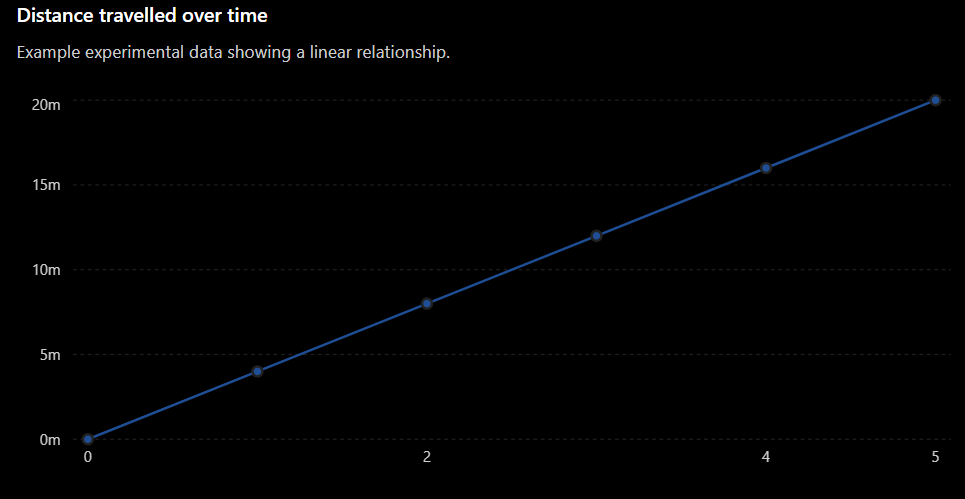
The graph shows that as time increases, distance also increases at a constant rate.
Independent and Dependent Variables
Before constructing a graph, we need to identify the two variables being investigated.
Independent Variable
The independent variable is the variable that is deliberately changed or selected during an investigation.
It is normally placed on the:
x-axis
The x-axis is the horizontal axis.
For example, if we measure distance every second, time is the independent variable.
Dependent Variable
The dependent variable is the variable that is measured or observed.
It changes in response to the independent variable.
It is normally placed on the:
y-axis
The y-axis is the vertical axis.
In our example, distance is the dependent variable because we measure how distance changes with time.
Remembering the Variables
A useful way to think about the relationship is:
Independent variable → what we change or select
Dependent variable → what we measure
For our example:
Time goes on the x-axis and distance goes on the y-axis.
Labelling the Axes
Every graph should have clearly labelled axes.
A good axis label includes:
- The name of the variable
- The unit of measurement
For example:
Time (s)
Distance (m)
Other examples include:
- Temperature (°C)
- Mass (g)
- Volume (cm³)
- Force (N)
- Length (cm)
Writing only "Time" or "Distance" may not provide enough information. The units tell the reader exactly what was measured.
Choosing an Appropriate Scale
A scale tells us what each interval on an axis represents.
Suppose our distance data range from:
0 m to 20 m
A sensible scale might be:
0, 5, 10, 15, 20
We would not choose:
0, 100, 200, 300
because almost all of our data would be crowded into a very small part of the graph.
A good scale should:
- Include all the data.
- Use most of the available graph space.
- Increase by equal intervals.
- Use convenient numbers.
Useful intervals often include:
1, 2, 5, 10, 20, 50, 100
Equal Intervals Are Essential
The numerical difference represented by equal distances along an axis must remain constant.
For example, this is a valid scale:
0, 10, 20, 30, 40
Each interval represents 10.
This is not a valid evenly spaced scale:
0, 10, 20, 50, 100
The numbers increase by different amounts even though they would appear equally spaced on the graph.
This can make the graph misleading.
Plotting Data Points
Once the axes and scales are ready, we can plot the experimental data.
Suppose we have the coordinate:
(3,12)
This means:
Start at 3 on the x-axis.
Move vertically until you reach 12 on the y-axis.
Mark the point carefully.
For our distance experiment, the coordinates are:
(0,0), (1,4), (2,8), (3,12), (4,16), (5,20)
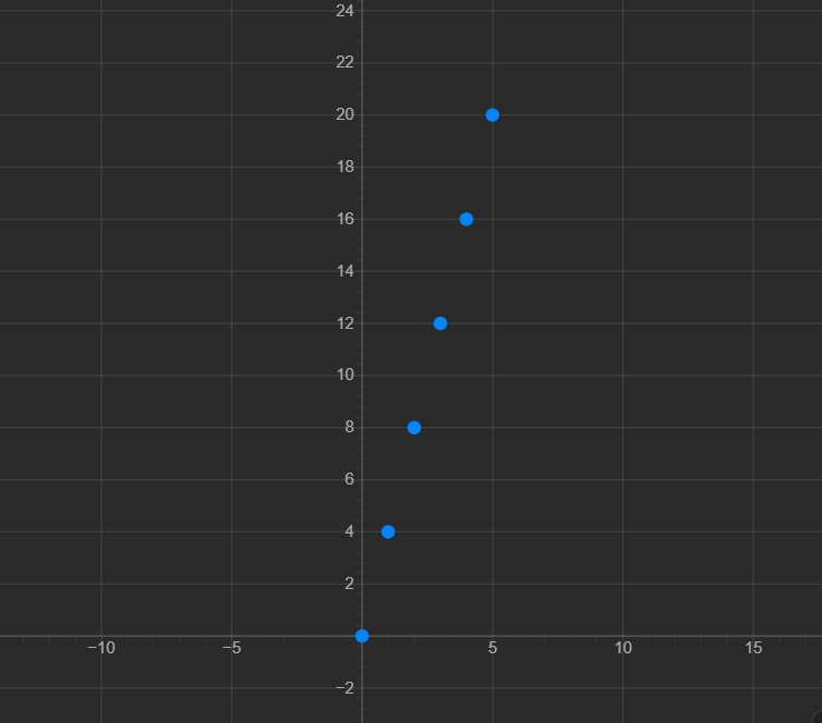
Each point represents one pair of experimental measurements.
Drawing a Line of Best Fit
Real experimental data do not always produce points that sit perfectly on a straight line.
For example:
| Time (s) | Distance (m) |
|---|---|
| 1 | 3.9 |
| 2 | 8.2 |
| 3 | 11.8 |
| 4 | 16.1 |
| 5 | 19.9 |
The points are still close to a straight-line pattern.
In an experiment, we may draw a line of best fit that follows the overall trend of the data.
A line of best fit:
- Shows the overall relationship.
- Does not need to pass through every point.
- Should have points reasonably balanced around it.
Do not simply connect every experimental point with a series of short lines unless there is a reason to do so.
Identifying a Linear Relationship
A relationship is linear when the data follow approximately a straight line.
Consider:
Some values are:
| x | y |
|---|---|
| 0 | 0 |
| 1 | 3 |
| 2 | 6 |
| 3 | 9 |
| 4 | 12 |
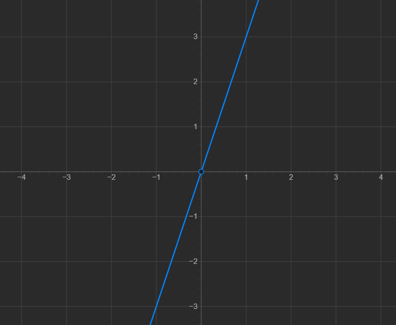
Every time x increases by 1, y increases by 3.
This is a constant rate of change, which produces a straight line.
Positive Linear Relationships
A graph has a positive relationship when the dependent variable increases as the independent variable increases.
The graph rises from left to right.
For example:
- Time increases → distance increases.
- Study time increases → number of questions completed increases.
- Mass added to a spring increases → extension increases.
A positive linear relationship looks generally like:
↗
Negative Linear Relationships
A graph can also have a negative linear relationship.
In this case, the dependent variable decreases as the independent variable increases.
The graph falls from left to right.
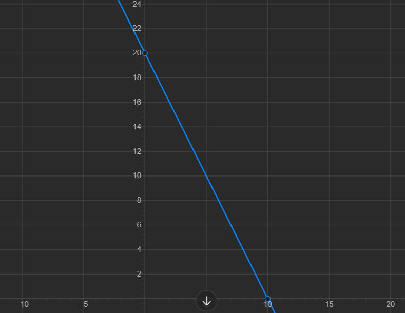
For example: