Graphing and Data Analysis
| Website: | Young Education |
| Kurs: | Experimental Physics and Scientific Measurement |
| Buch: | Graphing and Data Analysis |
| Gedruckt von: | Guest user |
| Datum: | Freitag, 25. September 2026, 01:53 |
1. Linear graphs
Learning outcomes
- I can construct clear and accurate linear graphs from experimental data.
- I can select appropriate scales and label graph axes correctly.
- I can plot data points accurately.
- I can distinguish between independent and dependent variables.
- I can identify linear relationships from graphical data.
What Is a Linear Graph?
A linear graph is a graph in which the data points follow, or approximately follow, a straight-line pattern.
Graphs are extremely important in mathematics and science because they allow us to see relationships between variables.
For example, imagine measuring the distance travelled by an object every second.
| Time (s) | Distance (m) |
|---|---|
| 0 | 0 |
| 1 | 4 |
| 2 | 8 |
| 3 | 12 |
| 4 | 16 |
| 5 | 20 |
When these data are plotted, they form a straight-line pattern.
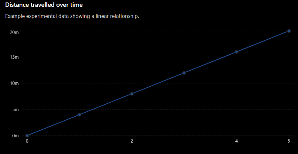
The graph shows that as time increases, distance also increases at a constant rate.
Independent and Dependent Variables
Before constructing a graph, we need to identify the two variables being investigated.
Independent Variable
The independent variable is the variable that is deliberately changed or selected during an investigation.
It is normally placed on the:
x-axis
The x-axis is the horizontal axis.
For example, if we measure distance every second, time is the independent variable.
Dependent Variable
The dependent variable is the variable that is measured or observed.
It changes in response to the independent variable.
It is normally placed on the:
y-axis
The y-axis is the vertical axis.
In our example, distance is the dependent variable because we measure how distance changes with time.
Remembering the Variables
A useful way to think about the relationship is:
Independent variable → what we change or select
Dependent variable → what we measure
For our example:
Time goes on the x-axis and distance goes on the y-axis.
Labelling the Axes
Every graph should have clearly labelled axes.
A good axis label includes:
- The name of the variable
- The unit of measurement
For example:
Time (s)
Distance (m)
Other examples include:
- Temperature (°C)
- Mass (g)
- Volume (cm³)
- Force (N)
- Length (cm)
Writing only "Time" or "Distance" may not provide enough information. The units tell the reader exactly what was measured.
Choosing an Appropriate Scale
A scale tells us what each interval on an axis represents.
Suppose our distance data range from:
0 m to 20 m
A sensible scale might be:
0, 5, 10, 15, 20
We would not choose:
0, 100, 200, 300
because almost all of our data would be crowded into a very small part of the graph.
A good scale should:
- Include all the data.
- Use most of the available graph space.
- Increase by equal intervals.
- Use convenient numbers.
Useful intervals often include:
1, 2, 5, 10, 20, 50, 100
Equal Intervals Are Essential
The numerical difference represented by equal distances along an axis must remain constant.
For example, this is a valid scale:
0, 10, 20, 30, 40
Each interval represents 10.
This is not a valid evenly spaced scale:
0, 10, 20, 50, 100
The numbers increase by different amounts even though they would appear equally spaced on the graph.
This can make the graph misleading.
Plotting Data Points
Once the axes and scales are ready, we can plot the experimental data.
Suppose we have the coordinate:
(3,12)
This means:
Start at 3 on the x-axis.
Move vertically until you reach 12 on the y-axis.
Mark the point carefully.
For our distance experiment, the coordinates are:
(0,0), (1,4), (2,8), (3,12), (4,16), (5,20)
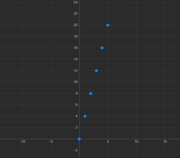
Each point represents one pair of experimental measurements.
Drawing a Line of Best Fit
Real experimental data do not always produce points that sit perfectly on a straight line.
For example:
| Time (s) | Distance (m) |
|---|---|
| 1 | 3.9 |
| 2 | 8.2 |
| 3 | 11.8 |
| 4 | 16.1 |
| 5 | 19.9 |
The points are still close to a straight-line pattern.
In an experiment, we may draw a line of best fit that follows the overall trend of the data.
A line of best fit:
- Shows the overall relationship.
- Does not need to pass through every point.
- Should have points reasonably balanced around it.
Do not simply connect every experimental point with a series of short lines unless there is a reason to do so.
Identifying a Linear Relationship
A relationship is linear when the data follow approximately a straight line.
Consider:
Some values are:
| x | y |
|---|---|
| 0 | 0 |
| 1 | 3 |
| 2 | 6 |
| 3 | 9 |
| 4 | 12 |
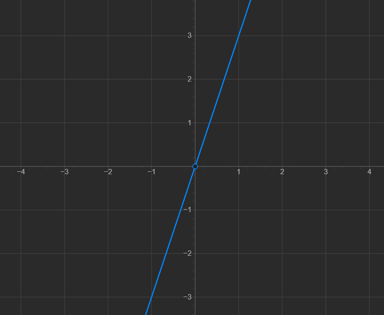
Every time x increases by 1, y increases by 3.
This is a constant rate of change, which produces a straight line.
Positive Linear Relationships
A graph has a positive relationship when the dependent variable increases as the independent variable increases.
The graph rises from left to right.
For example:
- Time increases → distance increases.
- Study time increases → number of questions completed increases.
- Mass added to a spring increases → extension increases.
A positive linear relationship looks generally like:
↗
Negative Linear Relationships
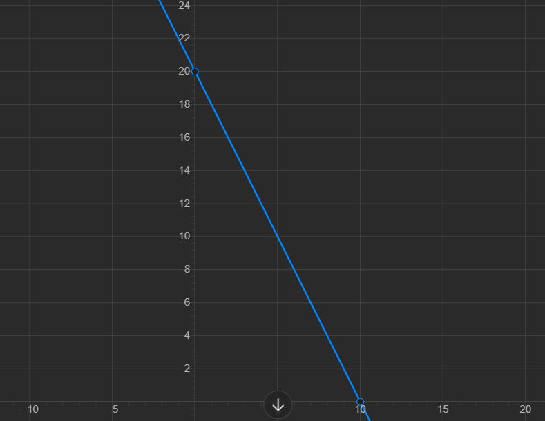
A graph can also have a negative linear relationship.
In this case, the dependent variable decreases as the independent variable increases.
The graph falls from left to right.
For example:
2. Gradient and intercepts
Learning outcomes
- I can determine the gradient of a straight-line graph.
- I can interpret the physical meaning of a graph's gradient.
- I can determine the x- and y-intercepts of graphs.
- I can relate graph features to physical quantities.
- I can calculate unknown quantities using gradients and intercepts.
What Is the Gradient of a Graph?
The gradient describes how steep a straight line is.
It tells us how much the value on the y-axis changes compared with a change in the value on the x-axis.
You may also hear gradient called slope.
A steep line has a larger gradient than a shallow line.
The gradient can be:
- Positive
- Negative
- Zero
- Undefined
More importantly, in science and real-world applications, the gradient often represents an actual physical quantity.
For example, the gradient of a distance-time graph can represent speed.
Calculating Gradient
To calculate the gradient of a straight line, choose two points on the line.
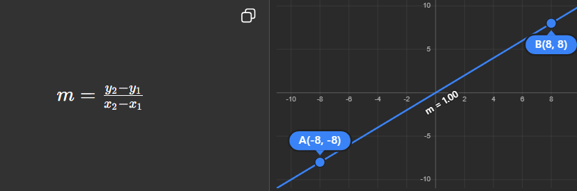
This is often remembered as:
where:
- Rise = vertical change
- Run = horizontal change
Example: Finding a Gradient
Suppose a straight line passes through:
(2, 4)
and
(6, 12)
The change in y is:
The change in x is:
Therefore:
m = 2
This means that every time x increases by 1, y increases by 2.
Choosing Points for a Gradient Calculation
When finding the gradient from a graph, choose two points that lie on the straight line.
If a line of best fit has been drawn through experimental data, the points used for the gradient calculation should usually be points on the line of best fit.
They do not have to be original experimental data points.
It is also helpful to choose points that are:
- Easy to read accurately.
- Far apart from each other.
- Located at clear grid intersections if possible.
Using points far apart usually reduces the effect of small reading errors.
Positive Gradient
A line that rises from left to right has a positive gradient.
For example:
has a gradient of:
3
This means that when x increases by 1, y increases by 3.
A positive gradient indicates that the two variables increase together.
Negative Gradient
A line that falls from left to right has a negative gradient.
For example:
has a gradient of:
−2
This means that when x increases by 1, y decreases by 2.
A negative gradient indicates that one variable decreases as the other increases.
Zero Gradient
A horizontal line has a gradient of:
0
For example:
As x changes, y remains constant.
Therefore:
and the gradient is zero.
Vertical Lines
A vertical line has an undefined gradient.
For example:
There is no horizontal change between points on the line.
This would require division by zero when calculating the gradient, which is undefined.
What Does Gradient Mean Physically?
In many graphs, the gradient is more than just a number.
It represents the rate at which one physical quantity changes compared with another.
The meaning of the gradient depends on the quantities plotted on the axes.
Example: Distance-Time Graph
Suppose distance is plotted against time.
The gradient is:
\( \frac{change \ in \ distance}{change \ in \ time} \)
This is speed.
Suppose an object travels from 0 m to 60 m in 5 seconds.
The gradient is:
\( \frac{60 - 0}{5 - 0} = 12 \)
Therefore:
speed = 12 m/s
The gradient of the graph tells us how fast the object is moving.
Units of Gradient
The units of a gradient come from:
\( \frac{units \ on \ the \ y-axis}{units \ on \ the \ x-axis} \)
For a distance-time graph:
\( \frac{meters}{seconds} \)
which gives:
m/s
For a mass-volume graph:
\( \frac{grams}{cm^3} \)
which gives:
g/cm3
This is the unit of density.
The units can therefore help us understand what the gradient physically represents.
Gradient as a Rate of Change
Gradient is fundamentally a rate of change.
It tells us:
How much does one quantity change when another quantity changes?
For example:
| Graph | Gradient can represent |
|---|---|
| Distance vs. time | Speed |
| Velocity vs. time | Acceleration |
| Mass vs. volume | Density |
| Extension vs. force | Extension per unit force |
| Cost vs. number of items | Cost per item |
The same mathematical idea can therefore describe many different physical situations.
What Is an Intercept?
An intercept is a point where a graph crosses one of its axes.
There are two main intercepts:
- x-intercept
- y-intercept
Intercepts can also have important physical meanings.
The y-Intercept
The y-intercept is the point where the graph crosses the y-axis.
At the y-intercept:
Consider:
When:
we get:
Therefore, the y-intercept is:
(0, 4)
The x-Intercept
The x-intercept is the point where the graph crosses the x-axis.
At the x-intercept:
Consider:
Set :
Add 6:
Divide by 2:
Therefore, the x-intercept is:
(3, 0)
Intercepts on a Graph
Remember:
At the y-intercept:
x = 0
At the x-intercept:
y = 0
This gives us a simple method for finding intercepts from equations.
The Straight-Line Equation
Straight-line graphs are often written in the form:
where:
- m = gradient
- c = y-intercept
Consider:
The gradient is:
4
and the y-intercept is:
3
So the line crosses the y-axis at:
(0, 3)
Finding an Unknown Quantity Using Gradient
Suppose a distance-time graph has a gradient of:
5 m/s
An object travels for 8 seconds.
Because:
we can rearrange:
Therefore:
distance = 40 m
Once we know what the gradient represents, we can use it to calculate unknown physical quantities.
Finding an Unknown Quantity Using the Intercept
Imagine a water tank contains 200 L of water at the beginning of an experiment.
Water then enters the tank at 15 L/min.
If volume is plotted against time, the relationship could be written as:
The gradient is:
15 L/min
This represents the rate at which water enters the tank.
The y-intercept is:
200 L
This represents the initial volume of water at:
After 10 minutes:
Therefore:
V = 350 L
Both the gradient and intercept provide useful physical information.
Interpreting a Real-World Graph
Suppose the cost of renting a bicycle is described by:
where:
- C is the total cost in dollars.
- t is the rental time in hours.
The gradient is:
8
This means the bicycle costs:
$8 per hour
The y-intercept is:
5
This represents an initial charge of:
$5
So the graph tells us two different things:
- Gradient → cost per hour
- y-intercept → starting fee
Using Gradient and Intercepts Together
Consider:
We can immediately identify:
and:
Therefore:
- Gradient = 3
- y-intercept = (0, 6)
To find the x-intercept, set:
So:
Therefore:
x-intercept=(−2,0)
The gradient and intercepts give us important information about the position and behaviour of the line.
Graph Features and Physical Quantities
When interpreting an experimental graph, ask three important questions.
What does the gradient represent?
Look at the quantities and units on the axes.
What does the y-intercept represent?
Ask what the dependent variable means when:
It may represent an initial value.
What does the x-intercept represent?
Ask what is happening when:
It may represent the time when a quantity reaches zero or the value required to produce a particular physical condition.
A Useful Graph Analysis Strategy
When given a straight-line graph:
1. Identify the axes
What physical quantities are plotted?
2. Identify the units
These can help determine what the gradient means.
3. Calculate the gradient
Use two clear points on the line.
4. Include units
Gradient is a physical rate when the axes represent measured quantities.
5. Find the intercepts
Look where the graph crosses each axis.
6. Interpret the results
Explain what the gradient and intercepts mean in the context of the problem.
Did You Know?
The gradient is one of the most important ideas connecting mathematics and science.
The same calculation:
\( \frac{ \Delta y }{ \Delta x } \)
can represent completely different physical quantities depending on the graph.
For example, it can represent speed, acceleration, density, resistance, a spring constant, or a rate of heating.
This is why reading the axis labels and units is just as important as calculating the gradient itself.
Key Vocabulary
Gradient – A measure of the steepness and direction of a straight line.
Slope – Another name for gradient.
Rate of change – How quickly one quantity changes compared with another.
Intercept – A point where a graph crosses an axis.
x-intercept – The point where a graph crosses the x-axis.
y-intercept – The point where a graph crosses the y-axis.
Independent variable – The variable normally plotted on the x-axis.
Dependent variable – The variable normally plotted on the y-axis.
Linear relationship – A relationship represented by a straight-line graph.
Key Takeaways
- Gradient measures the steepness and direction of a straight line.
- Gradient is calculated using the change in y divided by the change in x.
- A positive gradient rises from left to right.
- A negative gradient falls from left to right.
- A horizontal line has a gradient of zero.
- A vertical line has an undefined gradient.
- The units of a gradient come from the y-axis units divided by the x-axis units.
- In physical graphs, gradient often represents a meaningful rate of change.
- The y-intercept occurs where .
- The x-intercept occurs where .
- In , m is the gradient and c is the y-intercept.
- Gradients and intercepts can be used to calculate and interpret unknown physical quantities.
3. Best-fit lines
Learning outcomes
- I can draw appropriate lines of best fit for experimental data.
- I can distinguish between best-fit lines and connecting data points.
- I can identify outliers in experimental data.
- I can use best-fit lines to estimate values.
- I can explain why best-fit lines improve data interpretation.
What Is a Line of Best Fit?
When scientists collect experimental data, the results are rarely perfect.
Even when two variables have a clear relationship, the plotted data points may not fall exactly on a straight line.
For example:
| Time (s) | Distance (m) |
|---|---|
| 1 | 3.1 |
| 2 | 5.8 |
| 3 | 9.2 |
| 4 | 11.9 |
| 5 | 15.1 |
| 6 | 17.8 |
The points show a clear pattern, but they do not lie perfectly on one straight line.
A line of best fit is a straight line drawn through a set of data points to show the overall trend or relationship.
The line does not need to pass through every point.
Instead, it should represent the general pattern of the data.
Why Don't Experimental Points Form a Perfect Line?
Experimental measurements always contain some amount of variation or uncertainty.
Small differences can be caused by:
- Measurement uncertainty
- Limitations of measuring equipment
- Human reaction time
- Small changes in experimental conditions
- Natural variation
- Rounding measurements
As a result, real experimental data often appear scattered around the expected relationship.
A line of best fit helps us see the underlying pattern more clearly.
Drawing a Line of Best Fit
Consider the following experimental data:
| x | y |
|---|---|
| 1 | 3.1 |
| 2 | 5.8 |
| 3 | 9.2 |
| 4 | 11.9 |
| 5 | 15.1 |
| 6 | 17.8 |
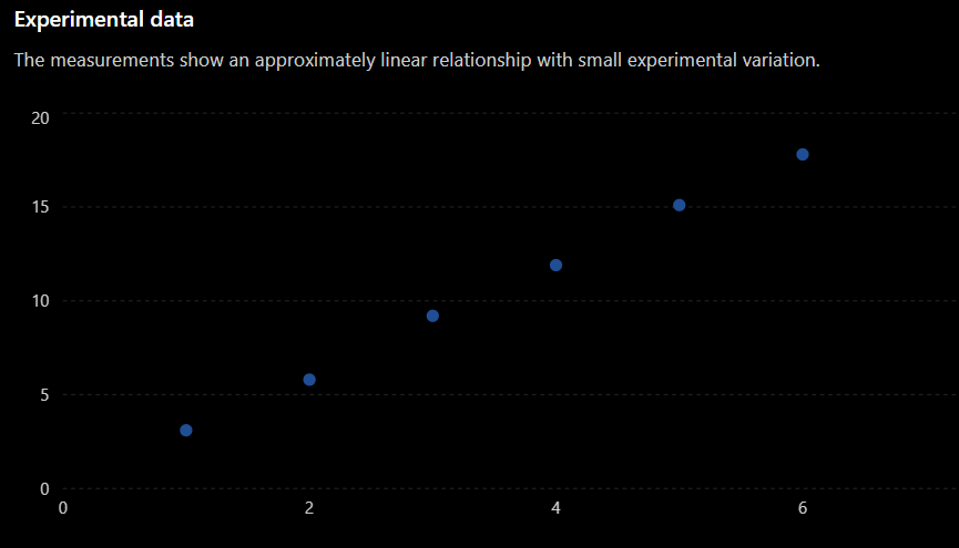
When drawing a line of best fit:
- Use a ruler.
- Follow the overall trend of the data.
- Try to have approximately the same number of points above and below the line.
- Do not try to force the line through every point.
- Do not automatically force the line through the origin.
- Ignore a clear outlier when appropriate.
The goal is to represent the trend, not every individual measurement.
Best-Fit Line vs. Connecting the Points
A common mistake is to connect each experimental point to the next point.
For example, students sometimes draw:
This creates a zigzag pattern that follows every small variation in the measurements.
For many experimental graphs, this is not appropriate.
A line of best fit instead shows the overall relationship:
Connecting the points emphasizes individual measurements.
A best-fit line emphasizes the relationship between the variables.
When Should Points Be Connected?
Connecting individual points is appropriate in some situations.
For example, if you are showing how a quantity changes continuously over time, connecting consecutive measurements may be useful.
However, when investigating the relationship between two continuous variables and looking for a general trend, a line or curve of best fit is usually more appropriate.
Always think about what the graph represents rather than automatically connecting every point.
The Line Does Not Need to Pass Through Every Point
This is one of the most important ideas about best-fit lines.
4. Identifying relationships
Learning outcomes
- I can identify linear and non-linear relationships from graphs.
- I can recognize directly proportional relationships.
- I can recognize inverse relationships.
- I can determine mathematical relationships from graphical trends.
- I can explain the physical meaning of graph patterns.
Relationships Between Variables
Graphs allow us to see how one variable changes when another variable changes.
For example, we might investigate how:
- Distance changes with time.
- Temperature changes as an object is heated.
- Mass changes with volume.
- Pressure changes with volume.
- The extension of a spring changes with force.
When the data are plotted, the shape of the graph gives us information about the relationship between the variables.
Some common relationships are:
- Linear
- Directly proportional
- Inverse
- Other non-linear relationships
- No clear relationship
Recognizing these patterns allows us to describe and sometimes predict how a system behaves.
Linear Relationships
A linear relationship produces a straight-line graph.
A common form is:
where:
- m is the gradient.
- c is the y-intercept.
For example:
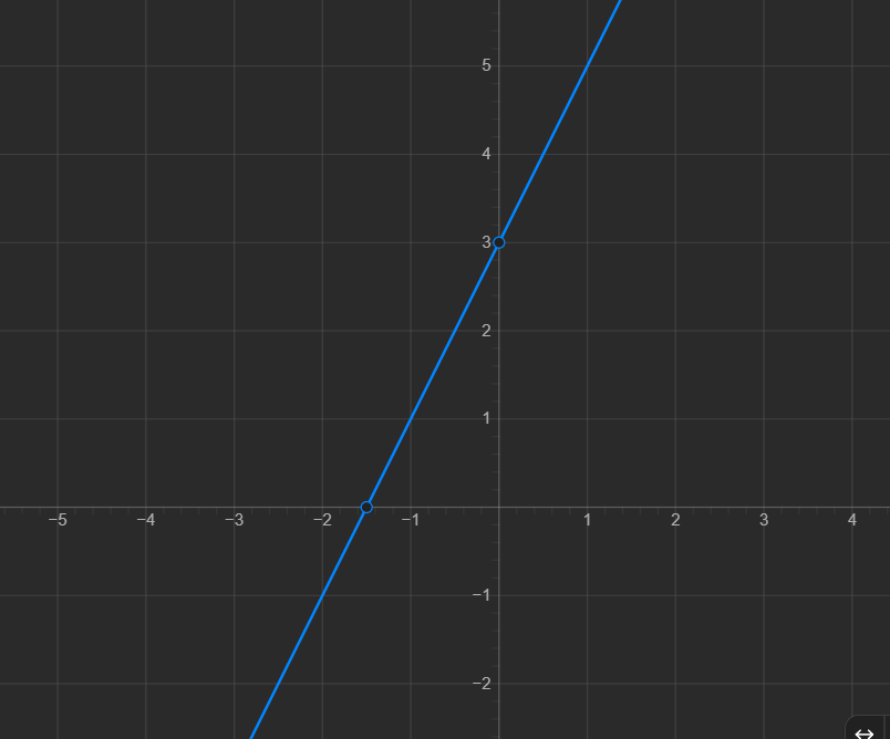
The graph is a straight line.
Every time x increases by 1, y increases by 2.
Therefore, the rate of change is constant.
Recognizing a Linear Relationship
A graph shows a linear relationship when:
- The points form approximately a straight line.
- The gradient is constant.
- Equal changes in x produce equal changes in y.
For example:
| x | y |
|---|---|
| 1 | 5 |
| 2 | 8 |
| 3 | 11 |
| 4 | 14 |
| 5 | 17 |
Each time x increases by 1:
This constant change tells us that the relationship is linear.
The equation is:
Positive and Negative Linear Relationships
Linear relationships can have positive or negative gradients.
Positive Linear Relationship
If y increases as x increases, the graph rises from left to right.
For example:
This has a positive gradient.
Negative Linear Relationship
If y decreases as x increases, the graph falls from left to right.
For example:
This has a negative gradient.
Both are linear because both produce straight lines.
Directly Proportional Relationships
A special type of linear relationship is a directly proportional relationship.
Two quantities are directly proportional when one is always a constant multiple of the other.
We write:
This means:
where k is the constant of proportionality.
For example:
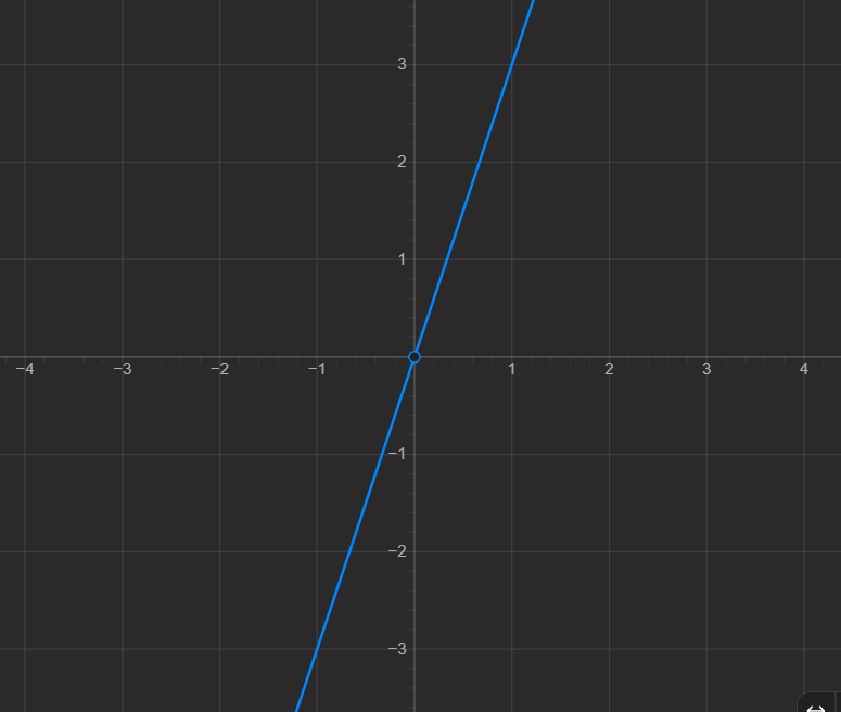
A directly proportional graph has two important features:
- It is a straight line.
- It passes through the origin (0,0).
Linear Does Not Always Mean Directly Proportional
This is an important distinction.
Consider:
This is linear and directly proportional because the graph passes through:
Now consider:
This is still a linear relationship, but it is not directly proportional.
Why?
Because when:
we get:
The graph does not pass through the origin.
Therefore:
All directly proportianl relationships are linear, but not all linear relationships are directly proportional.
The Constant of Proportionality
In a directly proportional relationship:
the value k tells us how much y changes for each unit of x.
We can calculate it using:
Suppose:
| x | y |
|---|---|
| 2 | 10 |
| 4 | 20 |
| 6 | 30 |
| 8 | 40 |
Calculate:
The ratio is constant.
Therefore:
and:
y = 5x
A Physical Example of Direct Proportion
Suppose a material has a density of:
4 g/cm3
The relationship between mass and volume is:
If volume doubles, mass doubles.
If volume triples, mass triples.
The mass-volume graph is a straight line through the origin.
The gradient represents:
\( \frac{mass}{volume} \)
which is the density of the material.
The mathematical pattern therefore tells us something about the physical system.
Non-Linear Relationships
A non-linear relationship does not produce a straight-line graph.
Instead, the graph may curve.
For example:
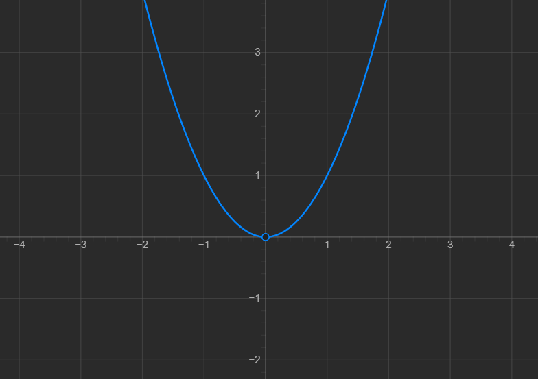
The gradient changes as x changes.
This tells us that y is not changing at a constant rate.
Consider:
| x | |
|---|---|
| 1 | 1 |
| 2 | 4 |
| 3 | 9 |
| 4 | 16 |
| 5 | 25 |
When x doubles from 2 to 4:
It does not simply double.
This is a non-linear relationship.
Recognizing Non-Linear Relationships
A relationship is likely to be non-linear if:
- The graph forms a curve.
- The gradient changes.
- Equal changes in x do not produce equal changes in y.
- A straight line does not fit the data well.
Non-linear does not mean that the graph has no pattern.
A curved graph can represent a very clear mathematical relationship.
Inverse Relationships
An inverse relationship occurs when one variable decreases as the other increases in a particular way.
A common inverse relationship is:
or:
For example:
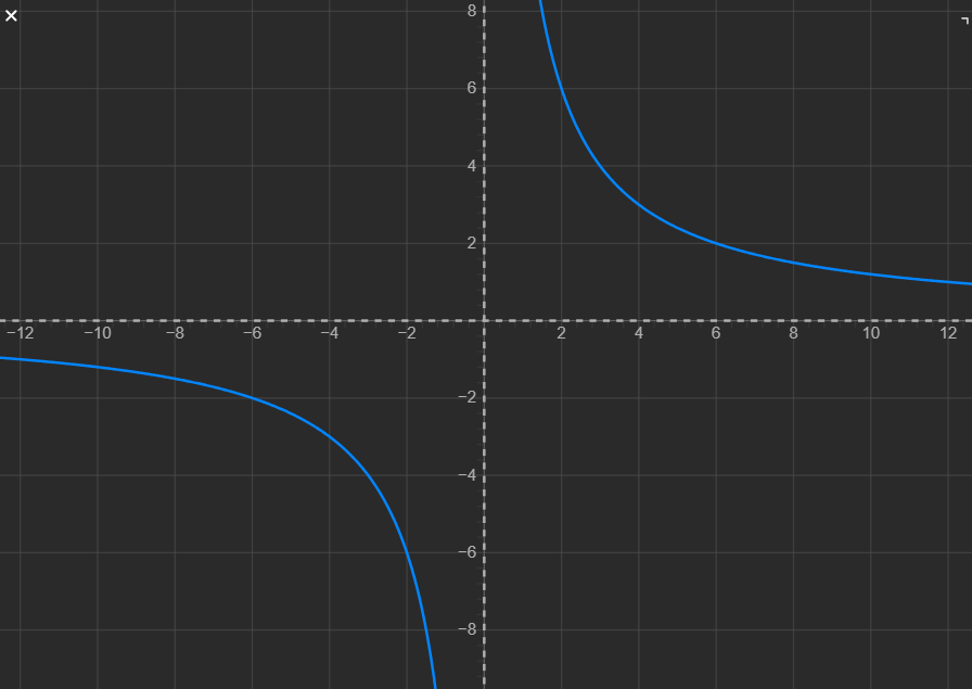
Some values are:
| x | y |
|---|---|
| 1 | 12 |
| 2 | 6 |
| 3 | 4 |
| 4 | 3 |
| 6 | 2 |
| 12 | 1 |
Notice what happens when x doubles:
while:
The value of y is halved.
Testing for an Inverse Relationship
For an inverse relationship:
we can rearrange:
This means that the product of x and y remains constant.
Using the previous data:
Therefore:
and:
A Physical Example of an Inverse Relationship
Imagine travelling a fixed distance.
If your speed increases, the time required for the journey decreases.
For a fixed distance:
where:
- t = time
- d = fixed distance
- v = speed
If the speed doubles, the travel time is halved.
This produces an inverse relationship between speed and time.
The shape of the graph tells us something meaningful about the physical situation.
Direct vs. Inverse Relationships
These two relationships behave very differently.
Direct Proportion
If x doubles:
If x triples:
The graph is a straight line through the origin.
Inverse Proportion
If x doubles:
If x triples:
The graph forms a curve.
Determining a Mathematical Relationship from Data
We can often use patterns in a table or graph to identify the mathematical relationship.
Consider:
| x | y |
|---|---|
| 1 | 4 |
| 2 | 8 |
| 3 | 12 |
| 4 | 16 |
Calculate:
We get:
The ratio is constant.
Therefore:
and:
Another Example
Consider:
| x | y |
|---|---|
| 1 | 20 |
| 2 | 10 |
| 4 | 5 |
| 5 | 4 |
Calculate:
We get:
The product is constant.
Therefore:
and:
Using Graph Shape to Identify Relationships
Different mathematical relationships produce characteristic graph shapes.
| Graph Pattern | Possible Relationship |
|---|---|
| Straight line | Linear |
| Straight line through origin | Directly proportional |
| Downward curve approaching the axes | Inverse |
| Upward curve becoming increasingly steep | Non-linear |
| Scattered points with no pattern | No clear relationship |
Recognizing these shapes is an important graph-analysis skill.
Graph Patterns and Physical Meaning
A graph should not be interpreted only as a mathematical shape.
We should also ask:
What does this pattern mean physically?
Suppose a distance-time graph is a straight line with a constant positive gradient.
This means the object is travelling at a constant speed.
Suppose the graph becomes increasingly steep.
The distance is increasing more rapidly with time, which may indicate that the object is speeding up.
Suppose the graph becomes horizontal.
Distance is no longer changing, so the object has stopped moving.
The shape of the graph therefore tells a story about what is happening physically.
Interpreting Different Sections of a Graph
Sometimes a graph contains several different patterns.
For example, imagine a distance-time graph with three sections.
Section A: Straight Rising Line
Distance increases steadily.
This indicates:
Section B: Horizontal Line
Distance remains constant.
This indicates:
Section C: Steeper Rising Line
Distance increases more quickly.
This indicates:
We can therefore interpret the behaviour of a system by examining different parts of its graph.
A Strategy for Identifying Relationships
When given a graph or table, follow these steps.
Step 1: Identify the Variables
What is plotted on the x-axis?
What is plotted on the y-axis?
Step 2: Examine the Shape
Is the graph:
- Straight?
- Curved?
- Increasing?
- Decreasing?
- Horizontal?
Step 3: Test the Relationship
For direct proportion, check whether:
is constant.
For inverse proportion, check whether:
is constant.
For a general linear relationship, check whether the gradient is constant.
Step 4: Write the Mathematical Relationship
For example:
or:
or:
Step 5: Explain the Physical Meaning
Describe what the relationship means for the quantities being measured.
Did You Know?
Many scientific laws were discovered by identifying mathematical patterns in experimental data.
Scientists often begin with measurements, plot them on graphs, and then look for relationships.
A straight line, curve, gradient, or intercept can reveal the mathematical rule connecting two physical quantities.
This is one reason graphing is such an important connection between mathematics and experimental science.
Key Vocabulary
Relationship – A connection between two variables.
Linear relationship – A relationship represented by a straight-line graph.
Non-linear relationship – A relationship represented by a graph that is not a straight line.
Direct proportion – A relationship in which two variables have a constant ratio.
Inverse relationship – A relationship in which one variable decreases as the other increases, with their product remaining constant for inverse proportion.
Constant of proportionality – The constant value relating two proportional variables.
Gradient – The rate of change of one variable compared with another.
Trend – The overall pattern shown by data.
Variable – A quantity that can change or take different values.
Key Takeaways
- The shape of a graph helps us identify the relationship between variables.
- A linear relationship produces a straight-line graph and has a constant gradient.
- A directly proportional relationship is a straight line that passes through the origin.
- For direct proportion, y/x is constant.
- A straight-line graph that does not pass through the origin is linear but not directly proportional.
- A non-linear relationship produces a curved graph or another pattern with a changing gradient.
- In an inverse proportional relationship, xy is constant.
- If one variable doubles in an inverse relationship, the other halves.
- Mathematical relationships can often be determined by examining graphs and testing patterns in the data.
- Graph patterns should also be interpreted in terms of what they mean physically for the system being studied.
5. Interpreting experimental data
Learning outcomes
- I can analyze experimental graphs to identify trends.
- I can draw evidence-based conclusions from data.
- I can identify anomalies in experimental results.
- I can evaluate whether experimental results support a hypothesis.
- I can communicate scientific conclusions using graphs and data.
What Does It Mean to Interpret Data?
Collecting experimental data is only one part of a scientific investigation.
Scientists must also interpret the data.
Interpreting data means examining measurements, tables, and graphs to determine what the results tell us about the question being investigated.
When interpreting experimental data, we often look for:
- Trends
- Patterns
- Relationships between variables
- Anomalies
- Evidence supporting or contradicting a hypothesis
The goal is not simply to describe individual numbers. We want to explain what the data mean.
From Data to Graphs
Consider an experiment investigating how temperature affects the rate of a chemical reaction.
A student records the following results:
| Temperature (°C) | Reaction Rate (units/min) |
|---|---|
| 10 | 2.1 |
| 20 | 3.8 |
| 30 | 6.2 |
| 40 | 8.1 |
| 50 | 10.3 |
The table contains the measurements, but the relationship becomes easier to see when the data are plotted.
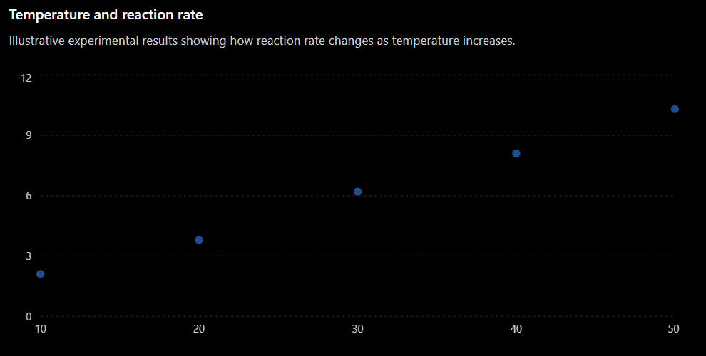
The graph makes the overall trend much clearer.
Identifying Trends
A trend is the general direction or pattern shown by the data.
A trend may be:
- Increasing
- Decreasing
- Constant
- Linear
- Non-linear
- Irregular
When identifying a trend, focus on the overall pattern, not every individual data point.
Positive Trends
A positive trend occurs when the dependent variable generally increases as the independent variable increases.
For example:
A good scientific description would be:
As temperature increased from 10°C to 50°C, the reaction rate increased from 2.1 units/min to 10.3 units/min.
This is stronger than simply saying:
The graph goes up.
Scientific descriptions should identify the variables and, when possible, include numerical evidence.
Negative Trends
A negative trend occurs when one variable decreases as another increases.
For example, suppose a student investigates how distance from a lamp affects light intensity.
The results might show:
A suitable conclusion could be:
As the distance from the lamp increased, the measured light intensity decreased.
Again, the conclusion describes the relationship between the actual physical quantities.
Constant Trends
Sometimes the dependent variable remains approximately constant even though the independent variable changes.
For example:
| Time (min) | Temperature (°C) |
|---|---|
| 1 | 25.1 |
| 2 | 25.0 |
| 3 | 25.2 |
| 4 | 25.1 |
| 5 | 25.0 |
There are small differences between the measurements, but there is no meaningful overall increase or decrease.
A suitable conclusion would be:
The temperature remained approximately constant at about 25°C during the experiment.
Small variations do not always represent a meaningful trend.
Evidence-Based Conclusions
A scientific conclusion should be based on evidence from the experiment.
Suppose a student investigates how the force applied to a spring affects its extension.
| Force (N) | Extension (cm) |
|---|---|
| 1 | 2.0 |
| 2 | 4.1 |
| 3 | 6.0 |
| 4 | 8.2 |
| 5 | 10.1 |
A weak conclusion would be:
The spring stretched more.
A stronger conclusion would be:
As the applied force increased, the extension of the spring increased. Increasing the force from 1 N to 5 N increased the extension from 2.0 cm to 10.1 cm.
The second conclusion is stronger because it:
- Identifies both variables.
- Describes the relationship.
- Uses numerical evidence.
Describe, Then Explain
When interpreting data, it is useful to separate what the data show from why the pattern occurs.
Describe
State the pattern shown by the evidence.
For example:
As temperature increased, reaction rate increased.
Explain
Use scientific knowledge to explain the pattern.
For example:
At higher temperatures, particles have more kinetic energy, resulting in more frequent successful collisions.
The description comes directly from the data.
The explanation uses scientific understanding.
A strong scientific conclusion often contains both.
What Is an Anomaly?
An anomaly is a result that does not fit the overall pattern of the other data.
It may also be called an anomalous result or outlier.
Consider:
| Temperature (°C) | Reaction Rate |
|---|---|
| 10 | 2.0 |
| 20 | 4.1 |
| 30 | 6.0 |
| 40 | 3.2 |
| 50 | 10.1 |
Most of the results show that reaction rate increases with temperature.
However, the result at:
40oC
is unusually low.
This result does not fit the overall trend and may be an anomaly.
Identifying Anomalies on a Graph
Anomalies are often easier to identify on graphs than in tables.
If most points follow a clear trend but one point lies far away from that pattern, the unusual point may be anomalous.
However, we should not simply remove an unusual result because we do not like it.
Instead, ask:
- Was the measurement recorded correctly?
- Was the equipment working correctly?
- Were the experimental conditions controlled?
- Was there human error?
- Could the result represent genuine variation?
- Should the measurement be repeated?
An anomalous result should be investigated.
Repeating Measurements
One important way to investigate an anomaly is to repeat the measurement.
Suppose the first measurement at 40oC gives:
3.2
Repeating the experiment gives:
8.0, 8.2, 8.1
The original value of 3.2 now appears much more likely to be anomalous.
Repeated measurements improve our confidence in the results.
They can also help distinguish between:
- Random variation
- Measurement error
- Genuine unusual results
What Is a Hypothesis?
A hypothesis is a testable prediction about what will happen in an investigation.
For example:
If temperature increases, then the rate of the reaction will increase.
After performing the experiment, we compare the results with the hypothesis.
The important question is:
Do the results support the prediction?
Does the Evidence Support the Hypothesis?
Suppose the hypothesis is:
Increasing light intensity will increase the rate of photosynthesis.
The results show:
| Light Intensity (%) | Oxygen Produced (cm³/min) |
|---|---|
| 20 | 2.0 |
| 40 | 4.2 |
| 60 | 6.1 |
| 80 | 8.0 |
| 100 | 9.8 |
The results show a clear increasing trend.
A suitable conclusion would be:
The results support the hypothesis. As light intensity increased from 20% to 100%, oxygen production increased from 2.0 cm³/min to 9.8 cm³/min.
Notice that the conclusion includes specific evidence.
Supported Does Not Mean Proven
In science, it is usually better to say:
The results support the hypothesis.
rather than:
The experiment proves the hypothesis.
A single experiment rarely proves something with complete certainty.
There may be:
- Measurement uncertainty
- Uncontrolled variables
- Limited data
- Random variation
- Experimental errors
Scientists build confidence by repeating investigations and collecting more evidence.
When Results Do Not Support a Hypothesis
Suppose the hypothesis predicts:
As temperature increases, the solubility of substance X will increase.
However, the measurements show no consistent change in solubility.
The correct conclusion is not to change the results to match the prediction.
Instead, we might conclude:
The results do not support the hypothesis because there was no consistent increase in solubility as temperature increased.
Scientific conclusions must follow the evidence, even when the evidence does not match the original prediction.
Partially Supported Hypotheses
Sometimes results support a hypothesis only under certain conditions.
Imagine that reaction rate increases between:
10oC and 50oC
but then decreases above:
50oC
A hypothesis stating that reaction rate always increases with temperature would not be fully supported.
A better conclusion might be:
The results support the hypothesis between 10°C and 50°C, but above 50°C the reaction rate decreased.
This is more accurate than simply saying the hypothesis was right or wrong.
Using Graphs as Evidence
Graphs are particularly useful when communicating scientific conclusions because they make patterns visible.
A graph can show:
- Whether variables increase or decrease together.
- Whether a relationship is linear or non-linear.
- How quickly a variable changes.
- Whether there are anomalies.
- Whether results agree with a prediction.
- Whether the relationship changes under different conditions.
When referring to a graph, describe the quantities and pattern, not just its appearance.
Instead of:
The line goes up.
Write:
The temperature increased as heating time increased.
Even better:
The temperature increased from 22°C at 0 minutes to 68°C after 10 minutes.
Using Numbers as Evidence
Whenever possible, support a conclusion with actual values from the experiment.
Instead of:
The plant grew more with more light.
Write:
Increasing the light exposure from 4 hours to 12 hours per day increased average plant height from 8.2 cm to 15.6 cm.
Numbers make the conclusion:
- More precise
- More convincing
- Easier to evaluate
- Directly connected to the evidence
A Strong Scientific Conclusion
A useful structure for writing conclusions is:
1. State the Trend
What relationship did the data show?
2. Give Evidence
Use specific measurements or features of the graph.
3. Address the Hypothesis
Did the results support the prediction?
4. Identify Important Anomalies
Mention unusual results if they affect the interpretation.
5. Explain the Pattern
Use scientific knowledge when an explanation is required.
Example Conclusion
Suppose an experiment investigates how temperature affects reaction rate.
A strong conclusion might be:
The results show that reaction rate generally increased as temperature increased. The rate increased from 2.1 units/min at 10°C to 10.3 units/min at 50°C. This supports the hypothesis that increasing temperature increases reaction rate. One result at 30°C was lower than the overall trend and may be anomalous. The increasing reaction rate can be explained by particles having greater kinetic energy at higher temperatures, producing more frequent successful collisions.
This conclusion uses both experimental evidence and scientific reasoning.
Correlation Does Not Always Mean Cause
A graph may show that two variables are related, but this does not automatically mean that one variable causes the other to change.
For example, suppose two variables increase together.
We can confidently say:
There is a positive relationship between the variables.
But claiming that one variable caused the change requires stronger evidence from a controlled experiment.
This distinction is important when interpreting scientific data.
A Data Interpretation Checklist
When analyzing experimental results, ask:
- What is the independent variable?
- What is the dependent variable?
- What overall trend does the graph show?
- Is the relationship positive, negative, constant, linear, or non-linear?
- Are there any anomalies?
- What numerical evidence supports my conclusion?
- Do the results support the hypothesis?
- Are there limitations that affect the conclusion?
- Can the pattern be explained using scientific knowledge?
- Have I clearly connected my conclusion to the evidence?
Did You Know?
Scientists sometimes obtain results that completely contradict their original hypothesis.
This is not necessarily a failed experiment.
Unexpected results can lead scientists to:
- Modify existing explanations.
- Design new experiments.
- Discover previously unknown relationships.
- Develop new hypotheses.
The purpose of an experiment is not to make the hypothesis correct. The purpose is to collect reliable evidence and determine what that evidence tells us.
Key Vocabulary
Interpret – To explain the meaning of information or data.
Trend – The overall pattern or direction shown by data.
Evidence – Information or measurements used to support a conclusion.
Conclusion – A statement explaining what the results of an investigation show.
Anomaly – A result that does not fit the overall pattern of the data.
Outlier – A data point that lies unusually far from the main trend.
Hypothesis – A testable prediction about the outcome of an investigation.
Support – To provide evidence that agrees with a hypothesis or explanation.
Correlation – A relationship in which two variables change in a related way.
Reliability – The extent to which repeated measurements produce consistent results.
Key Takeaways
- Experimental data should be analyzed for patterns and trends.
- Graphs often make relationships easier to identify than data tables alone.
- Scientific conclusions should be based on evidence, not expectations.
- Strong conclusions use specific numerical values from the data.
- An anomaly is a result that does not fit the overall pattern and should be investigated.
- Repeated measurements can help determine whether an unusual result is reliable.
- Experimental results may support, partially support, or fail to support a hypothesis.
- A hypothesis should not be described as "proven" simply because one experiment supports it.
- A relationship between variables does not automatically demonstrate cause and effect.
- Strong scientific communication connects the graph, numerical evidence, conclusion, and scientific explanation.