Graphing and Data Analysis
5. Interpreting experimental data
Learning outcomes
- I can analyze experimental graphs to identify trends.
- I can draw evidence-based conclusions from data.
- I can identify anomalies in experimental results.
- I can evaluate whether experimental results support a hypothesis.
- I can communicate scientific conclusions using graphs and data.
What Does It Mean to Interpret Data?
Collecting experimental data is only one part of a scientific investigation.
Scientists must also interpret the data.
Interpreting data means examining measurements, tables, and graphs to determine what the results tell us about the question being investigated.
When interpreting experimental data, we often look for:
- Trends
- Patterns
- Relationships between variables
- Anomalies
- Evidence supporting or contradicting a hypothesis
The goal is not simply to describe individual numbers. We want to explain what the data mean.
From Data to Graphs
Consider an experiment investigating how temperature affects the rate of a chemical reaction.
A student records the following results:
| Temperature (°C) | Reaction Rate (units/min) |
|---|---|
| 10 | 2.1 |
| 20 | 3.8 |
| 30 | 6.2 |
| 40 | 8.1 |
| 50 | 10.3 |
The table contains the measurements, but the relationship becomes easier to see when the data are plotted.
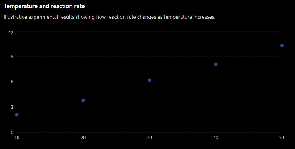
The graph makes the overall trend much clearer.
Identifying Trends
A trend is the general direction or pattern shown by the data.
A trend may be:
- Increasing
- Decreasing
- Constant
- Linear
- Non-linear
- Irregular
When identifying a trend, focus on the overall pattern, not every individual data point.
Positive Trends
A positive trend occurs when the dependent variable generally increases as the independent variable increases.
For example:
A good scientific description would be:
As temperature increased from 10°C to 50°C, the reaction rate increased from 2.1 units/min to 10.3 units/min.
This is stronger than simply saying:
The graph goes up.
Scientific descriptions should identify the variables and, when possible, include numerical evidence.
Negative Trends
A negative trend occurs when one variable decreases as another increases.
For example, suppose a student investigates how distance from a lamp affects light intensity.
The results might show:
A suitable conclusion could be:
As the distance from the lamp increased, the measured light intensity decreased.
Again, the conclusion describes the relationship between the actual physical quantities.
Constant Trends
Sometimes the dependent variable remains approximately constant even though the independent variable changes.
For example:
| Time (min) | Temperature (°C) |
|---|---|
| 1 | 25.1 |
| 2 | 25.0 |
| 3 | 25.2 |
| 4 | 25.1 |
| 5 | 25.0 |
There are small differences between the measurements, but there is no meaningful overall increase or decrease.
A suitable conclusion would be:
The temperature remained approximately constant at about 25°C during the experiment.
Small variations do not always represent a meaningful trend.
Evidence-Based Conclusions
A scientific conclusion should be based on evidence from the experiment.
Suppose a student investigates how the force applied to a spring affects its extension.
| Force (N) | Extension (cm) |
|---|---|
| 1 | 2.0 |
| 2 | 4.1 |
| 3 | 6.0 |
| 4 | 8.2 |
| 5 | 10.1 |
A weak conclusion would be:
The spring stretched more.
A stronger conclusion would be:
As the applied force increased, the extension of the spring increased. Increasing the force from 1 N to 5 N increased the extension from 2.0 cm to 10.1 cm.
The second conclusion is stronger because it:
- Identifies both variables.
- Describes the relationship.
- Uses numerical evidence.
Describe, Then Explain
When interpreting data, it is useful to separate what the data show from why the pattern occurs.
Describe
State the pattern shown by the evidence.
For example:
As temperature increased, reaction rate increased.
Explain
Use scientific knowledge to explain the pattern.
For example:
At higher temperatures, particles have more kinetic energy, resulting in more frequent successful collisions.
The description comes directly from the data.
The explanation uses scientific understanding.
A strong scientific conclusion often contains both.
What Is an Anomaly?
An anomaly is a result that does not fit the overall pattern of the other data.
It may also be called an anomalous result or outlier.
Consider:
| Temperature (°C) | Reaction Rate |
|---|---|
| 10 | 2.0 |
| 20 | 4.1 |
| 30 | 6.0 |
| 40 | 3.2 |
| 50 | 10.1 |
Most of the results show that reaction rate increases with temperature.
However, the result at:
40oC
is unusually low.
This result does not fit the overall trend and may be an anomaly.
Identifying Anomalies on a Graph
Anomalies are often easier to identify on graphs than in tables.
If most points follow a clear trend but one point lies far away from that pattern, the unusual point may be anomalous.
However, we should not simply remove an unusual result because we do not like it.
Instead, ask:
- Was the measurement recorded correctly?
- Was the equipment working correctly?
- Were the experimental conditions controlled?
- Was there human error?
- Could the result represent genuine variation?
- Should the measurement be repeated?
An anomalous result should be investigated.
Repeating Measurements
One important way to investigate an anomaly is to repeat the measurement.
Suppose the first measurement at 40oC gives:
3.2
Repeating the experiment gives:
8.0, 8.2, 8.1
The original value of 3.2 now appears much more likely to be anomalous.
Repeated measurements improve our confidence in the results.
They can also help distinguish between:
- Random variation
- Measurement error
- Genuine unusual results
What Is a Hypothesis?
A hypothesis is a testable prediction about what will happen in an investigation.
For example:
If temperature increases, then the rate of the reaction will increase.
After performing the experiment, we compare the results with the hypothesis.
The important question is:
Do the results support the prediction?
Does the Evidence Support the Hypothesis?
Suppose the hypothesis is:
Increasing light intensity will increase the rate of photosynthesis.
The results show:
| Light Intensity (%) | Oxygen Produced (cm³/min) |
|---|---|
| 20 | 2.0 |
| 40 | 4.2 |
| 60 | 6.1 |
| 80 | 8.0 |
| 100 | 9.8 |
The results show a clear increasing trend.
A suitable conclusion would be:
The results support the hypothesis. As light intensity increased from 20% to 100%, oxygen production increased from 2.0 cm³/min to 9.8 cm³/min.
Notice that the conclusion includes specific evidence.
Supported Does Not Mean Proven
In science, it is usually better to say:
The results support the hypothesis.
rather than:
The experiment proves the hypothesis.
A single experiment rarely proves something with complete certainty.
There may be:
- Measurement uncertainty
- Uncontrolled variables
- Limited data
- Random variation
- Experimental errors
Scientists build confidence by repeating investigations and collecting more evidence.
When Results Do Not Support a Hypothesis
Suppose the hypothesis predicts:
As temperature increases, the solubility of substance X will increase.
However, the measurements show no consistent change in solubility.
The correct conclusion is not to change the results to match the prediction.
Instead, we might conclude:
The results do not support the hypothesis because there was no consistent increase in solubility as temperature increased.
Scientific conclusions must follow the evidence, even when the evidence does not match the original prediction.
Partially Supported Hypotheses
Sometimes results support a hypothesis only under certain conditions.
Imagine that reaction rate increases between:
10oC and 50oC
but then decreases above:
50oC
A hypothesis stating that reaction rate always increases with temperature would not be fully supported.
A better conclusion might be:
The results support the hypothesis between 10°C and 50°C, but above 50°C the reaction rate decreased.
This is more accurate than simply saying the hypothesis was right or wrong.
Using Graphs as Evidence
Graphs are particularly useful when communicating scientific conclusions because they make patterns visible.
A graph can show:
- Whether variables increase or decrease together.
- Whether a relationship is linear or non-linear.
- How quickly a variable changes.
- Whether there are anomalies.
- Whether results agree with a prediction.
- Whether the relationship changes under different conditions.
When referring to a graph, describe the quantities and pattern, not just its appearance.
Instead of:
The line goes up.
Write:
The temperature increased as heating time increased.
Even better:
The temperature increased from 22°C at 0 minutes to 68°C after 10 minutes.
Using Numbers as Evidence
Whenever possible, support a conclusion with actual values from the experiment.
Instead of:
The plant grew more with more light.
Write:
Increasing the light exposure from 4 hours to 12 hours per day increased average plant height from 8.2 cm to 15.6 cm.
Numbers make the conclusion:
- More precise
- More convincing
- Easier to evaluate
- Directly connected to the evidence
A Strong Scientific Conclusion
A useful structure for writing conclusions is:
1. State the Trend
What relationship did the data show?
2. Give Evidence
Use specific measurements or features of the graph.
3. Address the Hypothesis
Did the results support the prediction?
4. Identify Important Anomalies
Mention unusual results if they affect the interpretation.
5. Explain the Pattern
Use scientific knowledge when an explanation is required.
Example Conclusion
Suppose an experiment investigates how temperature affects reaction rate.
A strong conclusion might be:
The results show that reaction rate generally increased as temperature increased. The rate increased from 2.1 units/min at 10°C to 10.3 units/min at 50°C. This supports the hypothesis that increasing temperature increases reaction rate. One result at 30°C was lower than the overall trend and may be anomalous. The increasing reaction rate can be explained by particles having greater kinetic energy at higher temperatures, producing more frequent successful collisions.
This conclusion uses both experimental evidence and scientific reasoning.
Correlation Does Not Always Mean Cause
A graph may show that two variables are related, but this does not automatically mean that one variable causes the other to change.
For example, suppose two variables increase together.
We can confidently say:
There is a positive relationship between the variables.
But claiming that one variable caused the change requires stronger evidence from a controlled experiment.
This distinction is important when interpreting scientific data.
A Data Interpretation Checklist
When analyzing experimental results, ask:
- What is the independent variable?
- What is the dependent variable?
- What overall trend does the graph show?
- Is the relationship positive, negative, constant, linear, or non-linear?
- Are there any anomalies?
- What numerical evidence supports my conclusion?
- Do the results support the hypothesis?
- Are there limitations that affect the conclusion?
- Can the pattern be explained using scientific knowledge?
- Have I clearly connected my conclusion to the evidence?
Did You Know?
Scientists sometimes obtain results that completely contradict their original hypothesis.
This is not necessarily a failed experiment.
Unexpected results can lead scientists to:
- Modify existing explanations.
- Design new experiments.
- Discover previously unknown relationships.
- Develop new hypotheses.
The purpose of an experiment is not to make the hypothesis correct. The purpose is to collect reliable evidence and determine what that evidence tells us.
Key Vocabulary
Interpret – To explain the meaning of information or data.
Trend – The overall pattern or direction shown by data.
Evidence – Information or measurements used to support a conclusion.
Conclusion – A statement explaining what the results of an investigation show.
Anomaly – A result that does not fit the overall pattern of the data.
Outlier – A data point that lies unusually far from the main trend.
Hypothesis – A testable prediction about the outcome of an investigation.
Support – To provide evidence that agrees with a hypothesis or explanation.
Correlation – A relationship in which two variables change in a related way.
Reliability – The extent to which repeated measurements produce consistent results.
Key Takeaways
- Experimental data should be analyzed for patterns and trends.
- Graphs often make relationships easier to identify than data tables alone.
- Scientific conclusions should be based on evidence, not expectations.
- Strong conclusions use specific numerical values from the data.
- An anomaly is a result that does not fit the overall pattern and should be investigated.
- Repeated measurements can help determine whether an unusual result is reliable.
- Experimental results may support, partially support, or fail to support a hypothesis.
- A hypothesis should not be described as "proven" simply because one experiment supports it.
- A relationship between variables does not automatically demonstrate cause and effect.
- Strong scientific communication connects the graph, numerical evidence, conclusion, and scientific explanation.