Graphing and Data Analysis
3. Best-fit lines
Learning outcomes
- I can draw appropriate lines of best fit for experimental data.
- I can distinguish between best-fit lines and connecting data points.
- I can identify outliers in experimental data.
- I can use best-fit lines to estimate values.
- I can explain why best-fit lines improve data interpretation.
What Is a Line of Best Fit?
When scientists collect experimental data, the results are rarely perfect.
Even when two variables have a clear relationship, the plotted data points may not fall exactly on a straight line.
For example:
| Time (s) | Distance (m) |
|---|---|
| 1 | 3.1 |
| 2 | 5.8 |
| 3 | 9.2 |
| 4 | 11.9 |
| 5 | 15.1 |
| 6 | 17.8 |
The points show a clear pattern, but they do not lie perfectly on one straight line.
A line of best fit is a straight line drawn through a set of data points to show the overall trend or relationship.
The line does not need to pass through every point.
Instead, it should represent the general pattern of the data.
Why Don't Experimental Points Form a Perfect Line?
Experimental measurements always contain some amount of variation or uncertainty.
Small differences can be caused by:
- Measurement uncertainty
- Limitations of measuring equipment
- Human reaction time
- Small changes in experimental conditions
- Natural variation
- Rounding measurements
As a result, real experimental data often appear scattered around the expected relationship.
A line of best fit helps us see the underlying pattern more clearly.
Drawing a Line of Best Fit
Consider the following experimental data:
| x | y |
|---|---|
| 1 | 3.1 |
| 2 | 5.8 |
| 3 | 9.2 |
| 4 | 11.9 |
| 5 | 15.1 |
| 6 | 17.8 |
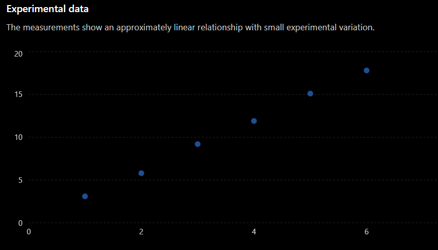
When drawing a line of best fit:
- Use a ruler.
- Follow the overall trend of the data.
- Try to have approximately the same number of points above and below the line.
- Do not try to force the line through every point.
- Do not automatically force the line through the origin.
- Ignore a clear outlier when appropriate.
The goal is to represent the trend, not every individual measurement.
Best-Fit Line vs. Connecting the Points
A common mistake is to connect each experimental point to the next point.
For example, students sometimes draw:
This creates a zigzag pattern that follows every small variation in the measurements.
For many experimental graphs, this is not appropriate.
A line of best fit instead shows the overall relationship:
Connecting the points emphasizes individual measurements.
A best-fit line emphasizes the relationship between the variables.
When Should Points Be Connected?
Connecting individual points is appropriate in some situations.
For example, if you are showing how a quantity changes continuously over time, connecting consecutive measurements may be useful.
However, when investigating the relationship between two continuous variables and looking for a general trend, a line or curve of best fit is usually more appropriate.
Always think about what the graph represents rather than automatically connecting every point.
The Line Does Not Need to Pass Through Every Point
This is one of the most important ideas about best-fit lines.