Lab Reports
© YE youngcutters.com/YE
2. Structure and Components of a Lab Report
2.12. Analysis
An effective analysis section that uses only tables with calculated or manipulated data, graphs, and sample calculations should be well-structured and focused on clarity, ensuring that each visual element (table, graph, or calculation) contributes to interpreting the data and answering the research question. Here’s how to organize and present this type of analysis effectively:
1. Start with Tables of Manipulated or Calculated Data
- Present all manipulated or calculated data in organized tables.
- Include clear headers for each column (e.g., variables, units, or conditions), and ensure all calculations are consistent with the stated formulas.
- Include a brief caption for each table that explains its content and purpose.
Example of a Table:
| Trial | Mass of Reactant (g) | Time (s) | Reaction Rate (g/s) |
|---|---|---|---|
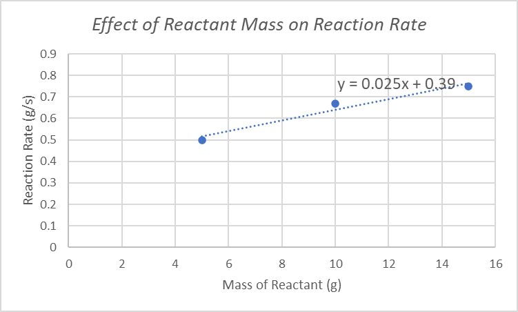
| 1 | 5.0 | 10 | 0.50 |
| 2 | 10.0 | 15 | 0.67 |
| 3 | 15.0 | 20 | 0.75 |
2. Include Graphs for Data Visualization
- Use graphs to highlight trends or relationships in the data. The graph type (e.g., line, bar, or scatter plot) should be chosen based on the nature of the data.
- Label axes clearly with variables and units, and include a descriptive title. Add a legend if multiple datasets are presented.
- Ensure that graphs emphasize important patterns, such as direct relationships, plateaus, or anomalies.
Example of a Graph:
Figure 1. Reaction rate increases with mass of reactant, indicating a proportional relationship.
3. Provide Sample Calculations
- Include one or two sample calculations to demonstrate how key values in the tables or graphs were derived.
- Break the calculation into steps, showing all relevant equations and substitutions. Clearly annotate what each step represents and include units throughout.
- Write the calculation in a simple, easy-to-follow format and reference the corresponding table or graph.
Example of a Sample Calculation:
To calculate reaction rate in Trial 1:
"This calculation was repeated for all trials, and the results are presented in Table 1."
4. Use Captions to Explain Key Insights
- Provide concise captions for each table, graph, and calculation that explain its significance. Captions should summarize the trends or relationships shown and connect them to the hypothesis or research question.
5. Tie Visual Elements Together
- After presenting tables, graphs, and calculations, briefly summarize their implications in a concluding statement. This ties together the visual data and ensures the reader understands the overall significance.
Example of Summary:
"The data in Table 1 and Figure 1 indicate a proportional relationship between reactant mass and reaction rate, as supported by the sample calculations. This aligns with the hypothesis that increasing the amount of reactant enhances the reaction rate due to more frequent particle collisions."
Key Features of an Effective Analysis Section:
- Logical Flow: Present tables, graphs, and calculations in the order they were analyzed or calculated.
- Clear Explanations: Use captions and short summaries to interpret the data without excessive text.
- Consistency: Ensure that data presented in tables and graphs aligns with calculations and experimental results.
- Professional Formatting: Use proper labels, units, and annotations for all visual elements.
By focusing on concise and accurate representation of data through tables, graphs, and calculations, this analysis format ensures clarity and engagement while effectively supporting your conclusions.