Collecting and Organizing Data
3. Organizing Data
Learning outcomes
- I can organize data using tables and charts.
- I can create and interpret frequency tables.
- I can use tally charts to record and summarize data.
- I can identify patterns in organized datasets.
- I can present data clearly and accurately.


Why Do We Organize Data?
Imagine asking 30 students:
"How many hours did you exercise last week?"
You might collect answers such as:
3, 5, 2, 4, 3, 6, 2, 3, 5, 4, 7, 3, 2, 5, 4...
This is raw data.
Raw data contains useful information, but it can be difficult to see:
- which values occur most often
- which values are unusual
- how values are distributed
- what patterns exist
- how different groups compare
Organizing the data makes these patterns much easier to:
see, interpret, and communicate.
What Is Data?
Data are pieces of information collected through observations, measurements, surveys, experiments, or other sources.
Examples include:
- student heights
- daily temperatures
- reaction times
- rainfall measurements
- test scores
- number of siblings
- plant growth
- favourite sports
A single recorded value is sometimes called a:
data value or observation.
Raw Data
Data in the form in which it was originally collected are called:
raw data.
For example, suppose 20 students were asked how many books they read last month:
2, 3, 1, 4, 2, 2, 5, 3, 1, 2, 4, 3, 2, 1, 5, 2, 3, 4, 2, 3
This is a valid dataset, but answering questions about it requires:
careful counting.
A table can make the information much clearer.
Tally Charts
A tally chart is a simple way to record how often different values or categories occur.
Each occurrence is represented by a:
tally mark.
For example:
| Books Read | Tally | Frequency |
|---|---|---|
| 1 | ` | |
| 2 | ` | |
| 3 | ` | |
| 4 | ` | |
| 5 | ` | ` |
The tally marks allow us to record observations quickly.
The frequency tells us the:
total number of occurrences.
Using Tally Marks
Tally marks are usually grouped in sets of:
five.
The first four marks are recorded separately:
||||
The fifth mark crosses the first four:
||||/
So:
||||/ = 5
and:
||||/ ||| = 8.
Grouping tally marks into fives makes larger quantities easier to:
count quickly.
From Raw Data to a Tally Chart
Consider this dataset:
Red, Blue, Blue, Green, Red, Blue, Yellow, Green, Blue, Red, Blue, Green
We can organize it as:
| Colour | Tally | Frequency |
|---|---|---|
| Red | ` | |
| Blue | ` | |
| Green | ` | |
| Yellow | ` | ` |
Immediately, we can see that:
Blue is the most common colour.
That pattern was much harder to see in the original:
raw data.
What Is Frequency?
The frequency of a value tells us how many times that value occurs.
For example:
2, 4, 3, 2, 5, 2, 4, 2
The value:
2
appears four times.
Therefore:
frequency of 2 = 4.
Frequency is one of the most important ideas used when:
organizing data.
Frequency Tables
A frequency table lists each value or category and shows how often it occurs.
Consider the data:
1, 3, 2, 4, 2, 3, 2, 5, 4, 3, 2, 1
A frequency table gives:
| Value | Frequency |
|---|---|
| 1 | 2 |
| 2 | 4 |
| 3 | 3 |
| 4 | 2 |
| 5 | 1 |
This table provides a much clearer summary of the dataset.
Checking a Frequency Table
A simple but important check is to:
add all the frequencies.
For the previous table:
2 + 4 + 3 + 2 + 1 = 12
There were:
12 original observations.
Therefore, the frequency table accounts for every value.
This is an excellent way to catch:
counting errors.
Worked Example 1: Creating a Frequency Table
Suppose these are the number of goals scored by a team over 15 games:
2, 1, 3, 2, 0, 4, 1, 2, 3, 2, 1, 0, 3, 2, 1
Step 1: Identify the possible values
0, 1, 2, 3, 4
Step 2: Count each value
| Goals | Tally | Frequency |
|---|---|---|
| 0 | ` | |
| 1 | ` | |
| 2 | ` | |
| 3 | ` | |
| 4 | ` | ` |
Step 3: Check the total
2 + 4 + 5 + 3 + 1 = 15
The table is consistent with the:
15 games.
What Can We Learn From the Table?
The table tells us much more quickly that:
- 2 goals occurred most often
- 4 goals occurred least often
- the team scored at least one goal in 13 games
- scores were concentrated between 1 and 3 goals
Organized data make patterns easier to:
identify and describe.
Tables Need Clear Labels
A good data table should tell the reader exactly what the data represent.
For example:
| Temperature (°C) | Frequency |
|---|---|
| 20 | 2 |
| 21 | 4 |
| 22 | 7 |
| 23 | 5 |
| 24 | 2 |
Notice that the unit:
°C
is included in the heading.
Writing only Temperature would provide less information.
Good Table Design
A well-designed table should include:
- a clear title when appropriate
- meaningful column headings
- units where needed
- consistent formatting
- values arranged logically
- accurate data
Avoid unnecessary decoration.
The purpose of a data table is:
clarity.
Ordering Data
Numerical values are usually arranged from:
smallest to largest.
For example:
| Number of Pets | Frequency |
|---|---|
| 0 | 5 |
| 1 | 9 |
| 2 | 6 |
| 3 | 3 |
| 4 | 1 |
This makes the pattern easier to follow than listing values randomly.
Categories that have no natural numerical order may instead be organized:
- alphabetically
- logically
- by frequency
- according to the purpose of the investigation
Frequency Tables for Categories
Frequency tables are not limited to numerical values.
Suppose students choose their preferred school activity:
| Activity | Frequency |
|---|---|
| Art | 6 |
| Music | 8 |
| Science Club | 5 |
| Sports | 11 |
Here the variable is:
categorical.
The frequency still tells us how many observations belong to each:
category.
Turning Tables Into Charts
Tables are excellent for showing:
exact values.
Charts are often better for showing:
patterns and comparisons.
For example:
| Transport | Students |
|---|---|
| Bus | 12 |
| Car | 8 |
| Walk | 6 |
| Bicycle | 4 |
The same information can be displayed visually.
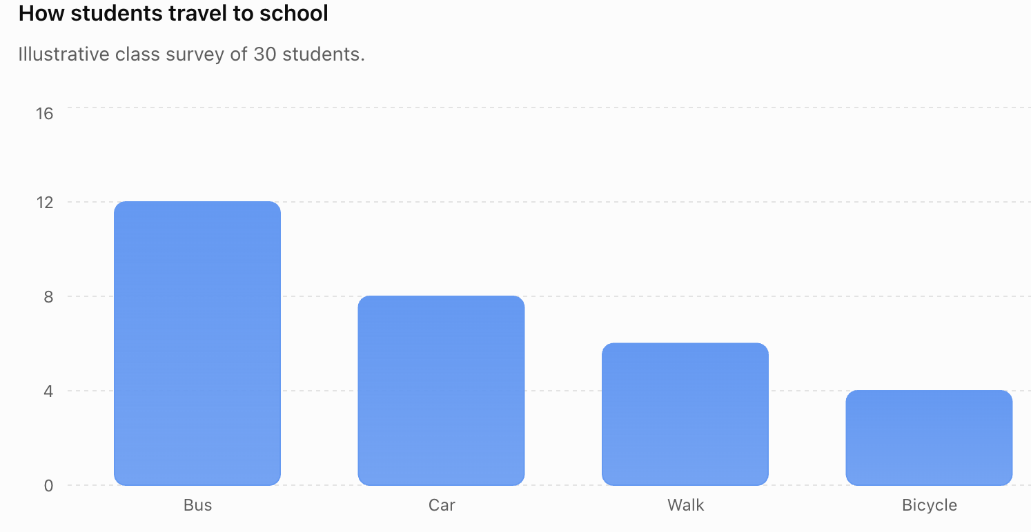
The bar chart makes it easy to see that:
bus is the most common method of transport.
Tables vs Charts
Neither format is always better.
Tables are useful when:
- exact values are important
- many individual values must be shown
- calculations may be required
- detailed information is needed
Charts are useful when:
- comparisons are important
- patterns need to be visible
- trends need to be identified quickly
- information needs to be communicated visually
Often, scientists and statisticians use:
both.
Choosing an Appropriate Chart
Different charts are useful for different kinds of data.
Bar chart
Useful for comparing:
categories or discrete values.
Line graph
Useful for showing how a quantity changes across an ordered variable, especially:
time.
Pie chart
Useful for showing how a total is divided into:
proportions or percentages.
Histogram
Useful for showing the distribution of:
continuous numerical data grouped into intervals.
Choosing the correct representation helps communicate data:
accurately.


Bar Charts
A bar chart represents data using rectangular:
bars.
The height or length of each bar represents the:
frequency or value.
Bars representing separate categories normally have:
gaps between them.
A good bar chart should include:
- a descriptive title
- labelled axes
- appropriate units
- an appropriate scale
- bars of equal width
Worked Example 2: Plant Growth
Four plants are grown under different lighting conditions.
| Light per Day | Final Height (cm) |
|---|---|
| 4 hours | 12 |
| 6 hours | 18 |
| 8 hours | 25 |
| 10 hours | 29 |
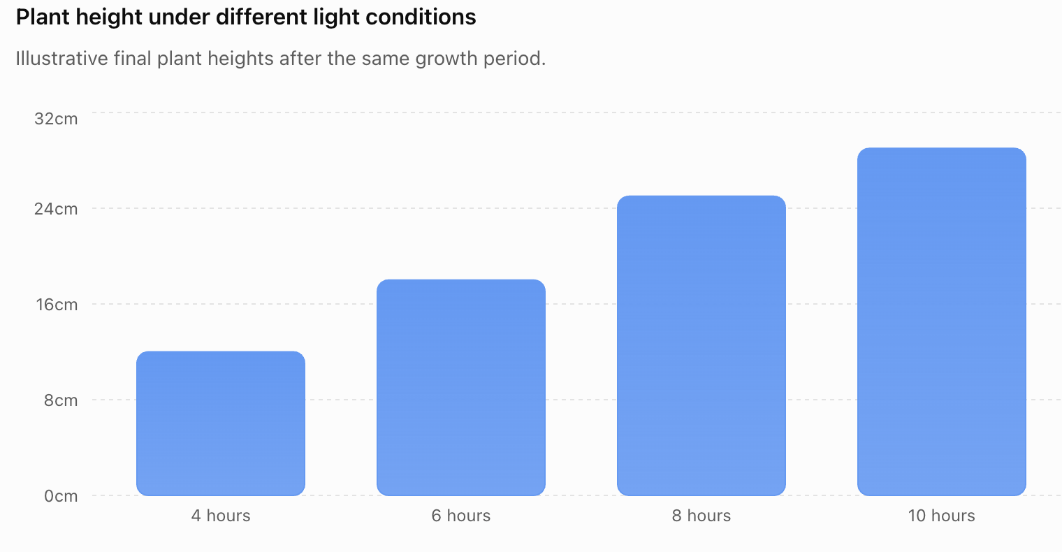
The organized data reveal a clear pattern:
plants receiving more light were taller in this dataset.
That statement describes the data.
It does not automatically prove that additional light:
caused the difference.
Presenting vs Interpreting Data
This distinction is extremely important.
Presenting data
Means showing what was measured or observed.
For example:
The plant receiving 8 hours of light reached 25 cm.
Interpreting data
Means explaining what the results might mean.
For example:
The results suggest that increased light exposure was associated with greater plant growth over the tested range.
The first statement reports:
data.
The second makes an:
interpretation.
Identifying Patterns
Once data are organized, we can look for:
- highest values
- lowest values
- common values
- differences
- similarities
- clusters
- gaps
- unusual values
- increasing or decreasing trends
These features help us understand what the dataset:
shows.
Example: Finding Patterns
Consider:
| Hours of Sleep | Students |
|---|---|
| 5 | 2 |
| 6 | 5 |
| 7 | 9 |
| 8 | 11 |
| 9 | 5 |
| 10 | 2 |
We can identify several patterns.
The largest frequency occurs at:
8 hours.
Relatively few students reported:
5 or 10 hours.
Most observations are concentrated between:
7 and 9 hours.
These are descriptions supported directly by the:
organized data.
Charts Make Patterns Visible
The same sleep data can be displayed visually.
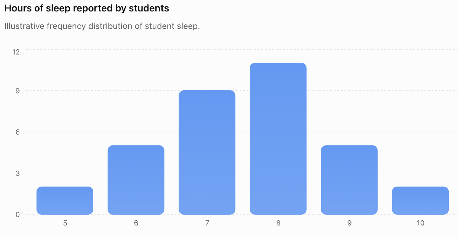
The overall shape is easier to recognize in the:
chart.
Grouped Frequency Tables
Sometimes there are too many different values to list individually.
Consider test scores ranging from:
0 to 100.
Instead of listing every possible score, we could group them:
| Score | Frequency |
|---|---|
| 0–19 | 1 |
| 20–39 | 3 |
| 40–59 | 7 |
| 60–79 | 12 |
| 80–100 | 7 |
These ranges are called:
class intervals.
This produces a:
grouped frequency table.
Why Group Data?
Grouping can make a large dataset easier to:
summarize.
Instead of examining dozens of individual values, we can see how observations are distributed across:
ranges.
However, grouping also removes some detail.
If we know that seven students scored between 80 and 100, we do not know their exact scores from the grouped table.
So there is often a trade-off between:
detail and simplicity.
Choosing Intervals Carefully
Grouped intervals should:
- cover all possible values
- not overlap
- follow a logical order
- usually have consistent widths where appropriate
Poor intervals can make data difficult to:
interpret.
For example, these intervals are problematic:
0–10
10–20
because the value 10 appears to belong to:
both groups.
Scientific Data Tables
Tables are especially important in:
science.
Suppose a student investigates how temperature affects reaction time.
| Temperature (°C) | Reaction Time (s) |
|---|---|
| 10 | 82 |
| 20 | 61 |
| 30 | 43 |
| 40 | 31 |
| 50 | 27 |
The headings include:
both the variable and its unit.
This is good scientific practice.
Independent and Dependent Variables
In experimental tables, the:
independent variable
is often placed in the first column.
The:
dependent variable
is usually placed in the next column or columns.
For the reaction example:
Independent variable → Temperature
Dependent variable → Reaction time
This arrangement makes the experimental relationship:
clear.
Repeated Measurements
Scientists often repeat measurements.
For example:
| Temperature (°C) | Trial 1 (s) | Trial 2 (s) | Trial 3 (s) |
|---|---|---|---|
| 10 | 81 | 84 | 82 |
| 20 | 60 | 63 | 61 |
| 30 | 44 | 42 | 43 |
| 40 | 31 | 32 | 30 |
Repeated measurements allow scientists to:
- check consistency
- identify unusual measurements
- calculate averages
- improve reliability
Organizing repeated measurements carefully is essential for:
scientific analysis.
Accuracy in Data Presentation
A beautifully organized table is useless if the values are:
incorrect.
Always check:
- frequencies
- totals
- units
- headings
- scales
- transferred values
- calculations
A single transcription error can change the apparent:
pattern.
Misleading Charts
Charts can also be presented in ways that exaggerate or hide:
differences.
For example, consider:
Group A = 98
Group B = 100.
If a vertical axis begins at:
97
rather than zero, the difference may appear enormous.
The numerical difference is actually only:
2 units.
A graph is not automatically objective simply because it contains:
numbers.
Always Examine the Scale
When reading a chart, ask:
- Where does the axis begin?
- Are the intervals equal?
- Are the units clearly stated?
- Is anything missing?
- Does the visual appearance accurately represent the numerical difference?
Good data literacy means examining:
how information is presented, not just what numbers appear.
Worked Example 3: From Raw Data to Interpretation
Suppose 25 students record how many minutes they spend reading each evening:
20, 30, 20, 40, 10, 30, 20, 50, 30, 40, 20, 30, 10, 20, 40, 30, 20, 60, 30, 40, 20, 30, 50, 20, 30
Step 1: Identify the values
10, 20, 30, 40, 50, 60
Step 2: Count frequencies
| Reading Time (min) | Frequency |
|---|---|
| 10 | 2 |
| 20 | 8 |
| 30 | 8 |
| 40 | 4 |
| 50 | 2 |
| 60 | 1 |
Step 3: Check
2 + 8 + 8 + 4 + 2 + 1 = 25
Correct.
Step 4: Identify patterns
The most common reading times are:
20 and 30 minutes.
Only one student reported:
60 minutes.
Most students reported between:
20 and 40 minutes.
Asking Questions About Organized Data
Once data are organized, we can answer questions such as:
Which category has the greatest frequency?
Which has the smallest?
How many observations are there altogether?
Which values occur most often?
Are there any unusual values?
What overall pattern is visible?
These questions turn a table from a storage system into a tool for:
reasoning.
Data in Everyday Life
Organized data appear almost everywhere.
Examples include:
- weather reports
- sports statistics
- election results
- school grades
- financial reports
- fitness trackers
- transportation schedules
- product comparisons
- scientific research
Being able to organize and interpret data is therefore useful far beyond:
mathematics class.


Data in Science
Scientists collect enormous amounts of:
data.
Before they can interpret results, they must organize those data carefully.
For example:
Biology: population counts, heart rate, plant growth
Chemistry: temperature, concentration, reaction time
Physics: distance, velocity, force, energy
Environmental science: rainfall, pollution, biodiversity
Tables and charts help scientists identify:
relationships and patterns.
Data in Digital Tools
Spreadsheet programs can organize large datasets very efficiently.
They can:
- sort values
- count frequencies
- calculate totals
- calculate averages
- create charts
- filter categories
- identify patterns
However, software does not remove the need to understand:
what the data mean.
A computer can create a chart even when the chosen chart is:
inappropriate or misleading.
Choosing Between a Table and a Chart
Suppose you want someone to know that:
37 students chose Option A and 24 chose Option B.
A table communicates the exact numbers clearly.
If you want the audience to notice quickly that:
Option A was selected more often,
a bar chart may communicate the comparison more effectively.
The best format depends on:
what you want the reader to understand.
Communicating Data Effectively
Good data presentation should be:
Clear
The reader should understand what is being shown.
Accurate
The values must represent the original data correctly.
Complete
Important headings, labels, and units must be included.
Appropriate
The chosen table or chart should suit the type of data.
Readable
The information should not be unnecessarily complicated.
Common Mistake: Forgetting Units
Instead of:
Length
write:
Length (cm).
Instead of:
Time
write:
Time (s).
Instead of:
Mass
write:
Mass (g).
Units are part of the:
measurement.
Leaving them out makes scientific data incomplete.
Common Mistake: Incorrect Frequencies
Suppose the raw data contain:
2, 2, 3, 4, 2, 3.
The frequency of 2 is:
3
not 2.
Tally marks are useful because they reduce the chance of:
losing track while counting.
Common Mistake: Frequencies Do Not Match the Dataset
If there are:
30 observations,
the frequencies should add to:
30.
If they add to 29 or 31, something has probably been:
miscounted.
Always perform this simple:
total-frequency check.
Common Mistake: Mixing Data and Interpretation
Suppose a plant grew:
8 cm.
That is:
data.
Saying:
"The fertilizer caused the plant to grow faster"
is an:
interpretation.
The interpretation may or may not be supported by the experimental design.
Keep:
what was observed
separate from:
what you think it means.
Common Mistake: Choosing the Wrong Chart
Not every dataset should become a:
pie chart.
Not every dataset should become a:
line graph.
The representation should match:
the structure and purpose of the data.
Choosing a graph is part of:
data reasoning.
A Simple Data-Organization Process
When given raw data:
Step 1
Identify what each value represents.
Step 2
Check the units.
Step 3
Identify the different values or categories.
Step 4
Use tally marks if useful.
Step 5
Calculate the frequency of each value.
Step 6
Create a clearly labelled frequency table.
Step 7
Check that the frequencies total the number of observations.
Step 8
Choose an appropriate chart if a visual representation would help.
Step 9
Look for patterns.
Step 10
Describe those patterns accurately without making unsupported claims.
Worked Example 4: Complete Data Organization
A class records the number of hours spent exercising during one week:
2, 4, 3, 5, 2, 3, 4, 3, 1, 2, 4, 5, 3, 2, 4, 3, 6, 2, 3, 4
Organize the data.
Frequency Table
| Exercise (hours) | Frequency |
|---|---|
| 1 | 1 |
| 2 | 5 |
| 3 | 6 |
| 4 | 5 |
| 5 | 2 |
| 6 | 1 |
Check:
1 + 5 + 6 + 5 + 2 + 1 = 20.
Correct.
Displaying the Exercise Data
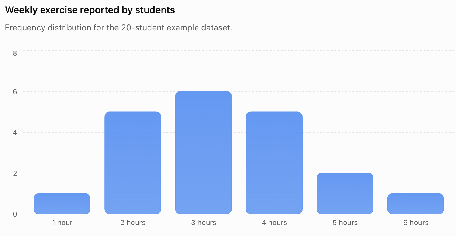
Now the pattern is easy to see.
The most common value is:
3 hours.
Most students reported:
2–4 hours.
The extreme values of 1 and 6 hours occurred much less:
frequently.
Why Organization Matters
Good organization transforms:
numbers
into:
information.
A long list of values may contain an important pattern that is difficult to notice.
A well-designed table or chart can make that pattern:
immediately visible.
This is why data organization is one of the foundations of:
statistics and scientific investigation.
Check Your Understanding
1. Define raw data.
2. What does frequency mean?
3. Why are tally marks grouped in sets of five?
4. Create tally marks representing a frequency of 13.
5. What is the purpose of a frequency table?
6. Why should frequencies be added after completing a frequency table?
7. What information should appear in a good table heading?
8. Why are units important?
9. When might a bar chart be more useful than a table?
10. When might a table be more useful than a chart?
Use the following dataset for Questions 11–15:
1, 2, 3, 2, 4, 2, 3, 5, 3, 2, 4, 3, 2, 1
11. Create a frequency table.
12. Which value has the greatest frequency?
13. Which value has the smallest frequency?
14. How many observations are in the dataset?
15. Describe one pattern visible in the data.
16. Explain the difference between presenting data and interpreting data.
17. Why might continuous data be grouped into intervals?
18. Give one disadvantage of grouping data.
19. Identify two ways a chart could mislead a reader.
20. Explain why organizing data is important in scientific investigations.
Key Terms
- Data: Information collected through observations, measurements, surveys, or experiments.
- Dataset: Collection of related data values.
- Raw data: Data in its original, unorganized form.
- Observation: Individual recorded data value.
- Tally: Mark used to record an occurrence.
- Tally chart: Table using tally marks to record frequencies.
- Frequency: Number of times a value or category occurs.
- Frequency table: Table showing values or categories and their frequencies.
- Grouped frequency table: Frequency table in which numerical values are combined into intervals.
- Class interval: Range of values used to group numerical data.
- Category: Group or label used to classify data.
- Bar chart: Chart using separated bars to compare categories or discrete values.
- Line graph: Graph commonly used to show change across an ordered variable such as time.
- Histogram: Graph showing frequencies of continuous numerical data grouped into intervals.
- Scale: System of values used along an axis.
- Variable: Characteristic or quantity that can take different values.
- Independent variable: Variable deliberately changed in an investigation.
- Dependent variable: Variable measured in response to the independent variable.
- Pattern: Recognizable feature or relationship within data.
- Data presentation: Process of displaying data clearly using tables, graphs, or other representations.
Key Takeaways
- Data are collected through observations, measurements, surveys, and experiments.
- Raw data can be difficult to interpret when presented as a long list.
- Organizing data makes patterns and comparisons easier to identify.
- Tally charts provide a quick method for recording observations.
- Tally marks are normally grouped in sets of five.
- Frequency tells us how many times a value or category occurs.
- Frequency tables summarize datasets efficiently.
- The total of all frequencies should equal the total number of observations.
- Numerical values are usually organized in a logical order.
- Frequency tables can represent both numerical and categorical data.
- Grouped frequency tables are useful for datasets containing many different values.
- Grouping makes data easier to summarize but removes some detail.
- Tables are particularly useful when exact values matter.
- Charts are particularly useful when patterns and comparisons need to be seen quickly.
- Bar charts are useful for comparing categories and discrete values.
- Line graphs are useful for displaying change across an ordered variable, especially time.
- Histograms are useful for displaying distributions of continuous data.
- Tables and graphs should contain clear headings, appropriate labels, and units.
- Scientific tables commonly place the independent variable before the dependent variable.
- Repeated measurements should be organized clearly so they can be compared and analyzed.
- Data presentation and data interpretation are different processes.
- A chart can be misleading if its scale or design exaggerates differences.
- Good data presentation should be clear, accurate, complete, appropriate, and readable.
- Organized data allow us to identify frequencies, patterns, clusters, gaps, and unusual values.
- Careful data organization is fundamental to statistics, mathematics, science, and everyday decision-making.