Collecting and Presenting Data
4. Graphing Skills
Learning outcomes
- I can select the most appropriate graph for different types of data.
- I can construct graphs with correctly labeled axes and units.
- I can plot data accurately.
- I can identify trends and relationships from graphs.
- I can interpret information presented in graphs.
Graphing Skills
Graphs are one of the most useful ways scientists display and analyse data. A well-constructed graph can make patterns and relationships much easier to recognise than looking at a large table of numbers.
Scientists must choose an appropriate type of graph, construct it correctly, plot data accurately, and use the graph to draw conclusions supported by evidence.
Why Do Scientists Use Graphs?
Graphs allow scientists to:
- display large amounts of data clearly
- compare different groups or conditions
- identify trends and relationships
- detect unusual results
- estimate values between measurements
- communicate experimental results
- support conclusions with evidence
Different types of data require different types of graphs.
Choosing the Correct Graph
Three common graphs used in science are:
- line graphs
- scatter graphs
- bar graphs
The correct graph depends mainly on the type of variables and the purpose of the graph.
| Graph Type | Best Used For | Example |
|---|---|---|
| Line graph | Ordered or continuous data where change or trend is important | Temperature over time |
| Scatter graph | Relationship between two numerical variables | Height vs mass |
| Bar graph | Comparing separate categories | Plant growth under different fertilisers |
Choosing an inappropriate graph can make data difficult or even misleading to interpret.
Line Graphs
A line graph is commonly used when data follows an ordered sequence, especially when showing how a continuous variable changes.
Examples include:
- temperature over time
- distance travelled over time
- plant height over several weeks
- concentration changing during a reaction
Consider these experimental results:
| Time (min) | Temperature (°C) |
|---|---|
| 0 | 20 |
| 2 | 29 |
| 4 | 36 |
| 6 | 41 |
| 8 | 44 |
| 10 | 45 |
A line graph makes the overall change easy to see.
Temperature over time
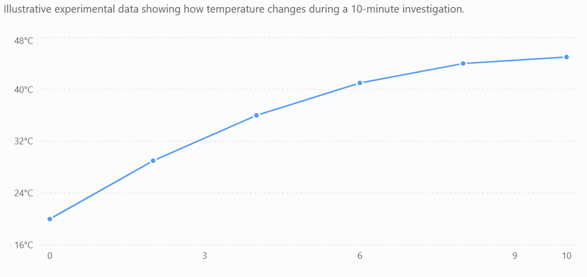
The graph shows that temperature increased rapidly at first and then began to level off.
Scatter Graphs
A scatter graph is used to investigate whether there is a relationship between two numerical variables.
For example, students might measure the height and mass of several plants.
| Plant Height (cm) | Plant Mass (g) |
|---|---|
| 8 | 3.1 |
| 12 | 4.2 |
| 15 | 5.8 |
| 19 | 6.5 |
| 22 | 8.1 |
| 27 | 9.3 |
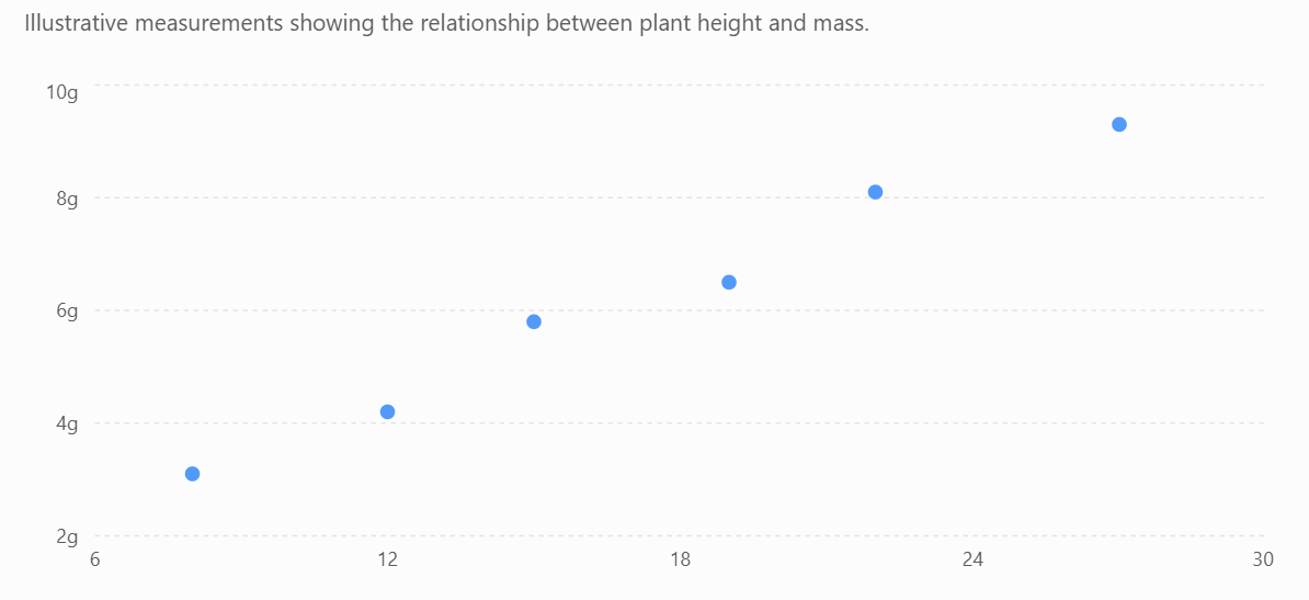
The points suggest that taller plants tend to have greater mass.
This is called a positive correlation.
A scatter graph does not normally require the points to be connected one-by-one. Instead, scientists may add a line of best fit to show the overall relationship.
Bar Graphs
A bar graph is appropriate when the independent variable consists of separate categories.
For example:
| Fertiliser | Mean Plant Growth (cm) |
|---|---|
| None | 4.2 |
| A | 7.8 |
| B | 11.3 |
| C | 6.5 |
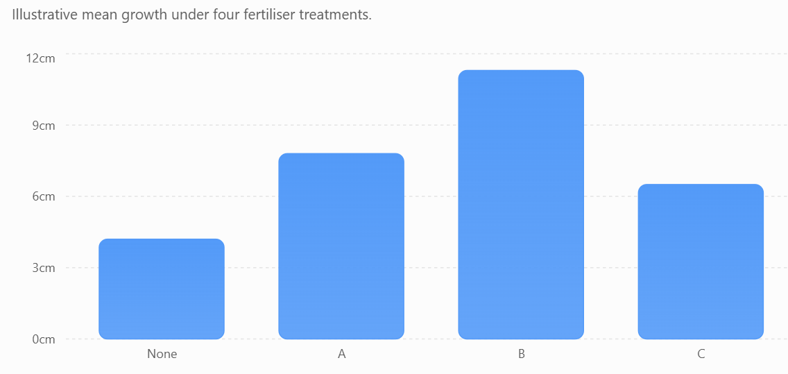
The bars are separated because None, A, B, and C are distinct categories rather than values along a continuous scale.
From the graph, Fertiliser B produced the greatest mean plant growth.
Independent and Dependent Variables
In most experimental graphs:
Independent variable → x-axis
Dependent variable → y-axis
The independent variable is the variable deliberately changed by the scientist.
The dependent variable is the variable measured in response.
For example, suppose a student investigates:
How does temperature affect reaction time?
The student changes temperature, so:
x-axis → Temperature (°C)
The student measures reaction time, so:
y-axis → Reaction Time (s)
A useful memory aid is:
DRY MIX
Dependent
Responding variable
Y-axis
Manipulated
Independent variable
X-axis
Labelling Axes
Each axis must clearly identify the variable and its unit.
For example:
Temperature (°C)
Time (s)
Distance (m)
Mass (g)
Avoid vague labels such as simply:
Temperature
or
Distance
when units are required.
Choosing an Appropriate Scale
The graph scale should:
- use most of the available graph space
- increase by equal intervals
- use convenient values
- cover the full range of data
- be easy to read
Good intervals might increase by:
1, 2, 5, 10, 20, 50...
Awkward intervals such as 3.7 or 13 should usually be avoided unless there is a specific reason to use them.
The Axis Does Not Always Need to Start at Zero
In many scientific graphs, particularly line and scatter graphs, an axis does not necessarily need to begin at zero.
Suppose temperatures range only from 82 °C to 94 °C.
Using a y-axis from 0–100 °C would compress all the points into a small part of the graph.
A scale from perhaps 80–95 °C could make the pattern much clearer.
However, truncated axes must be clearly labelled and used carefully because they can sometimes exaggerate differences.
For bar graphs, beginning the numerical axis at zero is generally important because the length of each bar represents its magnitude.
Plotting Data Accurately
Each point should be plotted carefully according to its x- and y-coordinates.
Suppose:
Temperature = 30 °C
Reaction time = 65 s
The point should be plotted at:
(30, 65)
A small cross × is often useful because its centre clearly shows the intended coordinate.
Points should not be placed approximately. Their positions should match the graph scale as accurately as possible.
Lines of Best Fit
When experimental points show an overall relationship, scientists may draw a line or curve of best fit.
A line of best fit should:
- follow the overall trend
- pass close to as many points as possible
- have points reasonably distributed around it
- not simply connect every point in order
The line represents the general relationship in the data.


Positive Relationships
A positive relationship occurs when one variable generally increases as the other increases.
For example:
As fertiliser concentration increases, plant growth increases.
The graph generally rises from left to right.
Negative Relationships
A negative relationship occurs when one variable increases while the other decreases.
For example:
As temperature increases, reaction time decreases.
The graph generally falls from left to right.
No Clear Relationship
Sometimes changing one variable does not produce a consistent change in another.
The graph may show scattered points with no obvious pattern.
In this situation, scientists should not claim that a relationship exists simply because they expected one.
Conclusions must be based on the data collected.
Correlation Does Not Prove Causation
Suppose a scatter graph shows that two variables are related.
This is called correlation.
However, correlation alone does not prove that one variable caused the other to change.
For example, ice cream sales and sunburn cases might both increase during hotter weather.
Ice cream does not cause sunburn.
Instead, a third factor—hot, sunny weather—affects both variables.
Scientists therefore distinguish between correlation and causation.
Identifying Anomalies
An anomaly is a data point that does not fit the overall trend.
For example:
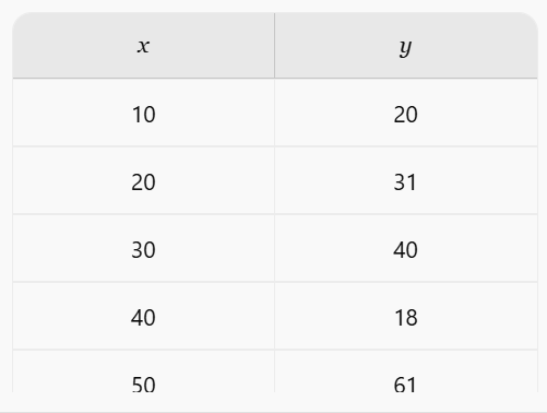
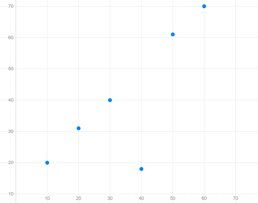
Most of the points follow an increasing pattern, but the point at (40, 18) is noticeably different.
Scientists should investigate anomalies rather than automatically deleting them.
Possible explanations include:
- measurement error
- equipment problems
- uncontrolled variables
- recording mistakes
- genuine variation
Repeating the measurement can help determine whether the anomalous result is reliable.
Interpolation
Graphs can sometimes be used to estimate values between measured data points.
This is called interpolation.
Suppose measurements were taken at:
20 °C and 30 °C.
A graph could be used to estimate a value at:
25 °C.
Interpolation is generally more reliable because the estimate lies within the measured range.
Extrapolation
Extrapolation involves predicting values outside the measured data range.
If measurements were collected between 10 °C and 50 °C, predicting what happens at 70 °C would be extrapolation.
Extrapolation is usually less reliable because we do not know whether the existing pattern will continue outside the measured range.
Interpreting Graphs
When interpreting a scientific graph, ask:
- What variables are shown?
- What units are being used?
- What does the scale represent?
- Is there a positive, negative, or no clear relationship?
- Are there any anomalies?
- Does the relationship remain constant?
- What numerical evidence supports the conclusion?
Strong graph interpretations use specific evidence.
Instead of:
"Temperature increased."
Write:
"Temperature increased from 20 °C at 0 minutes to 45 °C after 10 minutes."
Common Graphing Mistakes
Students should avoid:
- choosing the wrong graph type
- forgetting the graph title
- forgetting units
- putting variables on the wrong axes
- using uneven scale intervals
- using only a small portion of the graph paper
- plotting points inaccurately
- automatically connecting every experimental point
- ignoring anomalous results
- describing a trend without using data as evidence
A Graphing Checklist
Before finishing a graph, check:
- Is the correct graph type used?
- Is there a descriptive title?
- Is the independent variable on the x-axis?
- Is the dependent variable on the y-axis?
- Are both axes clearly labelled?
- Are units included?
- Is the scale appropriate and consistent?
- Are points plotted accurately?
- Is a line or curve of best fit appropriate?
- Can the main trend be clearly identified?
Did You Know?
Graphs can sometimes be designed in ways that make differences appear much larger or smaller than they really are.
For example, changing the starting value or range of an axis can dramatically change the visual appearance of the same dataset.
Scientists should therefore look carefully at axis labels and scales before interpreting any graph—not just the overall shape of the picture.
Key Terms
Line graph: A graph used to show trends across ordered or continuous data.
Bar graph: A graph used to compare separate categories.
Scatter graph: A graph used to investigate relationships between two numerical variables.
Trend: The overall pattern shown by data.
Correlation: A relationship between two variables.
Line of best fit: A line showing the overall trend of scattered data.
Anomaly: A result that does not fit the general pattern.
Interpolation: Estimating a value within the measured range.
Extrapolation: Predicting a value outside the measured range.
Key Takeaways
- Scientists choose graphs based on the type of data and relationship being investigated.
- Bar graphs are useful for categorical data.
- Line graphs are useful for showing ordered changes and trends.
- Scatter graphs are useful for investigating relationships between two numerical variables.
- The independent variable usually goes on the x-axis and the dependent variable on the y-axis.
- Axes must have appropriate labels, units, and scales.
- Data points must be plotted accurately.
- Graphs can show positive relationships, negative relationships, or no clear relationship.
- Anomalies should be identified and investigated.
- Correlation does not necessarily mean causation.
- Interpolation is generally more reliable than extrapolation.
- Graph interpretations should use specific numerical evidence from the data.