Collecting and Presenting Data
| Sitio: | Young Education |
| Curso: | Lab Reports and Science Fair |
| Libro: | Collecting and Presenting Data |
| Impreso por: | ゲストユーザ |
| Fecha: | viernes, 25 de septiembre de 2026, 02:37 |
1. Qualitative and Quantitative Data
Learning outcomes
- I can distinguish between qualitative and quantitative data.
- I can identify appropriate situations for collecting each type of data.
- I can record observations accurately.
- I can organize different types of data effectively.
- I can explain why both types of data are valuable.
Qualitative and Quantitative Data
Scientists collect data to describe observations, test ideas, identify patterns, and draw conclusions. The data collected during an investigation generally falls into two main categories: qualitative data and quantitative data.
Good scientific investigations often collect both types of data, because each provides different information about what is happening.
What Is Qualitative Data?
Qualitative data describes qualities or characteristics that are observed rather than measured numerically.
It usually uses words and descriptions.
Examples include:
- the solution changed from colourless to blue
- bubbles formed during the reaction
- the metal surface became dull
- the liquid became cloudy
- a white solid formed
- the plant leaves appeared yellow
- the substance had a rough texture
The word qualitative comes from the idea of describing the quality or characteristics of something.
Making Good Qualitative Observations
Scientific observations should be specific and objective.
For example:
Poor observation:
"The reaction looked weird."
Better observation:
"The colourless solution became cloudy and a white solid formed."
The second observation is more useful because another scientist could understand exactly what was observed.
Whenever possible, avoid vague words such as:
- nice
- bad
- weird
- normal
- strange
- a lot
Instead, describe exactly what you observe.
What Is Quantitative Data?
Quantitative data is information expressed using numbers or measurements.
Examples include:
- temperature = 24.5 °C
- mass = 12.4 g
- reaction time = 38 s
- plant height = 16.2 cm
- volume = 25 mL
- pH = 4.3
- number of bubbles produced = 27
The word quantitative relates to quantity, or how much of something there is.


Qualitative vs. Quantitative Data
The main difference is whether the observation is descriptive or numerical.
| Qualitative Data | Quantitative Data |
|---|---|
| Describes qualities | Measures quantities |
| Usually recorded in words | Usually recorded using numbers |
| May describe colour, texture or appearance | May measure mass, time, temperature or volume |
| "The solution turned blue." | "The solution reached 35 °C." |
| "Many bubbles formed." | "42 bubbles formed in 30 s." |
A useful way to remember the difference is:
Qualitative = What is it like?
Quantitative = How much? How many?
Choosing the Appropriate Type of Data
The type of data you collect depends on the question being investigated.
Suppose students investigate how temperature affects the time required for a tablet to dissolve.
They could measure:
- water temperature in °C
- dissolving time in seconds
These are quantitative data because numerical measurements are needed to answer the research question.
However, students might also observe:
- vigorous bubbling
- changes in colour
- pieces of tablet remaining
- changes in appearance
These are qualitative data.
Both Types Can Be Collected Together
Imagine that a student adds magnesium to hydrochloric acid.
The student records:
Qualitative observations:
- bubbles formed on the magnesium
- the magnesium gradually disappeared
- the container felt warmer
The student also records:
Quantitative observations:
- starting temperature = 22.4 °C
- final temperature = 31.8 °C
- reaction time = 47 s
Together, these observations provide a much more complete description of the reaction.
Recording Data Accurately
Scientific data should be recorded as observations are made, rather than relying on memory later.
Measurements should include both a number and a unit.
For example:
Poor: 15
Better: 15 cm
Even better: 15.2 cm, if the measuring instrument allows this precision.
Scientists should also avoid changing measurements simply because a result seems unexpected. Unexpected results may contain important information.
Organising Quantitative Data
Quantitative data is often organised in a data table.
For example:
| Water Temperature (°C) | Dissolving Time (s) |
|---|---|
| 10 | 182 |
| 20 | 124 |
| 30 | 87 |
| 40 | 61 |
| 50 | 43 |
Notice that the units are included in the column headings.
This avoids repeatedly writing the unit beside every measurement.
Quantitative data can also be displayed using graphs, allowing scientists to identify patterns and relationships between variables.
Organising Qualitative Data
Qualitative observations can also be organised systematically.
For example:
| Substance | Colour | Appearance | Observation During Heating |
|---|---|---|---|
| A | White | Powder | No visible change |
| B | Blue | Crystals | Became white |
| C | Black | Powder | Produced smoke |
Organising observations in a table makes it easier to compare different samples or conditions.
Turning Qualitative Observations into Quantitative Data
Sometimes an observation that begins as qualitative can be measured more precisely.
For example:
Qualitative:
"The plant grew taller."
This could become:
Quantitative:
"The plant increased in height from 12.4 cm to 18.7 cm."
Another example:
Qualitative:
"The reaction produced lots of gas."
A more useful quantitative measurement might be:
Quantitative:
"The reaction produced 42 mL of gas in 60 seconds."
Whenever practical, numerical measurements can make comparisons more precise.
Why Is Quantitative Data Valuable?
Quantitative data allows scientists to:
- make precise comparisons
- perform calculations
- identify mathematical relationships
- create graphs
- calculate averages
- determine rates of change
- repeat and compare experiments
For example, saying:
"Plant A grew more than Plant B"
provides some information.
But saying:
"Plant A grew 8.4 cm while Plant B grew 3.1 cm"
allows a much more precise comparison.
Why Is Qualitative Data Valuable?
Not everything important can be represented easily by a number.
Qualitative observations can reveal:
- colour changes
- formation of solids
- changes in appearance
- unexpected behaviour
- visible evidence of chemical reactions
- patterns that were not originally being measured
For example, temperature measurements might show that a chemical reaction occurred, but observing a new colour and the formation of a solid provides additional evidence about what happened.
Using Both Types of Data
Strong scientific investigations often combine qualitative and quantitative observations.
Imagine students investigate the effect of light intensity on plant growth.
They might collect quantitative measurements such as:
- plant height
- number of leaves
- leaf length
- light intensity
They could also record qualitative observations such as:
- leaf colour
- leaf shape
- appearance of the stem
- signs of wilting


Together, these data provide a more complete picture than either type alone.
Observation vs. Inference
Scientists must also distinguish between an observation and an inference.
An observation describes something that was directly detected or measured.
Observation:
"The solution changed from colourless to blue."
An inference is an interpretation or explanation based on observations.
Inference:
"A new substance must have formed."
Both can be useful, but scientists should clearly distinguish between what they actually observed and what they think the observation means.
Did You Know?
Modern scientific instruments can turn observations that were once mainly qualitative into quantitative measurements.
For example, a scientist might describe a solution as "dark blue."
A device called a spectrophotometer can instead measure how much light the solution absorbs, producing numerical data that can be analysed and compared precisely.


Key Terms
Data: Information collected during an investigation.
Qualitative data: Descriptive information about qualities or characteristics.
Quantitative data: Numerical information obtained by counting or measuring.
Observation: Information directly detected or measured.
Measurement: A numerical observation made using an appropriate instrument.
Inference: An interpretation or explanation based on observations.
Key Takeaways
- Scientific data can be qualitative or quantitative.
- Qualitative data describes characteristics using words.
- Quantitative data uses numbers and measurements.
- Colour, texture, appearance and visible changes are commonly recorded qualitatively.
- Mass, temperature, time, length, volume and pH are commonly recorded quantitatively.
- Measurements should include appropriate units.
- Data should be recorded accurately and systematically.
- Tables can be used to organise both qualitative and quantitative data.
- Quantitative data allows precise comparisons and mathematical analysis.
- Qualitative data provides important descriptive information that measurements may not capture.
- Good investigations often collect both types of data to provide stronger evidence.
2. Measurement and Uncertainty
Learning outcomes
- I can measure quantities using appropriate scientific instruments.
- I can record measurements with correct units.
- I can estimate uncertainty in measurements.
- I can explain how measurement uncertainty affects results.
- I can select the most appropriate measuring equipment.


3. Data Tables
Learning outcomes
- I can organize experimental results into clear data tables.
- I can label tables with titles, headings, and units.
- I can record data accurately and consistently.
- I can distinguish between raw and processed data.
- I can identify patterns within data tables.


4. Graphing Skills
Learning outcomes
- I can select the most appropriate graph for different types of data.
- I can construct graphs with correctly labeled axes and units.
- I can plot data accurately.
- I can identify trends and relationships from graphs.
- I can interpret information presented in graphs.
Graphing Skills
Graphs are one of the most useful ways scientists display and analyse data. A well-constructed graph can make patterns and relationships much easier to recognise than looking at a large table of numbers.
Scientists must choose an appropriate type of graph, construct it correctly, plot data accurately, and use the graph to draw conclusions supported by evidence.
Why Do Scientists Use Graphs?
Graphs allow scientists to:
- display large amounts of data clearly
- compare different groups or conditions
- identify trends and relationships
- detect unusual results
- estimate values between measurements
- communicate experimental results
- support conclusions with evidence
Different types of data require different types of graphs.
Choosing the Correct Graph
Three common graphs used in science are:
- line graphs
- scatter graphs
- bar graphs
The correct graph depends mainly on the type of variables and the purpose of the graph.
| Graph Type | Best Used For | Example |
|---|---|---|
| Line graph | Ordered or continuous data where change or trend is important | Temperature over time |
| Scatter graph | Relationship between two numerical variables | Height vs mass |
| Bar graph | Comparing separate categories | Plant growth under different fertilisers |
Choosing an inappropriate graph can make data difficult or even misleading to interpret.
Line Graphs
A line graph is commonly used when data follows an ordered sequence, especially when showing how a continuous variable changes.
Examples include:
- temperature over time
- distance travelled over time
- plant height over several weeks
- concentration changing during a reaction
Consider these experimental results:
| Time (min) | Temperature (°C) |
|---|---|
| 0 | 20 |
| 2 | 29 |
| 4 | 36 |
| 6 | 41 |
| 8 | 44 |
| 10 | 45 |
A line graph makes the overall change easy to see.
Temperature over time
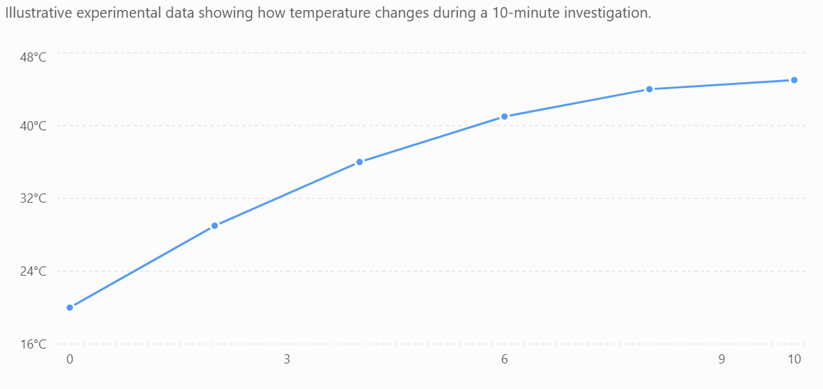
The graph shows that temperature increased rapidly at first and then began to level off.
Scatter Graphs
A scatter graph is used to investigate whether there is a relationship between two numerical variables.
For example, students might measure the height and mass of several plants.
| Plant Height (cm) | Plant Mass (g) |
|---|---|
| 8 | 3.1 |
| 12 | 4.2 |
| 15 | 5.8 |
| 19 | 6.5 |
| 22 | 8.1 |
| 27 | 9.3 |
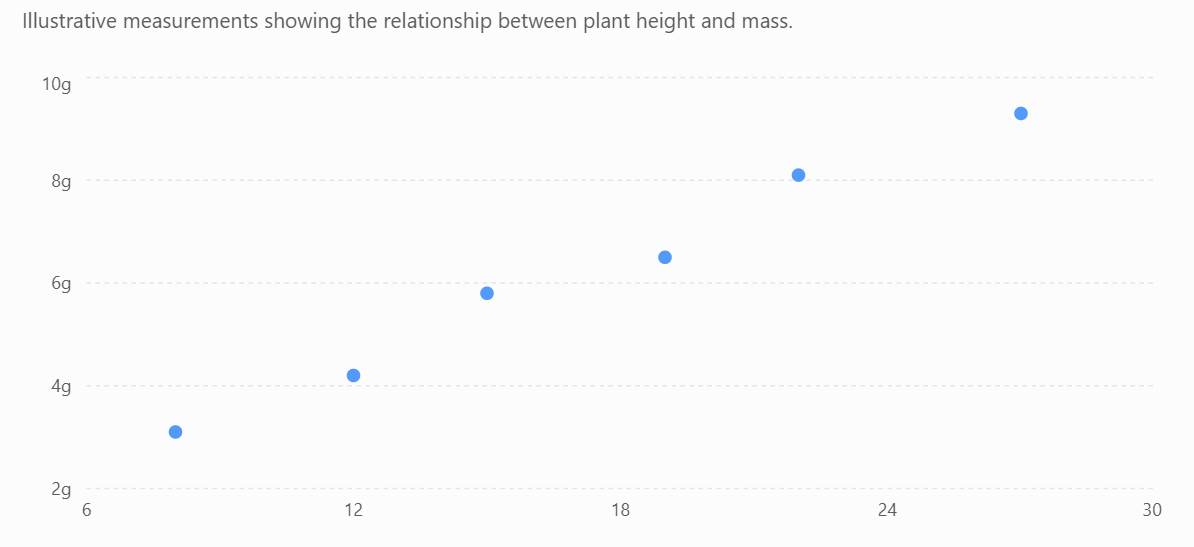
The points suggest that taller plants tend to have greater mass.
This is called a positive correlation.
A scatter graph does not normally require the points to be connected one-by-one. Instead, scientists may add a line of best fit to show the overall relationship.
Bar Graphs
A bar graph is appropriate when the independent variable consists of separate categories.
For example:
| Fertiliser | Mean Plant Growth (cm) |
|---|---|
| None | 4.2 |
| A | 7.8 |
| B | 11.3 |
| C | 6.5 |
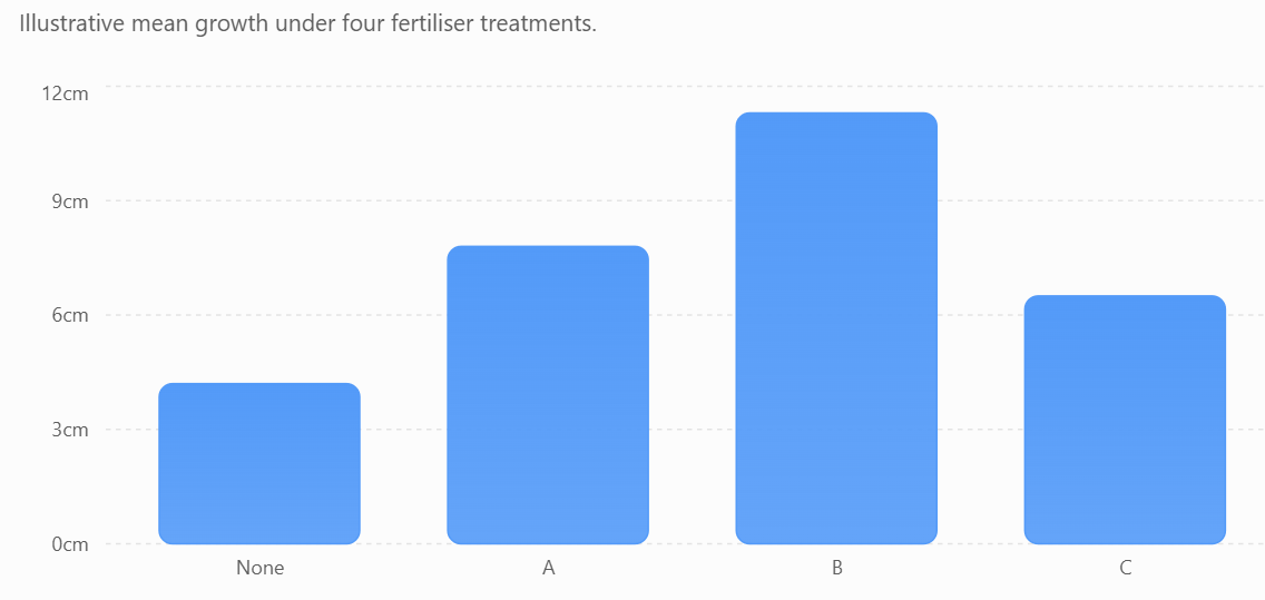
The bars are separated because None, A, B, and C are distinct categories rather than values along a continuous scale.
From the graph, Fertiliser B produced the greatest mean plant growth.
Independent and Dependent Variables
In most experimental graphs:
Independent variable → x-axis
Dependent variable → y-axis
The independent variable is the variable deliberately changed by the scientist.
The dependent variable is the variable measured in response.
For example, suppose a student investigates:
How does temperature affect reaction time?
The student changes temperature, so:
x-axis → Temperature (°C)
The student measures reaction time, so:
y-axis → Reaction Time (s)
A useful memory aid is:
DRY MIX
Dependent
Responding variable
Y-axis
Manipulated
Independent variable
X-axis
Labelling Axes
Each axis must clearly identify the variable and its unit.
For example:
Temperature (°C)
Time (s)
Distance (m)
Mass (g)
Avoid vague labels such as simply:
Temperature
or
Distance
when units are required.
Choosing an Appropriate Scale
The graph scale should:
- use most of the available graph space
- increase by equal intervals
- use convenient values
- cover the full range of data
- be easy to read
Good intervals might increase by:
1, 2, 5, 10, 20, 50...
Awkward intervals such as 3.7 or 13 should usually be avoided unless there is a specific reason to use them.
The Axis Does Not Always Need to Start at Zero
In many scientific graphs, particularly line and scatter graphs, an axis does not necessarily need to begin at zero.
Suppose temperatures range only from 82 °C to 94 °C.
Using a y-axis from 0–100 °C would compress all the points into a small part of the graph.
A scale from perhaps 80–95 °C could make the pattern much clearer.
However, truncated axes must be clearly labelled and used carefully because they can sometimes exaggerate differences.
For bar graphs, beginning the numerical axis at zero is generally important because the length of each bar represents its magnitude.
Plotting Data Accurately
Each point should be plotted carefully according to its x- and y-coordinates.
Suppose:
Temperature = 30 °C
Reaction time = 65 s
The point should be plotted at:
(30, 65)
A small cross × is often useful because its centre clearly shows the intended coordinate.
Points should not be placed approximately. Their positions should match the graph scale as accurately as possible.
Lines of Best Fit
When experimental points show an overall relationship, scientists may draw a line or curve of best fit.
A line of best fit should:
- follow the overall trend
- pass close to as many points as possible
- have points reasonably distributed around it
- not simply connect every point in order
The line represents the general relationship in the data.


Positive Relationships
A positive relationship occurs when one variable generally increases as the other increases.
For example:
As fertiliser concentration increases, plant growth increases.
The graph generally rises from left to right.
Negative Relationships
A negative relationship occurs when one variable increases while the other decreases.
For example:
As temperature increases, reaction time decreases.
The graph generally falls from left to right.
No Clear Relationship
Sometimes changing one variable does not produce a consistent change in another.
The graph may show scattered points with no obvious pattern.
In this situation, scientists should not claim that a relationship exists simply because they expected one.
Conclusions must be based on the data collected.
Correlation Does Not Prove Causation
Suppose a scatter graph shows that two variables are related.
This is called correlation.
However, correlation alone does not prove that one variable caused the other to change.
For example, ice cream sales and sunburn cases might both increase during hotter weather.
Ice cream does not cause sunburn.
Instead, a third factor—hot, sunny weather—affects both variables.
Scientists therefore distinguish between correlation and causation.
Identifying Anomalies
An anomaly is a data point that does not fit the overall trend.
For example:
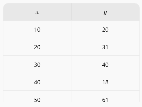
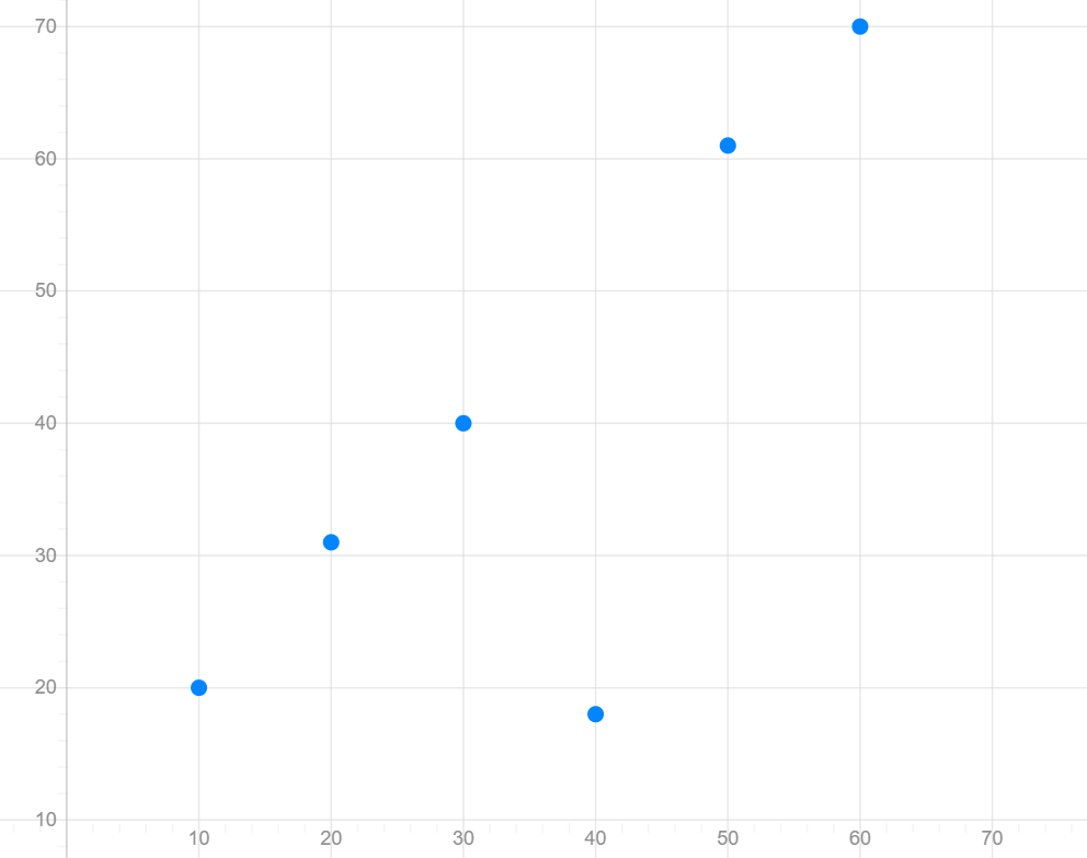
Most of the points follow an increasing pattern, but the point at (40, 18) is noticeably different.
Scientists should investigate anomalies rather than automatically deleting them.
Possible explanations include:
- measurement error
- equipment problems
- uncontrolled variables
- recording mistakes
- genuine variation
Repeating the measurement can help determine whether the anomalous result is reliable.
Interpolation
Graphs can sometimes be used to estimate values between measured data points.
This is called interpolation.
Suppose measurements were taken at:
20 °C and 30 °C.
A graph could be used to estimate a value at:
25 °C.
Interpolation is generally more reliable because the estimate lies within the measured range.
Extrapolation
Extrapolation involves predicting values outside the measured data range.
If measurements were collected between 10 °C and 50 °C, predicting what happens at 70 °C would be extrapolation.
Extrapolation is usually less reliable because we do not know whether the existing pattern will continue outside the measured range.
Interpreting Graphs
When interpreting a scientific graph, ask:
- What variables are shown?
- What units are being used?
- What does the scale represent?
- Is there a positive, negative, or no clear relationship?
- Are there any anomalies?
- Does the relationship remain constant?
- What numerical evidence supports the conclusion?
Strong graph interpretations use specific evidence.
Instead of:
"Temperature increased."
Write:
"Temperature increased from 20 °C at 0 minutes to 45 °C after 10 minutes."
Common Graphing Mistakes
Students should avoid:
- choosing the wrong graph type
- forgetting the graph title
- forgetting units
- putting variables on the wrong axes
- using uneven scale intervals
- using only a small portion of the graph paper
- plotting points inaccurately
- automatically connecting every experimental point
- ignoring anomalous results
- describing a trend without using data as evidence
A Graphing Checklist
Before finishing a graph, check:
- Is the correct graph type used?
- Is there a descriptive title?
- Is the independent variable on the x-axis?
- Is the dependent variable on the y-axis?
- Are both axes clearly labelled?
- Are units included?
- Is the scale appropriate and consistent?
- Are points plotted accurately?
- Is a line or curve of best fit appropriate?
- Can the main trend be clearly identified?
Did You Know?
Graphs can sometimes be designed in ways that make differences appear much larger or smaller than they really are.
For example, changing the starting value or range of an axis can dramatically change the visual appearance of the same dataset.
Scientists should therefore look carefully at axis labels and scales before interpreting any graph—not just the overall shape of the picture.
Key Terms
Line graph: A graph used to show trends across ordered or continuous data.
Bar graph: A graph used to compare separate categories.
Scatter graph: A graph used to investigate relationships between two numerical variables.
Trend: The overall pattern shown by data.
Correlation: A relationship between two variables.
Line of best fit: A line showing the overall trend of scattered data.
Anomaly: A result that does not fit the general pattern.
Interpolation: Estimating a value within the measured range.
Extrapolation: Predicting a value outside the measured range.
Key Takeaways
- Scientists choose graphs based on the type of data and relationship being investigated.
- Bar graphs are useful for categorical data.
- Line graphs are useful for showing ordered changes and trends.
- Scatter graphs are useful for investigating relationships between two numerical variables.
- The independent variable usually goes on the x-axis and the dependent variable on the y-axis.
- Axes must have appropriate labels, units, and scales.
- Data points must be plotted accurately.
- Graphs can show positive relationships, negative relationships, or no clear relationship.
- Anomalies should be identified and investigated.
- Correlation does not necessarily mean causation.
- Interpolation is generally more reliable than extrapolation.
- Graph interpretations should use specific numerical evidence from the data.
5. Digital Tools for Data Collection
Learning outcomes
- I can identify digital tools used in scientific investigations.
- I can collect data using digital sensors or software.
- I can organize digital data effectively.
- I can explain the advantages of digital data collection.
- I can evaluate the reliability of digitally collected data.
Digital Tools for Data Collection
Modern scientists often use digital tools to collect, store, analyse, and display experimental data. These tools can make measurements faster, allow large amounts of data to be collected automatically, and often provide greater precision than manual measurements.
Digital data collection is used in school laboratories as well as in fields such as medicine, environmental science, engineering, astronomy, and space exploration.
What Are Digital Data-Collection Tools?
A digital data-collection tool is a device or piece of software that records measurements electronically.
Examples include:
- digital thermometers
- light sensors
- motion sensors
- pH probes
- pressure sensors
- heart-rate monitors
- digital balances
- sound sensors
- data loggers
- smartphones and tablets
- computer software and spreadsheets
Many of these tools use sensors to detect changes in the environment.
What Is a Sensor?
A sensor is a device that detects a physical or chemical quantity and converts it into a signal that can be measured and recorded.
For example, a temperature sensor detects changes in temperature and converts them into an electrical signal.
The computer or data logger then converts the signal into a numerical value such as:
24.6 °C


Common Digital Sensors
Different sensors measure different quantities.
| Digital Tool | Quantity Measured | Typical Unit |
|---|---|---|
| Temperature probe | Temperature | °C |
| Light sensor | Light intensity | lux |
| Motion sensor | Position, speed or motion | m, m/s |
| pH probe | pH | pH units |
| Pressure sensor | Pressure | Pa or kPa |
| Force sensor | Force | N |
| Sound sensor | Sound intensity | dB |
| Oxygen sensor | Oxygen concentration | % or mg/L |
| Carbon dioxide sensor | CO₂ concentration | ppm |
The correct sensor must be chosen for the variable being measured.
Digital Data Loggers
A data logger is a device that automatically records measurements from one or more sensors.
Instead of a student manually reading a thermometer every minute, a temperature probe connected to a data logger could automatically record the temperature every few seconds.
For example:
| Time (s) | Temperature (°C) |
|---|---|
| 0 | 22.1 |
| 10 | 23.4 |
| 20 | 25.8 |
| 30 | 28.7 |
| 40 | 31.2 |
| 50 | 33.0 |
The data can then be transferred to a computer for analysis.
Collecting Data Automatically
One major advantage of digital sensors is that they can collect measurements at regular time intervals.
For example, a student investigating cooling might program a temperature sensor to record one measurement every:
5 seconds
for:
10 minutes
The system could therefore collect more than 100 measurements without the student having to read the thermometer manually.
This allows scientists to observe changes that might otherwise be missed.
Using Digital Tools in Motion Experiments
Motion sensors are particularly useful in physics.
A motion sensor can repeatedly measure the position of an object and allow software to calculate quantities such as:
- distance
- displacement
- speed
- velocity
- acceleration
The software can then automatically produce graphs such as:
- distance-time graphs
- velocity-time graphs
- acceleration-time graphs
This gives students much more detailed information about motion than using a stopwatch alone.


Using Digital Tools in Chemistry
Digital sensors are also useful in chemistry.
For example, a student investigating a neutralisation reaction could use:
- a pH probe to measure pH
- a temperature probe to measure temperature changes
- a digital balance to measure mass
A pH probe could record how the pH changes as an alkali is gradually added to an acid.
This produces many measurements and allows the change to be displayed as a graph.
Using Digital Tools in Biology
Digital tools can collect biological and environmental data.
Examples include:
- heart-rate monitors
- oxygen sensors
- carbon dioxide sensors
- humidity sensors
- light sensors
- temperature probes
Students might investigate how exercise affects heart rate or how light intensity affects photosynthesis.
Digital tools allow measurements to be recorded continuously as conditions change.
Smartphones as Scientific Tools
Modern smartphones contain several built-in sensors.
Depending on the device, these may include:
- accelerometers
- gyroscopes
- microphones
- cameras
- light sensors
- GPS receivers
- magnetometers
Scientific apps can use these sensors to perform simple experiments.
For example, an accelerometer can investigate movement, while a microphone can collect information about sound.
However, smartphone sensors may not always be calibrated to the same standard as specialised laboratory equipment.
Organising Digital Data
Digital data can quickly become difficult to understand if it is not organised properly.
Scientists commonly use spreadsheets and other data-processing software.
Data should be organised into clearly labelled columns.
For example:
| Time (s) | Temperature (°C) | pH |
|---|---|---|
| 0 | 21.8 | 2.1 |
| 30 | 23.4 | 2.7 |
| 60 | 25.9 | 3.6 |
| 90 | 27.1 | 5.2 |
| 120 | 27.4 | 7.0 |
Columns should contain:
- clear headings
- correct units
- consistent numbers of decimal places where appropriate
Files should also be given meaningful names so that they can be identified later.
Using Spreadsheets
Spreadsheet programs are useful because they can perform calculations automatically.
Scientists can use them to calculate:
- means
- percentages
- rates
- differences
- maximum and minimum values
- standard deviations
They can also produce graphs directly from the collected data.
For example, a computer could calculate the mean of:
24.1, 24.3, 24.2, 24.5, 24.4 °C
and report:
Mean temperature = 24.3 °C
This reduces the amount of repetitive calculation required.
Advantages of Digital Data Collection
Digital tools provide several important advantages.
Large Amounts of Data
Sensors can collect hundreds or thousands of measurements.
This can reveal patterns that would be difficult to detect with only a few manual readings.
Frequent Measurements
A sensor might record data every second—or even many times each second.
Humans cannot usually record measurements this quickly or consistently.
Automatic Recording
The system records measurements automatically.
This reduces the chance of forgetting a measurement or recording it at the wrong time.
Greater Precision
Some digital instruments can display measurements with greater resolution than simple analogue equipment.
For example:
Analogue thermometer: nearest 1 °C
Digital probe: nearest 0.1 °C
Immediate Graphing
Many digital systems can produce graphs while an experiment is taking place.
Scientists can therefore see patterns developing in real time.
Long-Term Monitoring
Sensors can collect data for hours, days, or even months.
For example, an environmental sensor could monitor temperature in a forest continuously without a scientist being present.
Digital Data Is Not Automatically Correct
Digital measurements can appear very precise because they contain many decimal places.
For example:
Temperature = 23.847 °C
However, displaying many digits does not guarantee that the measurement is accurate.
A sensor could be poorly calibrated or affected by environmental conditions.
Scientists must therefore evaluate digital measurements just as carefully as manual measurements.
Calibration
Calibration involves checking an instrument against a known reference value.
For example, a temperature sensor could be tested using known temperature standards.
If the instrument consistently reads too high or too low, its measurements may need to be corrected or the instrument recalibrated.
Regular calibration helps improve the accuracy and reliability of digital data.
Resolution
The resolution of a digital sensor is the smallest change it can detect or display.
For example:
Sensor A displays:
24 °C
Sensor B displays:
24.1 °C
Sensor B has a finer displayed resolution.
However, better resolution does not automatically mean better accuracy.
Sampling Rate
The sampling rate describes how frequently a digital sensor records measurements.
For example:
1 measurement every 10 seconds
has a lower sampling rate than:
10 measurements every second
The appropriate sampling rate depends on how quickly the variable changes.
A very slow sampling rate might miss important changes.
For example, measuring the acceleration of a bouncing ball only once every 10 seconds would provide almost no useful information.
Evaluating Reliability
Scientists should ask several questions when deciding whether digitally collected data is reliable:
- Was the correct sensor used?
- Was the sensor calibrated?
- Was the sensor positioned correctly?
- Was the sampling rate appropriate?
- Were repeated measurements consistent?
- Were there any unusual readings?
- Was the instrument's measurement range appropriate?
- Were environmental conditions controlled?
Reliable data should be consistent and repeatable when the experiment is performed under the same conditions.
Identifying Anomalies
Digital systems can sometimes produce unusual readings called anomalies.
Imagine a temperature sensor produces:
| Time (s) | Temperature (°C) |
|---|---|
| 0 | 22.1 |
| 10 | 22.8 |
| 20 | 23.5 |
| 30 | 71.4 |
| 40 | 24.8 |
| 50 | 25.3 |
The value 71.4 °C does not fit the surrounding measurements.
Possible explanations include:
- temporary sensor failure
- poor electrical connection
- accidental contact with another object
- software error
- genuine experimental change
Scientists should investigate unusual measurements rather than simply deleting them.
Digital vs. Manual Data Collection
| Manual Collection | Digital Collection |
|---|---|
| Scientist reads instrument | Sensor records measurement |
| Usually fewer measurements | Can collect many measurements |
| May involve reaction-time errors | Can record at precise intervals |
| Data often entered manually | Data can be stored automatically |
| Simple equipment may be sufficient | Requires electronic equipment |
| Useful for many basic experiments | Useful for rapid or long-term changes |
Neither method is always better.
The best method depends on the scientific question being investigated.
When Manual Measurement May Be Better
Digital equipment is not always necessary.
For example, measuring the length of a pencil with a ruler is simple, inexpensive, and sufficiently precise.
Using an electronic motion sensor would make the investigation unnecessarily complicated.
Scientists should choose equipment based on what is appropriate, not simply because it is digital.
Did You Know?
Some scientific experiments produce enormous amounts of digital data.
Space telescopes, particle detectors, weather satellites, and environmental monitoring networks can generate vast datasets that cannot realistically be analysed by hand.
Scientists therefore use computers and specialised software to identify patterns, process measurements, and search through the data.
Key Terms
Sensor: A device that detects a physical or chemical quantity.
Data logger: A device that automatically records measurements from sensors.
Digital data: Information recorded electronically.
Calibration: Checking an instrument against a known reference.
Resolution: The smallest change an instrument can detect or display.
Sampling rate: How frequently measurements are recorded.
Reliability: The extent to which measurements are consistent and repeatable.
Anomaly: A measurement that does not fit the general pattern.
Key Takeaways
- Digital tools are widely used to collect, store, and analyse scientific data.
- Common sensors measure quantities such as temperature, pH, light, pressure, force, sound, and motion.
- Data loggers can collect measurements automatically at regular intervals.
- Digital data can be organised using tables, spreadsheets, and graphs.
- Digital tools can collect large amounts of data quickly and accurately.
- They are particularly useful for rapid changes and long-term monitoring.
- Digital measurements are not automatically reliable simply because they appear precise.
- Calibration, resolution, sensor position, and sampling rate can all affect results.
- Scientists should check for anomalies and repeat measurements where appropriate.
- The best measuring method is the one most appropriate for the investigation, whether it is digital or manual.