Graphing and Data Analysis

3. Best-fit lines

Learning outcomes
  • I can draw appropriate lines of best fit for experimental data.
  • I can distinguish between best-fit lines and connecting data points.
  • I can identify outliers in experimental data.
  • I can use best-fit lines to estimate values.
  • I can explain why best-fit lines improve data interpretation.

What Is a Line of Best Fit?

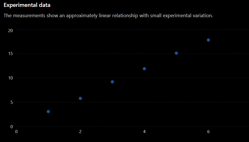
When scientists collect experimental data, the results are rarely perfect.

Even when two variables have a clear relationship, the plotted data points may not fall exactly on a straight line.

For example:

Time (s) Distance (m)
1 3.1
2 5.8
3 9.2
4 11.9
5 15.1
6 17.8

The points show a clear pattern, but they do not lie perfectly on one straight line.

A line of best fit is a straight line drawn through a set of data points to show the overall trend or relationship.

The line does not need to pass through every point.

Instead, it should represent the general pattern of the data.


Why Don't Experimental Points Form a Perfect Line?

Experimental measurements always contain some amount of variation or uncertainty.

Small differences can be caused by:

  • Measurement uncertainty
  • Limitations of measuring equipment
  • Human reaction time
  • Small changes in experimental conditions
  • Natural variation
  • Rounding measurements

As a result, real experimental data often appear scattered around the expected relationship.

A line of best fit helps us see the underlying pattern more clearly.


Drawing a Line of Best Fit

Consider the following experimental data:

x y
1 3.1
2 5.8
3 9.2
4 11.9
5 15.1
6 17.8

When drawing a line of best fit:

  • Use a ruler.
  • Follow the overall trend of the data.
  • Try to have approximately the same number of points above and below the line.
  • Do not try to force the line through every point.
  • Do not automatically force the line through the origin.
  • Ignore a clear outlier when appropriate.

The goal is to represent the trend, not every individual measurement.


Best-Fit Line vs. Connecting the Points

A common mistake is to connect each experimental point to the next point.

For example, students sometimes draw:

This creates a zigzag pattern that follows every small variation in the measurements.

For many experimental graphs, this is not appropriate.

A line of best fit instead shows the overall relationship:

Connecting the points emphasizes individual measurements.

A best-fit line emphasizes the relationship between the variables.


When Should Points Be Connected?

Connecting individual points is appropriate in some situations.

For example, if you are showing how a quantity changes continuously over time, connecting consecutive measurements may be useful.

However, when investigating the relationship between two continuous variables and looking for a general trend, a line or curve of best fit is usually more appropriate.

Always think about what the graph represents rather than automatically connecting every point.


The Line Does Not Need to Pass Through Every Point

This is one of the most important ideas about best-fit lines.
A good best-fit line should pass through the middle of the pattern.

Some points may be above the line.

Some points may be below the line.

This is expected.

The line represents the relationship suggested by all the data together.


Should the Line Pass Through the Origin?

Not necessarily.

The origin is:

(0, 0)

A line should pass through the origin only when the data and the physical relationship suggest that:

For example, some directly proportional relationships should pass through the origin.

However, other relationships may have a non-zero y-intercept.

Never force a best-fit line through the origin simply because the origin appears on the graph.


What Is an Outlier?

An outlier is a data point that lies unusually far away from the overall pattern of the other data.

Suppose an experiment produces:

Force (N) Extension (cm)
1 2.1
2 4.0
3 6.2
4 14.0
5 10.1
6 12.0

Most of the data follow approximately:

But the point:

(4, 14)

does not fit this pattern.

It is a possible outlier.


What Causes Outliers?

An outlier may occur because of:

  • A measurement error
  • Incorrectly recorded data
  • Faulty equipment
  • An unusual experimental condition
  • Human error
  • Natural variation

However, an unusual result is not automatically a mistake.

Scientists should investigate possible outliers rather than simply deleting them.

Repeating the measurement can help determine whether the unusual result is reliable.


Outliers and the Best-Fit Line

A clear outlier should not usually pull the line of best fit away from the pattern shown by the majority of the data.

Imagine six points follow a clear straight-line pattern but one point lies far above them.

The best-fit line should represent the trend of the main group of points.

The unusual point can then be identified and investigated separately.

This allows the graph to represent the most likely relationship between the variables.


Using a Best-Fit Line to Estimate Values

Once a line of best fit has been drawn, we can use it to estimate values that were not measured directly.

Suppose experimental data suggest the relationship:

We want to estimate y when:

Using the trend:


Therefore:

y ≈ 15.5​

Because the value comes from a best-fit relationship rather than an exact measurement, we should treat it as an estimate.


Interpolation

When we use a best-fit line to estimate a value inside the range of our experimental data, this is called interpolation.

Suppose measurements were collected between:

and:

Using the graph to estimate the value at:

would be interpolation.

Interpolation is generally more reliable because the estimate lies within the region supported by experimental measurements.


Extrapolation

When we extend a best-fit line beyond the measured data to predict a value, this is called extrapolation.

Suppose our measurements only cover:

but we use the line to predict what happens at:

This is extrapolation.

Extrapolation can be useful, but it is less reliable.

The relationship may change outside the range that was actually measured.


Interpolation vs. Extrapolation

Consider experimental data collected between 2 s and 10 s.

Estimating a value at:

6 s

is interpolation because 6 s lies within the measured range.

Estimating a value at:

15 s

is extrapolation because 15 s lies outside the measured range.

A useful rule is:

Interpolation = inside the data

Extrapolation = beyond the data


How to Estimate a Value from a Graph

Suppose you want to estimate y for a particular value of x.

Step 1

Find the required value on the x-axis.

Step 2

Move vertically until you reach the line of best fit.

Step 3

Move horizontally toward the y-axis.

Step 4

Read the corresponding y-value.

Because the line represents experimental data, your answer should normally be described as an estimated value.


Using Best-Fit Lines to Calculate Gradient

A best-fit line can also be used to calculate the gradient of an experimental relationship.

Remember:

\( gradient = \frac{change \ in \ y}{change \ in \ x} \)

Choose two clear points on the best-fit line.

These points do not need to be original experimental data points.

For example, suppose two convenient points on a best-fit line are:

(2,7)

and:

(8,25)

Then:

 
gradient = 3​

Choose points that are far apart when possible. This generally gives a more reliable gradient.


Why Do Best-Fit Lines Improve Data Interpretation?

Consider a graph containing 15 experimental points.

Looking at each point individually can make the results appear complicated.

A best-fit line simplifies the data by showing the overall pattern.

It can help us:

  • Identify whether a relationship exists.
  • Determine whether the relationship is positive or negative.
  • Calculate the gradient.
  • Estimate unknown values.
  • Identify unusual measurements.
  • Compare different sets of experimental data.
  • Make predictions.

The best-fit line helps separate the important trend from small experimental variations.


Example: Temperature Experiment

A student heats water and records its temperature.

Time (min) Temperature (°C)
0 20
1 24
2 29
3 32
4 37
5 41

The measurements are not perfectly spaced, but they show a clear increasing trend.

A best-fit line could be drawn through the data.

The student could then use the line to:

  • Estimate the temperature at 2.5 minutes.
  • Calculate the approximate heating rate.
  • Predict the temperature at a later time.
  • Identify any measurements that do not fit the overall trend.

The graph therefore provides more information than simply looking at the data table.


A Best-Fit Line Checklist

When drawing a line of best fit, ask:

  • Have I plotted all the data accurately?
  • Is there a clear trend?
  • Should the trend be represented by a straight line?
  • Does my line pass through the middle of the data?
  • Are there approximately equal numbers of points above and below the line?
  • Have I avoided connecting individual points?
  • Have I identified any obvious outliers?
  • Have I avoided forcing the line through the origin without a reason?
  • Can the line be used to make reasonable estimates?

Did You Know?

Scientists often use mathematical methods called regression to calculate a best-fit line.

Instead of estimating the line by eye, a computer can calculate the line that mathematically fits the data most closely.

For a linear relationship, the result can often be written as:

where:

  • m is the gradient.
  • c is the y-intercept.

Drawing a best-fit line by eye is an important first step toward understanding these more advanced statistical techniques.


Key Vocabulary

Line of best fit – A line that represents the overall trend in a set of data.

Trend – The general pattern or direction shown by data.

Outlier – A data point that lies unusually far from the overall pattern.

Interpolation – Estimating a value within the range of measured data.

Extrapolation – Predicting a value beyond the range of measured data.

Estimate – An approximate value based on available information.

Experimental error – Variation between a measured value and the expected or true value.

Gradient – The rate of change represented by the steepness of a line.

Regression – A mathematical method used to determine a relationship that best represents a set of data.


Key Takeaways

  • Experimental data rarely form a perfectly straight line.
  • A line of best fit represents the overall trend of the data.
  • A best-fit line does not need to pass through every data point.
  • Experimental points should not automatically be connected one by one.
  • A clear outlier lies unusually far from the main pattern of the data.
  • Outliers should be investigated rather than automatically removed.
  • Best-fit lines can be used to calculate gradients and estimate unknown values.
  • Interpolation estimates values within the measured range and is generally more reliable.
  • Extrapolation predicts values beyond the measured range and should be treated with greater caution.
  • A best-fit line makes the overall relationship between variables easier to identify and interpret.